Category: Television

In praise of the starship ceiling

The ceiling of the bridge on the Enterprise 1701-D has not, I feel, had sufficient love bestowed upon it. I am very fond of all the purplish-gray, padded-upholstery, conference-hotel interior design elements of TNG, but their relationship with the progress of aesthetic trends in this century has not been entirely amicable or graceful. But the ceiling I’m talking about doesn’t seem dated or even retro, perhaps because it started as retro: I’m no expert, but to me this design reads as pretty much straight Art Nouveau.
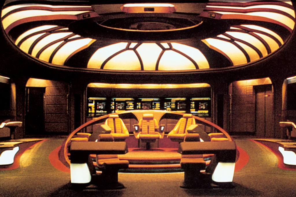
Perspective from the view screen of the Enterprise-D bridge

That’s actually from the rebuild they did for Generations (1994), but it’s the best view I can find from an actual photo. Most of what shows up in image searches now is from fan CGI recreations, but I think the quality of light and material you can see there are an important part of what I’m talking about. It’s of a piece with the rest of the set, but it also looks like something set apart. Here’s a partial perspective from an actual episode.
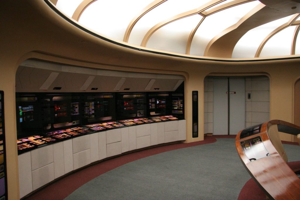
Side view of the rear portion of the Enterprise-D bridge.

I noticed this angle while watching “Descent” with Kat, whose enjoyment of TNG is mild and reserved largely for the characters of Lore and Hugh. It was the first time I’d realized that the center of the ceiling is actually a porthole with stars in it. There’s a helpful writeup about the origins of the design on Forgotten Trek, but it focuses more on the production history than on concept artist Andrew Probert’s thought process.
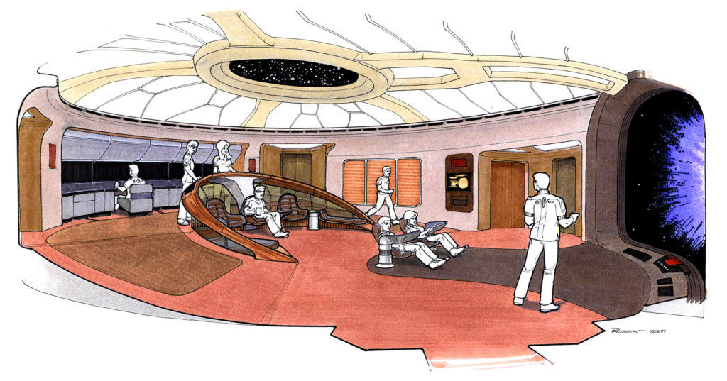
Charming marker-art concept sketch for the bridge

It doesn’t address this either, but I suspect that the production function of the ceiling as a stage light was pretty helpful. While it looks like at least in the first season, they did set up lights for each individual shot the way one normally does on a soundstage, the show’s primary set also had a built-in hemispherical softbox! The crew could bounce flattering light on multiple sides of an actor’s face without having to do anything special or worry about lamp stands getting in the shot. Meanwhile, the science station alcoves in the back are shielded from that soft light by the overhang and can be lit by monitors, from underneath, for increased drama whenever Geordi tells the captain that teching the tech tech is worth a shot.

I really wonder if Ron Moore was thinking about the soft light of that design, two shows later, when they came up with the layout of the Battlestar Galactica CIC.
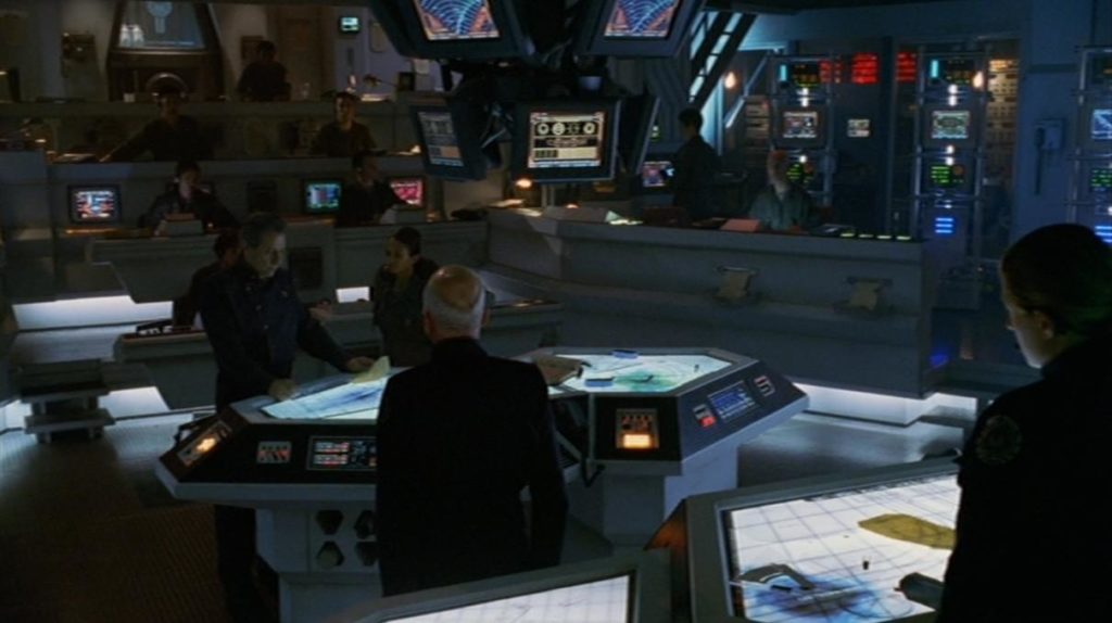
I say this with love: it is an inferior design, at least in terms of pure spatial reference. I watched every single episode and webisode of BSG, and I never had any idea what the horizontal axes of this room were supposed to be, or what most of the people on screen were doing. The nice thing about having all the chairs turned in the same direction as Picard when he points at his big tv-windshield and says “go” is that, as an audience member, you don’t have to guess whether that’s the front of the spaceship. Sure, maybe it makes military sense that the CIC would be buried in the deepest and most armored part of a battlestar, rather than having a big round window on top of it. But in effect it often felt more like they were sitting around somewhere underground, not charging into the fray or leaping through the fracking galaxy.

As pieces of functional stage go, though, the CIC poetically inverts the bridge in a way that works well. Its ceiling is a pit of darkness; almost every light on set faces upward or bounces off the floor, casting faces into shadow. Maximum drama at all times! In Star Trek, the captain can always look around and see the face of someone who’s going to give him a suggestion for the problem at hand. But in BSG, everyone keeps their eyes down, because they all know none of their answers are going to be good ones.

“Who’s the agent in charge to get my sister-in-law into bed these days.”

In the grand tradition of Dada Everything, and appropriately via Adam Parrish, comes Josh Millard’s Previously, on the X-Files… It’s fun! In a few minutes of hitting refresh to perform my valuable human function of sorting random nonsense from random inspiration, I was able to generate some pretty great stuff, like Dana Lebowski, Scully’s Terrible Realization and Scully/Langly: Dance Remix. But the best part about it is that the transcripts from which it draws seem to include a great many standalone ellipses, which work beautifully in the context of textual noise. Besides creating these amazing awkward moments, you also get tense standoffs and very confused Mulders and this spectacular failure to communicate.

Someone make one of these for Next Generation now please yes.

I couldn’t get through the whole thing without a Studio 60 joke! I’m sorry. It’s in paragraph seven.

Ready for another screed about how a television show has failed to satisfy me? You are? You are ready for some unexpected things!

I wanted to like Cupid ’09! I did. I loved Cupid ’98 and I loved Veronica Mars, so Rob Thomas + more exposure + more money had to add up to something good, right? No! Cupid ’09 is a stupid television show that is bad. Tonight I had to turn it off halfway through. I have identified three reasons for this, listed in order of increasing subtlety.

First, the writing is bad. Advertising bad. Not freecreditreport.com commercial bad, but easily eHarmony bad. I have no way of accounting for this. Rob Thomas has demonstrated repeatedly that he can write, and indeed manage a writing team well; has he concentrated so hard on that that he has forgotten how to read?

Second, the shooting style is weird and elliptic. They seem to have fewer ad breaks than a typical show, but they try to deal with that by throwing in B-roll with lots of lens flare. It ends up looking like a documentary with pretensions instead of a comic drama. (Speaking of which, it also seems to have no dramatic or comedic elements, but that goes back to #1.)

Third–and honestly, this is the killer–Bobby Cannavale isn’t Jeremy Piven. He’s a good actor, and Jeremy Piven isn’t the only guy who would be capable of taking on the role, but to make Cupid work, Trevor has to be kind of a jackass. Cannavale’s Trevor is ripped, deep-voiced, gentle, well-dressed, polite and full of faith in human nature. Piven’s was horny, cynical, scruffy and smirking. Piven was playing Han Solo, writ short; Cannavale seems to think he’s in Touched by an Angel.

Fourth, it is impossible to stop hating Cannavale’s fauxhawk, which appears in 80% of the shots. He had a fauxhawk while in the mental hospital. No. No.

Point three there is indicative of a larger issue, which is that the cast has no chemistry. They’re all about as lively as shellshocked deer. Sarah Paulsen’s lone facial expression already helped sink Studio 60, of course, but Jeffrey D. Sams’s seething bouncer roommate created just as many sparks as Paula Marshall’s Claire; Rick Gomez’s stand-in seems to deal with Trevor by simply turning to Valium.

Absent any conflict among the regulars, the show has to lean on its match-of-the-week for interest, and nobody cares about them. Nobody did before, either. We just liked seeing how they illuminated the tension between Claire and Trevor, but this time, there’s nothing there to see.

Brendan painstakingly imitates a Photoshop filter, third in a series

I will probably never love another episode of television as much as I love Battlestar Galactica, season 3, episode 9, “Unfinished Business.” And not just because it has images like this:

GET UP.  We're just getting STARTED.

I’ve spent at least the last year and a half (actually, more like seven years, since my undergrad Drawing I class) being obsessed with this limited-tone art style. I called it “rotoscoping” once, and Lisa and Will jumped on me because there’s no animation involved, so I have to admit that it’s actually what people call “tracing.” But selective tracing.

As was likely very obvious to anyone in my family, and as I only realized yesterday, my playing around with tone is blatantly derived from my uncle John’s painting and wood engraving work, especially his portraits of my grandfather (which he often combines with layered collage). Mr. Olmos there has some features similar to his, like the disappearing eyes which Ian and I inherited. I hope I get to look that craggy eventually. Right now people are still asking me what my major is, despite the obvious gray in my hair.

I almost forgot to mention that this is the first thing I’ve ever inked with the brushes I bought in 2003, and although it was a lot slower than my usual pens, I completely get why cartoonists get so excited about it now. There’s a feeling of dynamic control over the line weight that you just can’t get with pens, even the brush pen with which I inked a lot of later Xorph strips. (Not that there are actually any distinct lines in the finished images below. Good.)

So I made a picture and it’s a wallpaper if you want it: the images below link to 1600×1200 and 1600×1000 (widescreen) jpegs. There’s also a browser-sized version if you just want to zoom in a bit.

Adama at standard ratio, with logo.

Adama at normal ratio, no logo.

PS Can Battlestar Galactica be back on now plz

Update 2008.01.26 0001 hrs: Naturally, UJ has a much more cogent post on the subject (the art, not Battlestar), along with one of the portraits I was talking about.

This is for everybody who misses how the Internet used to bag on Studio 60

The sitcom is killing sketch comedy.

Maria was emailing around this one Muppets bit from Seth Rogen’s stint on SNL and she apologized if anyone had already seen it, but, as she pointed out, “nobody watches SNL anymore.” This is hardly news. SNL’s function now is not so much to be watched as to give Andy Samberg Emmys for songs that have a penis joke. The only reason I’d even set it playing on the Tivo was because they had Spoon on, marking the first and only time I’ve deliberately watched the show for the music.

The rest of the show was factory standard, a very careful reenactment of the weekly SNL ritual (is it really a coincidence that part of the show actually airs on Sunday?). The freshest joke was a Macgyver reference. Macgyver ceased production before some of you were born.

I’ve mentioned here before that sketch comedy is unprofitably hard; not coincidentally, I was talking about Studio 60 at the time, like I’m about to do now.

Studio 60 had a running thing where one of the writer-performers wrote and led a commedia dell’arte sketch in several episodes, evidently so Aaron Sorkin could demonstrate that he took Intro to Theater History. The focus groups hated it but the head writer heroically kept it in until it could build an audience (“Matt, Matt! This week two guys in Dallas liked it!”). There are a few problems here.

  1. Commedia dell’arte isn’t funny.
  2. At least, not in and of itself, and not anymore; humor needs context, and a modern audience–even an audience that took Intro to Theater History–doesn’t have the same context as one composed of 16th-century Venetians.
  3. Dated and ritualized forms of comedy getting inexplicably more popular every week is the kind of thing that can only happen in fiction.
  4. Unfortunately for Studio 60, it can’t happen believably even there.

Now, could you write a funny sketch that incorporated the stock types and exaggerated physicality of commedia dell’arte? I doubt it. What you could do is write a ten-minute play or one-act, which gives you the time to introduce the conventions to the audience, set things up going in a direction that the tropes predict, upend the whole thing and finish with a telling and funny point about the form’s influence on modern writing.

Studio 60 tried to go a lot of places, but that wasn’t one of them. Sorkin, bless him, doesn’t do reexamination; he does reverence.

This is where I get back to SNL, as revered an institution as exists in modern television, nowhere moreso than within itself. Like Studio 60, it can’t bear self-examination; the brand of comedy in which it traffics is built high and shakily on mannerisms that date back to Dean Martin and Jerry Lewis, or even Abbott and Costello. It persists entirely due to inertia and the occasional breakout YouTube bit (ever noticed, by the way, that those look and sound like nothing else on the show?).

Now, when every network ran three or four sitcoms and they all made use of the same stylized rhythm as sketch, that was enough: they supplied each other with context. But sitcoms don’t work that way anymore. Poetically, it’s due in part to Aaron Sorkin’s Sports Night that shows like Arrested Development, The Office and My Name is Earl were able to take hold and eventually shatter the studio-audience / three-camera format.

I misstated my thesis at the beginning; it’s not so much that sitcoms are killing sketch as that sitcoms have been its life support, and now they’re pulling plugs out, one by one. If the dependency holds, SNL has about as much time left as Two and a Half Men. Both of them are rigid guardians of their genre and flagship shows. Personally, as Matt Boyd once said about syndicated comics, I want to punch a hole in that boat.

While Veronica rides the bubble

When you make a show about kids in high school, you are making a show about people who are almost always more clever, brave, and resourceful than any adult, but who are surrounded by authority that limits them, ostensibly in their best interest: teachers, parents, prurient laws and condescension. You are making a show about the struggle against that authority. You are making a show about the agency of disenfranchised people.

And that’s why it’s so hard, and maybe impossible, to make the leap to college–the conflict is gone. Despite some nice moments, Veronica Mars hasn’t handled it well, and my understanding is that Buffy couldn’t either. Let’s not get into Dawson’s Creek. Even Six Feet Under had to keep Claire off campus except for (apparently) one class. And this is the same logic that started killing Scrubs: once JD, Turk and Elliot became residents and gained some authority of their own, the show began drifting from drama-with-jokes-in toward straight comedy.

I’m afraid for the last Harry Potter book, if he really doesn’t go back to Hogwarts.

Me: (scrolling through Tivo) We have a couple of Novas…

Maria: What are they on? …No, I’m not interested in those.

Me: But this one has lemurs!

Maria: No. No. You know what they should make one about?

Me: What?

Maria: Unicorns.