“This is not about appropriation: this is about the problems of setting in fiction that trouble us all because we live in the same empired-haunted world, ruined by colony and postcolony alike, this tainted, unstable ground. There is no true and authentic fixed thing, and no one can, or should wish to, lay claim to it. Imagine the horror, if there were such a thing that you could hold in your hands, that you could never put down or toss away, how it would burn and cut.”
Author: Brendan
Some websites that exist
types of websites that exist anymore:
– algorithmic feed of whatever makes the rat keep pushing the lever
– we hope you enjoyed your 3 free articles
– ENABLE NOTIFICATIONS? SHARE LOCATION?? GET NEWSLETTER???
– labor of love by an actual person, last updated 2009— Cliff Jerrison 🌻 (@pervocracy) March 12, 2021
I think about this tweet a lot, even though I don’t actually read twitter anymore. It has achieved what I believe user @BAKKOOONN has called “barium dye” status, inescapable in any segment of the internet’s digestive tract—in part because it so succinctly captures the ache inherent in our cultural surrender to platforms that do not care for us. This paragraph should make it clear that I myself do not find it easy to escape the reach of those platforms. But it has never been easier to carve out your own platform, either.
For that reason I would like to point out some labors of love that have been updated in 2022. I link to my favorites all the time: Leonard and Sumana and Lucy and Rachel are indefatigable. I will enthuse at anyone about longtime stalwarts Derek Guy and Tom Murphy and Audrey Watters and their respective fields of expertise if given the slightest opportunity, and I hope Molly White never runs out of dry schadenfreude, even if her current beat (I hope) fades from the headlines. Jenny is a great and terribly clever friend whose archives I still have to go back and savor. Adam Cadre seems never to have flagged on updates for the last two decades. David Bordwell has been giving away just masterful levels of accessible, expansive teaching on film for even longer than that!
Blogspot, never my favorite platform, has begun to acquire a certain old-timey charm to me, via its placid refusal to become a redesigned algorithmic nightmare (for now!). I’ve been following Peter Gainsford for years, interested in his Classical-era mythbusting even when I am far from understanding its academic context. Kerry Callen has a unique style and sense of humor that recalls the days when lots more comics artists kept delightful sketchblogs. I wish I could remember how I stumbled across Dan of the Salty Throne; not only does reading his posts feel like stepping into an idea stream just as the flash flood barrels down upon you, but his blogroll also helped me realize where all the RPG hobby writers went when Google Plus died. I put five more URLs into my RSS reader yesterday, and I look forward to following them toward more.
There are sites still marching onward that are almost suspiciously me-shaped, too, perhaps because I was shaped by them. If you ever want to learn how to undertake the arcane rituals of BlogNomic, let me know, I’m currently an active mentor. Cyberdelia seems like I made it up for my own amusement (but I didn’t!). And just today, I made a tiny update to my ancient tilde.club page, and I’m not even the only one!
I thought about including my Patreon subscriptions, and some of my favorite podcasts, and my favorite email newsletters—okay, well, I am going to link to Sophie’s newsletter because Sophie is wonderful and her latest letter arrived in my inbox as I was writing this. But I think I will save those for other entries. I just want to remind myself that Cliff Jerrison and despair can be disproven. Not all love’s labors are lost.
“For some years I’ve been arguing that the martial arts cinema of East Asia constitutes as distinctive a contribution to film artistry as did more widely recognized ‘schools and movements’ of European cinema like Soviet Montage and Italian Neorealism.”
I used to read the AV Club every day and now I don’t read it at all and it’s probably not hard to gather why
But Caroline Siede’s retrospective analysis of romantic comedy as a film genre just wrapped up, after a hundred reviews, and I think they are all worth reading if you can manage three quarters of your browser being occluded by ads. Even when I have drawn different conclusions from Siede I have found her work exemplary, and have in fact used her work as an example when thinking about how to structure longer writing about movies. I can recommend in particular her highlighting of gems like Saving Face (2004), The Big Sick (2017), Brown Sugar (2002), and of course, the movie that guaranteed I would one day fall for a Chicago brunette.
It has been ten years almost to the DAY since I linked to one of Jeremy’s projects. This is neglectful and I apologize, Jeremy
I get pretty excited when someone whose creative work I have long admired puts out a nice long essay, these days, because I am—and I cannot emphasize this enough—forty. Jeremy Penner, who has been the kind of historian who actively makes more history ever since I came to know him, dropped a bombshell of such an essay into my Old Reader just this week.
“Quite frankly, nobody who wasn’t an absolute fanatical follower of webcomics discourse 20 years ago has any idea what the fuck this means.”
But I am just such a one, and this filled some gaps in my understanding of the little sphere wherein I came of age. I value this kind of clear and well-founded writing so much. It’s the counterpoint to the Wesley Aptekar-Cassels quote I posted earlier today: archives may succumb, but archivists keep fighting.
“this website should be thought of as a jungle — attempts to link to it are at your own risk. you may attempt to archive it, but should you wish to avoid sadness down the line, you should accept now in your heart that all archives will eventually succumb to the sands of time.”
Old Fashions
I realized with mild startlement, this morning, that I’ve been using a Google Reader replacement called The Old Reader for over eight years—longer than I actually ever used Google Reader. One of the widely loved features of GR was its quiet, useful social function, allowing you to follow your friends and see what they wanted to surface and recommend. The idea of a social network that just unobtrusively shows you the things you want to see, in order, seems like a quaint and nostalgic dream these days.
I never actually made much use of the social feature—I just wanted a reader that persisted between computers—but today (after eight years!) I’ve realized that The Old Reader lets you follow people too, and I’m curious about trying it. Do you use it, dear Four People Who Read This Blog And Possibly A Lost Search Crawler Robot? I’m xorphus there and I’d be happy to connect.
“There’s really no limitation if you’re up to the challenge.”
If it’s ever unclear where my fascination with the tools of creative constraint came from, this process overview video about my uncle John Andrew Dixon’s collage work en plein air should provide a strong clue.
In praise of the starship ceiling
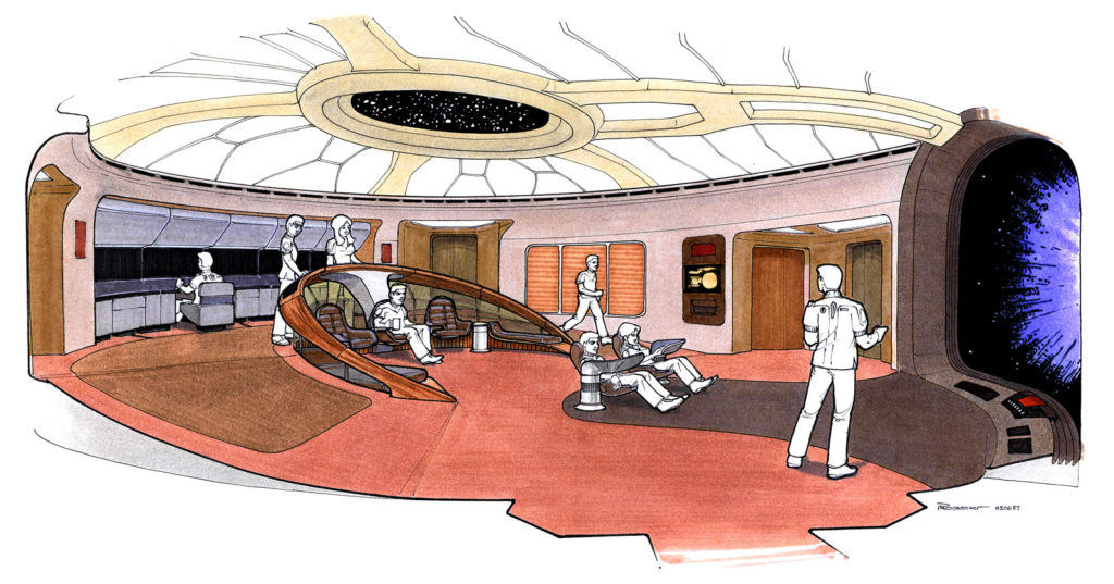
The ceiling of the bridge on the Enterprise 1701-D has not, I feel, had sufficient love bestowed upon it. I am very fond of all the purplish-gray, padded-upholstery, conference-hotel interior design elements of TNG, but their relationship with the progress of aesthetic trends in this century has not been entirely amicable or graceful. But the ceiling I’m talking about doesn’t seem dated or even retro, perhaps because it started as retro: I’m no expert, but to me this design reads as pretty much straight Art Nouveau.

That’s actually from the rebuild they did for Generations (1994), but it’s the best view I can find from an actual photo. Most of what shows up in image searches now is from fan CGI recreations, but I think the quality of light and material you can see there are an important part of what I’m talking about. It’s of a piece with the rest of the set, but it also looks like something set apart. Here’s a partial perspective from an actual episode.

I noticed this angle while watching “Descent” with Kat, whose enjoyment of TNG is mild and reserved largely for the characters of Lore and Hugh. It was the first time I’d realized that the center of the ceiling is actually a porthole with stars in it. There’s a helpful writeup about the origins of the design on Forgotten Trek, but it focuses more on the production history than on concept artist Andrew Probert’s thought process.

It doesn’t address this either, but I suspect that the production function of the ceiling as a stage light was pretty helpful. While it looks like at least in the first season, they did set up lights for each individual shot the way one normally does on a soundstage, the show’s primary set also had a built-in hemispherical softbox! The crew could bounce flattering light on multiple sides of an actor’s face without having to do anything special or worry about lamp stands getting in the shot. Meanwhile, the science station alcoves in the back are shielded from that soft light by the overhang and can be lit by monitors, from underneath, for increased drama whenever Geordi tells the captain that teching the tech tech is worth a shot.
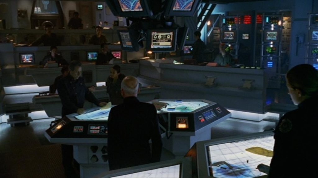
I really wonder if Ron Moore was thinking about the soft light of that design, two shows later, when they came up with the layout of the Battlestar Galactica CIC.

I say this with love: it is an inferior design, at least in terms of pure spatial reference. I watched every single episode and webisode of BSG, and I never had any idea what the horizontal axes of this room were supposed to be, or what most of the people on screen were doing. The nice thing about having all the chairs turned in the same direction as Picard when he points at his big tv-windshield and says “go” is that, as an audience member, you don’t have to guess whether that’s the front of the spaceship. Sure, maybe it makes military sense that the CIC would be buried in the deepest and most armored part of a battlestar, rather than having a big round window on top of it. But in effect it often felt more like they were sitting around somewhere underground, not charging into the fray or leaping through the fracking galaxy.
As pieces of functional stage go, though, the CIC poetically inverts the bridge in a way that works well. Its ceiling is a pit of darkness; almost every light on set faces upward or bounces off the floor, casting faces into shadow. Maximum drama at all times! In Star Trek, the captain can always look around and see the face of someone who’s going to give him a suggestion for the problem at hand. But in BSG, everyone keeps their eyes down, because they all know none of their answers are going to be good ones.
I didn’t write enough about movies last year.
In 2022 I want to work on that, and I want to finally kick off a project I’ve been threatening to undertake for years. Ready for my new blog’s inaugural 3300-word multimedia essay about Steven Soderbergh?