From my ‘Haus of Cards’ archive . . .

December 14th, 2013

“At Hallmark, the approach to creating emotional, relational communication for anonymous others is captured by the phrase ‘universal specificity,’ which suggests that people’s emotions are essentially universal, and that the industry can meet the nation’s social expression needs by customizing these core insights.”
— Emily West

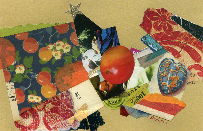
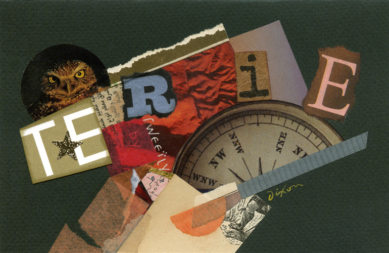
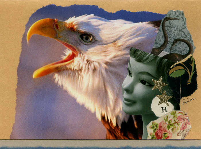
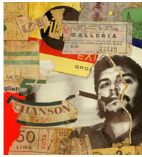
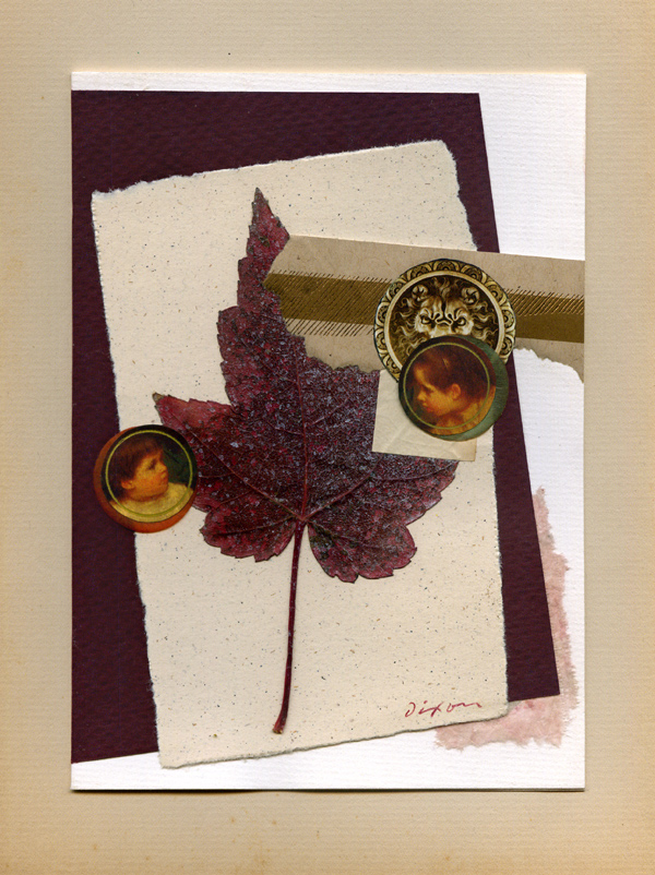
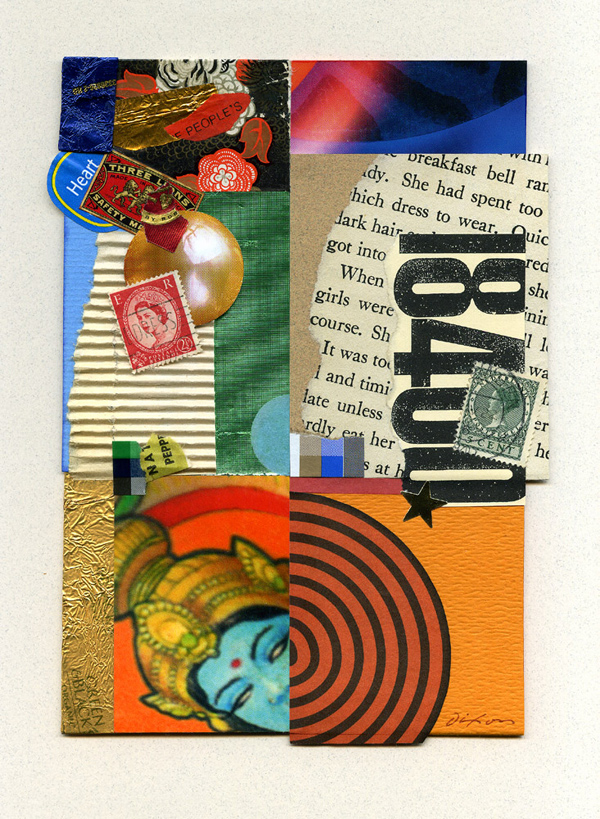
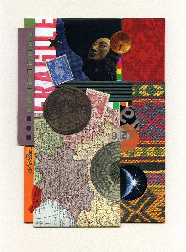
There is, of course, nothing evil about the greeting card industry, but I have never felt comfortable with store-bought messages and decided to give them up early in life. After many years of making original birthday cards, I intensively produced over a thousand small, hand-crafted designs between 1999 and 2003. These visual investigations also served as personal greetings to people I knew. They provided the foundation for my entire approach to creating collage miniatures.
 

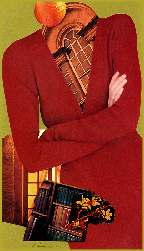
Dixon_ThatRedDress

That Red Dress
collage miniature by J A Dixon
collection of B Palmer

Dixon_Astermandarquoise

Astermandarquoise
collage miniature by J A Dixon
collection of R Crabtree

Dixon_SweetlyTerie

Sweetly Terie
collage miniature by J A Dixon
collection of T Strock

Dixon_NestedPair

Nested Pair
collage miniature by J A Dixon
collection of J Hellyer

Beyond “vacation art” . . .

November 30th, 2013

“I have been producing collages for nearly fifty-five years, many of the early ones were done during long flights or in the waiting areas at airports.”
— Richard Meier

This season of the year finds many artists visiting family and friends. My spending time as a traveler without the suppletory activity of creating art makes for a less than satisfying experience. Visiting new places or returning to familiar haunts is noticably deficient if not combined with sketching or assembling ingredients for a collage experiment. Of course, we all need to relax now and then, sharing time with people who mean the most to us, but many of us also recognize a price to pay whenever the creative urge is asked to take a back seat for any length of time. What better opportunity than a change of environment to infuse our investigations with a fresh dose of spontaneity?

The sabbatical is a time-honored tradition for creative people, which brings to mind Cecil Touchon’s remarkable Paris Papers. But in contrast to this kind of planned artistic get-away, there is also much to be gained by a custom of fusing the influences of short-term travel with an ongoing artistic process. This makes me think of the highly publicized collage artwork of American architect Richard Meier. I saw something years ago which suggested the collage-making proclivity that runs parallel to his professional practice developed from the found material he acquired crisscrossing continents as an in-demand designer, and that many of the early works were created on airliners. I remember being impressed with his wooden case, crafted to accommodate several square working surfaces plus the modest number of accourtrements a collage artist requires to do one’s thing. No doubt his days of transporting blades and scissors on aircraft are part of the past. The status of being a celebrated architect has provided Meier ample “rare” opportunities to showcase examples of his collage. Whether or not the eventual significance of his work within the medium will prove commensurate with the attention it has already received remains a matter of opinion (like nearly everything in the art world).

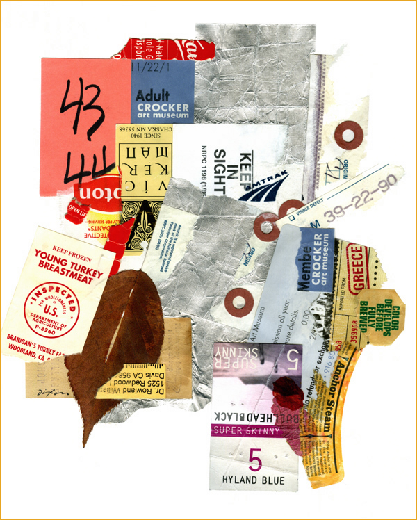
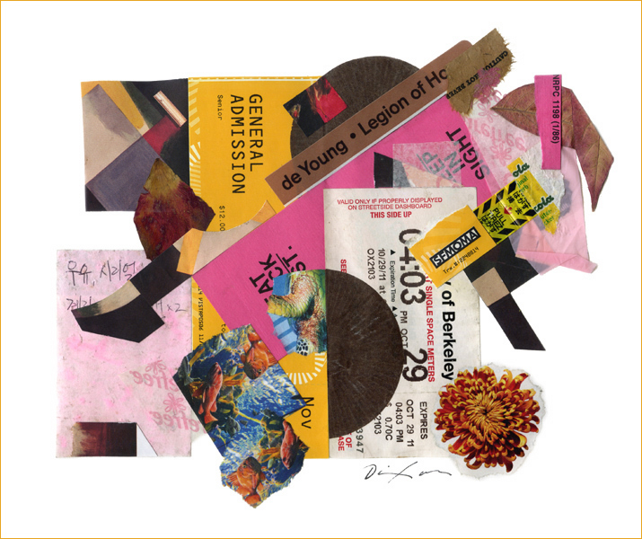
Two years ago, I had the privilege to view a milestone exhibition of Kurt Schwitters originals at the Berkeley Art Museum. During my stay in Northern California, a brother-in-law was kind enough to let me set up a makeshift work area in his home office so that I could capture as collage experiments the flow of new stimuli. Please allow me to share two of those artworks for the first time:
 

Untitled (Back to California, part one)
collage experiment by J A Dixon
8 x 9.5 inches, not for sale

Untitled (Back to California, part two)
collage experiment by J A Dixon
8.5 x 7.5 inches, not for sale

Happy Thanksgiving

November 28th, 2013

“This new day is too dear, with its hopes and invitations, to waste a moment on the yesterdays.”
— Ralph Waldo Emerson


Be mindful of small pleasures.
Give thanks for life’s treasures.
 

Dixon_Thanksgiving2013


On reworking a “finished” piece . . .

November 27th, 2013

“. . . the completion of a work is only ever an abandonment, a halt that can always be regarded as fortuitous in an evolution that might have been continued.”
— Paul Valéry

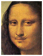
Whether one thinks of the anonymous medieval monk embellishing a pre-existing manuscript, of Leonardo da Vinci working on the surface of his older painting, or of George Lucas making alterations to the original Star Wars trilogy, there is a long and sometimes controversial history of “refining” creative works already accepted as finished. I remember reading about Asian masters who thought nothing of making additions to artworks created in earlier eras. Apparently some art historians believe that halos were added to religious masterpieces much later. Duchamp did not draw those whiskers on the actual Mona Lisa, but he might have, had he been able to get away with it. What has all this to do with collage? Perhaps our entire genre came into being with the essential hunch that worthwhile art could result from revising something in contrast to its original purpose or frame of reference.

There is a wide spectrum to consider, if the subject under discussion is “altered art.” We might be talking about anchoring the concept for a collage on a singular appropriated image or transforming a mundane object into a new work of art. (L T Holmes recently shared a multi-part, personal tour of her Don’t Get Jittery On Me.) Or we might be referring to the simple idea of returning to a work already deemed complete and “writing a final chapter” to improve it. Think long enough about this topic and you may ask yourself whether any artwork is ever really done. Going back to Leonardo and Lucas for a moment, both turn up from time to time in attributions that suggest they also may have altered a version of the Valéry quotation more pithy than the poet most likely ever expressed.

“A poem is never finished, only abandoned.” — Paul Valéry
“Art is never finished, only abandoned.” — Leonardo da Vinci
“A movie is never finished, only abandoned.” — George Lucas

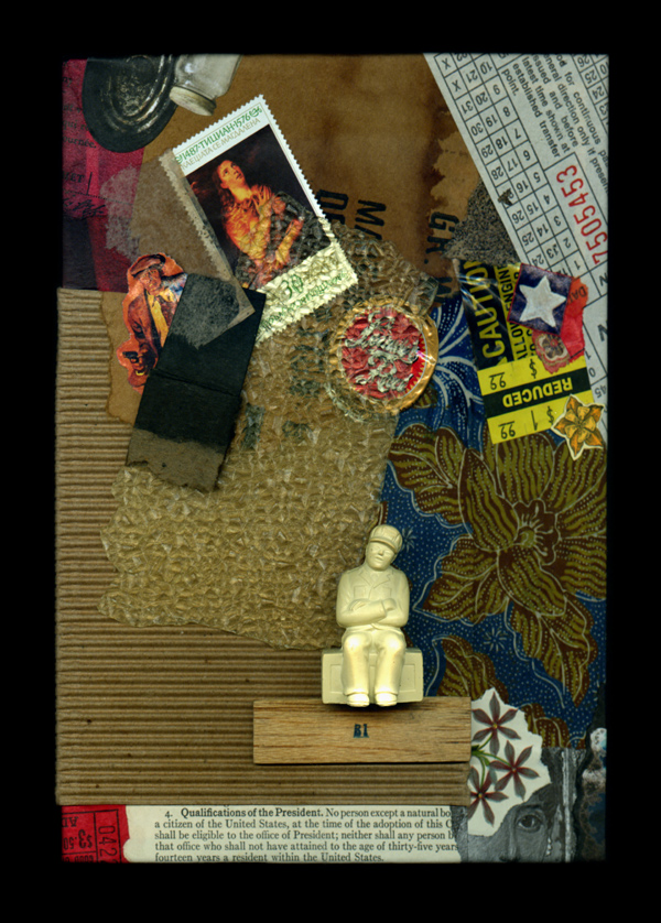
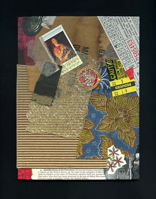
Forgive me if all of this undue rambling merely serves as an opportunity to highlight two “finished” collage artworks that I recently chose to revisit. Both examples also illustrate the complications of visually comparing two images created with different digital devices. After writing about a corresponding issue last week, I have since discovered S Caswell-Pearce’s related words from an April entry at paper with a past. My images for Rhapsody with Fever Chills demonstrate the same scanner/camera differential, although the scan of the new version is a better rendition of the artwork’s strong complementary effects. (This piece is currently on display with the “Seeing Red” exhibit in the McKinney Conference Center at Kentucky’s Constitution Square Historic Site.) The digital documentation of a revised Broken Qualifications, having shared the original version previously at this site, became a bit more challenging the second time around, given the addition of three-dimensional ingredients. At any rate, neither piece had ever felt fully resolved, although I had no specific plans to “reopen the case” until I made a broader reassessment of my inventory. Did I enhance them, ruin them, or just squander my time? You be the judge.
 

Rhapsody with Fever Chills
collage on paper by J A Dixon
7.5 x 10 inches, available for purchase

Broken Qualifications
collage/assemblage by J A Dixon
6 x 8 inches, available for purchase

Her nature, his inquiry . . .

November 23rd, 2013


The Substance of Her Nature
collage miniature by J A Dixon
5 x 7.25 inches
(currently on consignment)
 
Purchase this artwork!

The Essence of His Inquiry
collage miniature by J A Dixon
5 x 7.25 inches
(currently on consignment)
 
Purchase this artwork!

this thing we all do . . .

November 20th, 2013

In response to an assertion that his environmental works are impossible to visually document—

James Turrell: “Well, someone has to make up for all the work that photographs better than it is.”
 

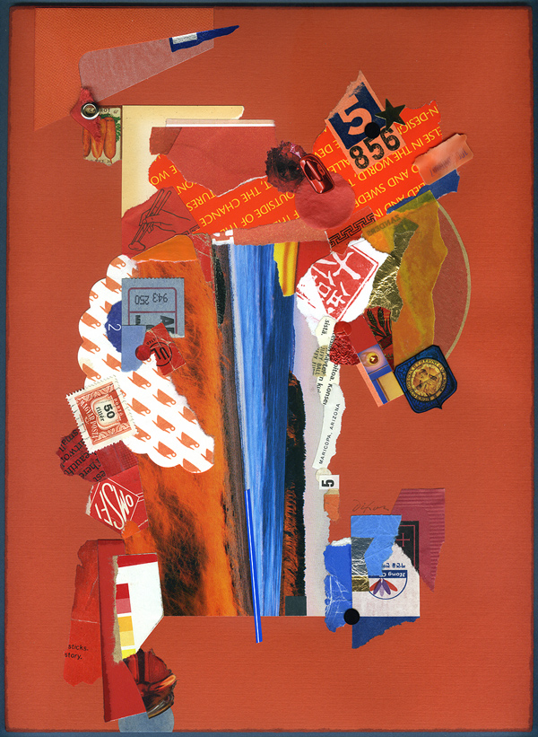
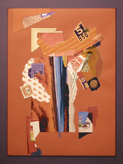
Mr. Turrell’s recent quip brings to the forefront a distinct feature of representing or documenting one’s artwork. Does it really look like the image being included with a call for entries, posted at an online marketplace, or shared on a social network? Of course, the photographing of artwork to enhance its appeal did not begin with digital devices or the World Wide Web. Most of us are familiar with the curator’s disclaimer that reserves their right to reject artwork which arrives substantially different than visually represented when proposed. Even non-artists know how easy it is to boost the contrast or color saturation of a digital image. Setting apart from our discussion works that are essentially digital from the outset, it is important for anyone working in the medium of traditional collage to squarely meet this challenge: How do we properly interpret the visual experience of seeing our artwork firsthand?

Needless to say, faithfully photographing or scanning conventional artwork is something that professionals face every day, but how can it ever be an exact science? What is the “true” appearance of anything? As the three examples below demonstrate, one of my recent collage artworks photographed differently under three different lighting conditions, before it was delivered. The more neutral version is closer to how it might “typically” appear, but perhaps the most faithful rendition would be an image made in the setting for which the piece was commissioned, under the unique lighting conditions of that particular environment, and then subsequently balanced for a reasonable match to the naked eye.

I review nearly a hundred collage artworks a day, as my eye passes over numerous online displays each week. What percentage of these creations actually look like the corresponding digital image? We all know what it’s like to see something and think, “I wonder if it really looks like that.” On the other hand, we also know what it’s like to scan a piece and think, “Wow. That looks better than I expected.”

All that any of us can do is establish a level of integrity about representing work to others. For those who routinely cheat or push an ethical boundary? Rest assured; the habit will eventually come back to haunt their studios.

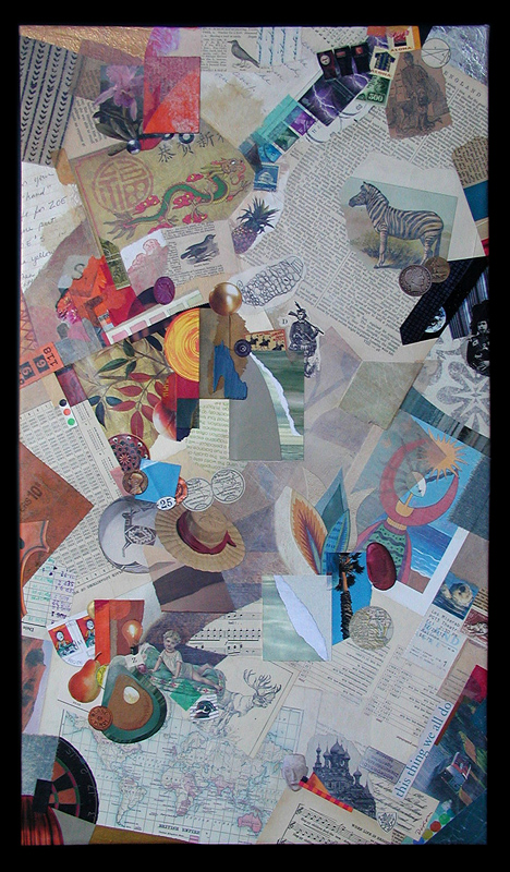
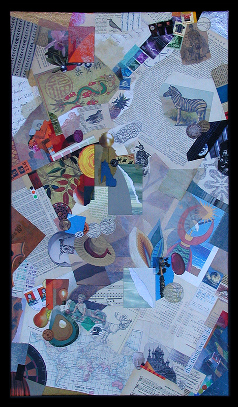
And now, a few words about today’s collage example. I must first express my appreciation to Lee and David Simpson for the commission that resulted in this thing we all do, a mixed media and collage artwork on canvas. To infuse the composition with images that represent aspects of significance to their lives, this piece was personalized by using the clients’ own artifacts and memorabilia, as well as additional ingredients carefully selected from my morgue. Creating works with special meaning to those for which they were intended has always been some of the most fulfilling time I have spent as an artist.
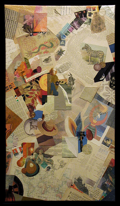


this thing we all do (three different digitals)
collage with combined mediums on canvas by J A Dixon
15.75 x 27.75 inches (22.50 x 34.50 inches, framed)
collection of L and D Simpson
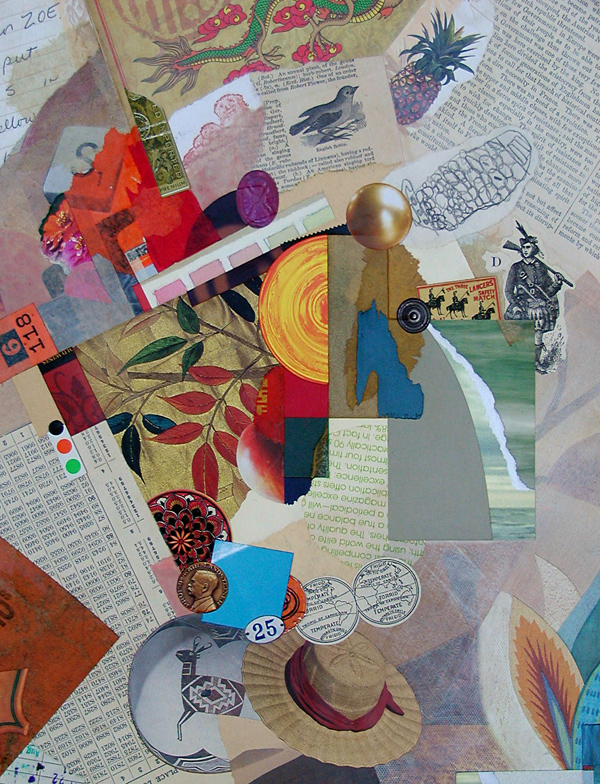
this thing we all do (detail)
collage with combined mediums on canvas by J A Dixon
(photographed and digitally balanced to match original)
 

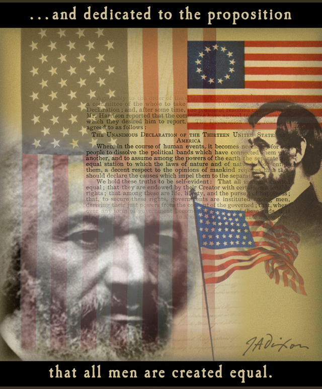
150 years ago today . . .

November 19th, 2013

“That is what he said.
That is what Abraham Lincoln said.”
 

Dixon_Nov19

On collage derivations . . .

November 17th, 2013

“I believe that it is better to be receptive to correction than to be satisfied with one’s own imperfection, and to think that one is oh so original!”
— Piet Mondrian

As I mentioned in a welcome statement from over a year ago (and perhaps more recently), I have nothing against digital collage, although I do maintain a bias in favor of conventional (so-called analogue) techniques, especially at this site, but don’t expect me to become “all blogmatic” about the topic, since I have been known to gratefully accept commissions for digital montage and affirm my respect for those who do collage illustration at a high level. The point I want to make today is that, so far, I have not generated much enthusiasm for manipulating or reproducing my “tear and glue” artworks as digital prints or “art merchandise.” Someone recently asked if I sold note-card versions of my miniatures, and I had to admit that “I have never quite gotten around to that.”

There are many reasons, both good and bad, to produce derivations of one’s own work for the marketplace. There are also many reasons, both good and bad, to restrain oneself. I would hope to be open-minded about the subject. Not everyone who enjoys collage can afford to collect originals. In addition, I often get ideas about how to combine separate works into a composite digital design, exploring in the process a distinctive aesthetic resonance that might not be discovered in other ways. I occasionally imagine how one of my miniatures would look as a super-enlargement, or I envision an exhibition of large canvases created from Giclée blow-ups of small works. No doubt, there is an appropriate place for digital technology in the medium, whether on the front- or back-end of the process. The digital image is, of course, the stock in trade of any artist with an active presence on the Internet. That comes with its own set of issues that I plan to cover in my next discussion. Meanwhile, I hope to preserve my emphasis on a traditional methodology and observe how other collage practitioners adopt emerging technology to enhance their fine-art investigations.
 

Microcosmic Moments
compilation of nine miniatures by J A Dixon
proposed digital concept, variable in dimensions

Modular Zowee
composite of collage details by J A Dixon
proposed digital concept, variable in dimensions

Mystery Solved (detail)
super-enlargement of collage detail by J A Dixon
proposed digital concept, variable in dimensions

Mystery Solved (set of four cards)
merchandise with collage details by J A Dixon
proposed digital reproductions, 5.75 x 4.5 inches

Broadband Access
digital montage by J A Dixon
editorial illustration for ACUTA Journal

The Paris Papers

November 15th, 2013

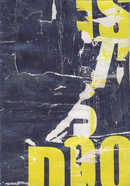
A recent series of intensive collage investigations undertaken by Cecil Touchon while abroad — resulting in The Paris Papers — are more than worthy of our careful study. One of the medium’s most assiduous practitioners, Mr. Touchon clearly earned a well-deserved break after his significant contributions to the Collage Centennial, and yet it is no surprise for me to learn that he would combine it with such a Herculean self-assignment. We are all the beneficiaries.

p s ~ He also let everyone know the good news that he quit smoking during his month-long adventure hanging out with collaborator Matthew Rose. Amazing.
 

fs3384ct13-cecil-touchon-web

Fusion Series #3384
collage on paper by Cecil Touchon
made with bits of paper from Parisian street posters
8 x 12 inches, 2013
 

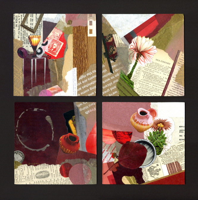
Quadratic Expression

November 12th, 2013

 
Dixon_QuadraticExpression

Quadratic Expression
4 collage miniatures by J A Dixon
11.25 x 11.25 inches
 
Purchase this artwork!

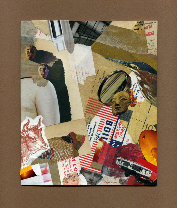
Excessive Understatement

November 11th, 2013

 
Excessive Understatement

Excessive Understatement
collage miniature by J A Dixon
6 x 7.25 inches
 
Purchase this artwork!