Archive for the ‘Methodology’ Category

a mini-tutorial for gel transfers

Tuesday, September 27th, 2016

“Self-education is, I firmly believe, the only kind of education there is.”
― Isaac Asimov

A growing number of people will now agree that most emerging social networks are not what they’re cracked up to be. For an artist who spends a lot of time in solitary activities, it can be a beneficial connection to a larger body of peers. I concur with Cal Newport that it can also be a habit-forming distraction that pulls one into a more shallow mode than the deep concentration necessary to produce exceptional creative work. There are times, however, when a Facebook interaction is so good that I have to marvel at the way people can quickly exchange valuable information across continents. Case in point: a recent back-and-forth between Peter Dowker (Lac-Brome, Quebec) and Matthew Rose (Paris, France) about image transfers for collage assembly. When Susanna Lakner (Stuttgart, Germany) and Melinda Tidwell (Santa Fe, New Mexico) jumped in, it developed into one of the best step-by-step descriptions of gel-medium transfer that I have seen. Here is my summary of Dowker’s technique—

“First of all, stay away from the hard stuff, like the toxic chemical cleaner trichlorethylene. Instead, use a gel-medium method to achieve an effective transfer. Apply a healthy coat of liquid acrylic medium to the image side of an ingredient and adhere it face down. GLOSS medium sticks better than matte. Rub with a brayer, or burnish gently with a soup spoon, and let it dry. Using a bit of water, gently rub off the paper backing with your finger or a piece of cloth. Don’t use too much water and slowly move over the surface, removing a bit at a time. Use oil varnish or vegetable oil to bring up the image. A minute amount of paper will always remain behind, giving it a cloudy appearance when dry. The oil varnish or vegetable oil will make that disappear and enhance the transparency. I formerly used matte oil-based varnish, which works okay. The vegetable oil idea comes from Allan Beally. There will be hardly any build up at all — probably less than any of the collaged pieces next to it. When making a transfer onto vintage papers, I find it’s better to seal them first before you begin — 1 or 2 coats of matte gel medium — the water involved to rub off the back of the transfer can destroy the substrate. Keep in mind that different papers react in different ways. Sealing is only necessary if the base is fragile. Be patient after gluing down the transfer. Letting it TOTALLY dry before rubbing off the paper is essential. If you’re not patient and start rubbing too soon, the image can start to break down. Wait a minimum of 2 hours (overnight is best) before removing the paper backing. If I know I’m going to be using a transfer from the outset, I start the piece on heavy card, to keep the substrate from becoming wrinkly in one spot from the water. The method works with original elements or copies. When I do use a laser print, it’s on thin, cheap office paper. Removing the paper backing can take ten minutes or more, because I go slow, not wanting to damage the image — not really that long at all. I’ve had the most luck since I began sealing the receiving surface with matte medium and waiting longer for it to dry. And the oil works wonders!”
My thanks to Mr. Dowker for allowing me to share this description here. Some of us have also used a variation that involves removing the paper backing independently, in a basin of water, before adding it to the collage surface. When doing that, one ends up working with a collage element that is essentially a veneer of acrylic medium, which introduces a size limitation and other aspects of craftsmanship. Peter calls this the “gel-skin method.” Although he has used it many times, a drawback for him is the need to build up 4 to 5 layers of medium — so it’s not too fragile for the rubbing stage — which makes for a thicker transfer. According to Peter, “not very appealing to the fussier ones among us.” The gel-skin method does allow for a right-reading image (if that’s important), otherwise the previous method will result in a flopped image (unless it can be photomechanically or digitally reversed prior to transfer). Each collage artist will refine an individual methodology, and, not surprisingly, new discoveries and “fortunate accidents” occasionally can result. As Peter reminds us, “Don’t be shy!”

Take a few minutes to savor a few of his extraordinary artworks below—
 

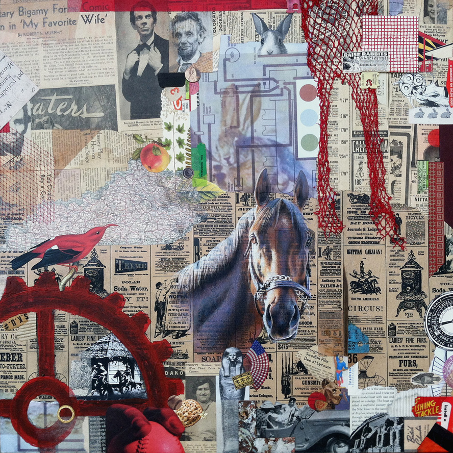
CUTTERS
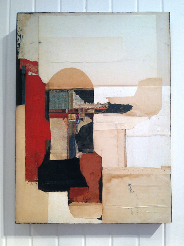
collage with image transfer by P Dowker

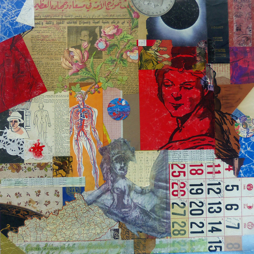
ACORN
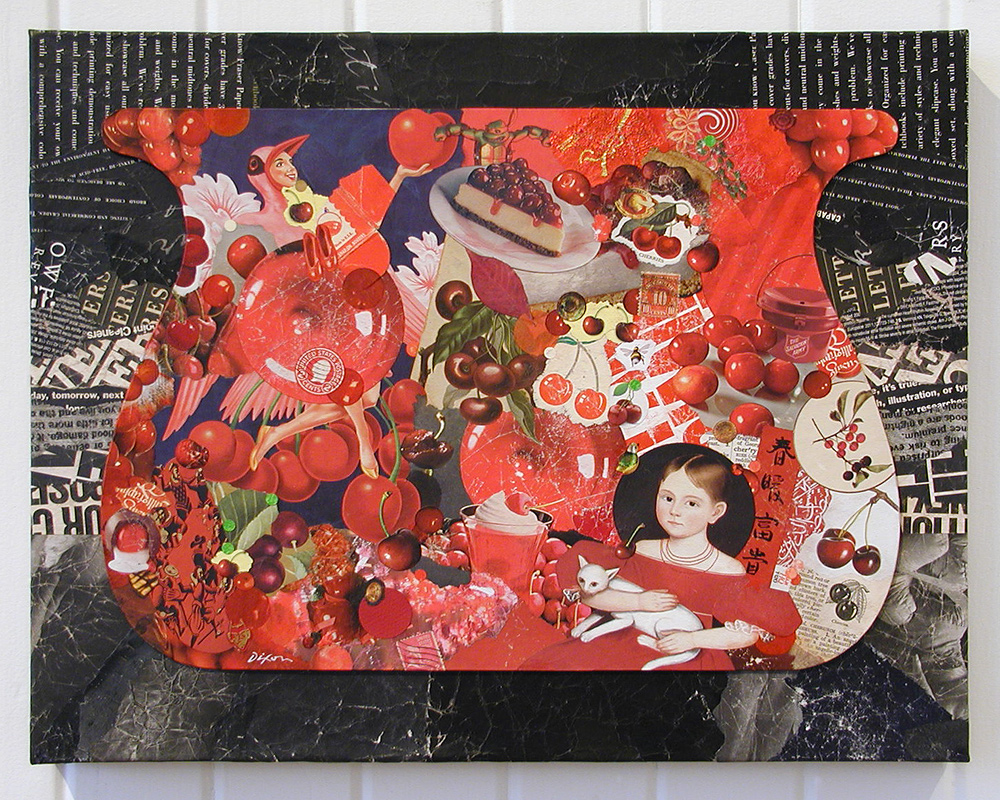
collage with image transfer by P Dowker

VAAVING
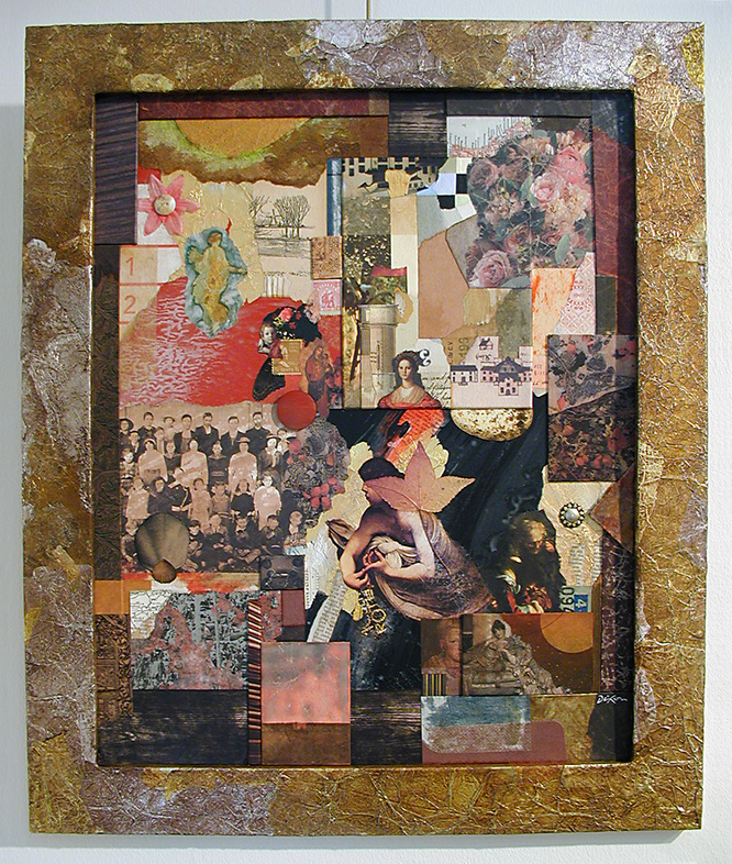
collage with image transfer by P Dowker

TOYS
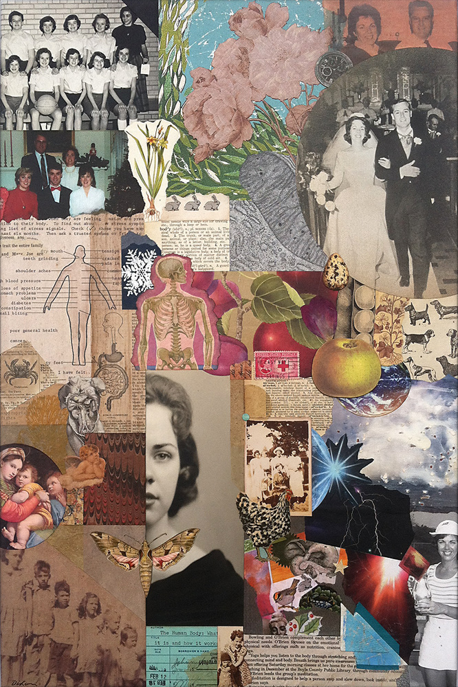
collage with image transfer by P Dowker

A closer look . . .
Friday, September 9th, 2016
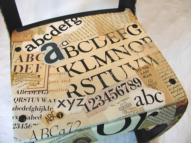
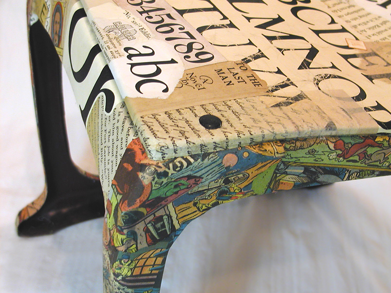
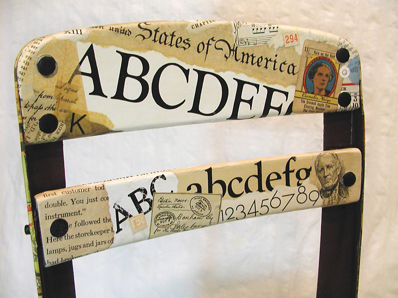
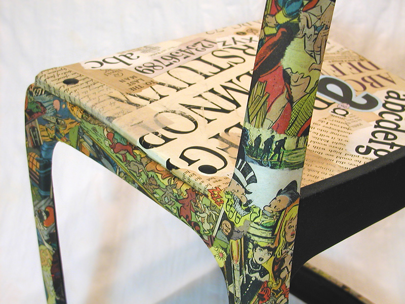
Here are a few detailed images of my repurposed chair, Good Morning, Mrs. Bradshaw. I knew from the outset that I would not be satisfied to achieve a “merely aesthetic” result, even though I am usually pleased if my collage artwork successfully does no more than that. I sought to visually communicate a symbolic tension that evoked my feelings as youngster, caught between the clarity of adult expectations and the fuzzy pleasure of indulging a literary genre that was generally frowned upon in the 1950s. I include the name of my first-grade teacher in the title. She was probably the first person outside my family who recognized and encouraged my creative interests.
 

The project took on a life of its own when I became convinced that it was
finally time to exploit some of my vintage typesetting specimens.

My concept rests on the visual contrast between “scholastic” and “vernacular”
imagery — what a ’50s schoolboy was supposed to read and what he was not.

My desire to preserve the circular “rivets” that held the wooden seat and back
slats to a metal structure presented challenges of collage artisanship.

A fun, rewarding part of the process was to capture the youthful energy of
reading comics and to avoid obvious narrative references at the same time.

Thank you for your interest and attention. Please let me know what you think of my work, this blogsite, or the medium of collage in general. Comment here or through TCM at Facebook. Stop back again!
 

Merely a metabolic event?

Sunday, June 19th, 2016

“I’m a ‘what if’ person. I have always felt that failure was a completely underrated experience.”
– Kevin Costner

Process is everything with some artists, and I respectfully get that. Experimental spontaneity within the small format is a vital and meaningful aspect of my art, but when I scale up for a larger work, I apply that experience and insight toward an end result — something more planned, with the intention to provoke a positive response in another — an agreeable product, if you will. So, what about the individual artwork that has “merely” contributed to the overall creative metabolism of an artistic investigation, and, as a stand-alone work, is little more than a “glorious failure,” in the final analysis?

I wish I knew how to answer that dangling question. Obviously, not every collage “sketch” is significant in its own right, but if the potential exists for it to engage a particular person, and that person wants to observe it repeatedly, to discover if it has a few secrets others have missed — how can anyone diminish its intrinsic value?

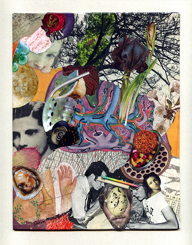
Dixon_Metabolism

Metabolism
collage miniature by J A Dixon
7.375 x 9.5 inches
 
Purchase this artwork.

Spencer Gulf

Monday, April 25th, 2016

“The Japanese word yugen means ‘aesthetically mysterious.’ We don’t have a word like this to describe art in the Western art world. Yugen as a concept worries some because it describes an intangible. It says ‘awe’ and ‘mystery’ can also be qualitative aesthetics, and the beauty of this is that though yugen is a Japanese word what it describes is universal in reach. Though a refined concept, it is an everyman’s word because it describes perfectly a good deal of the art the entire world makes to achieve personal and cultural satisfaction. In a time when we are 1% and 99% sensitive, let us indeed remember that the art mainstream, the academic discourse, the intellectual game of art about art, the ivory tower is only 1% of why the world makes art.”
— Randall Morris
 

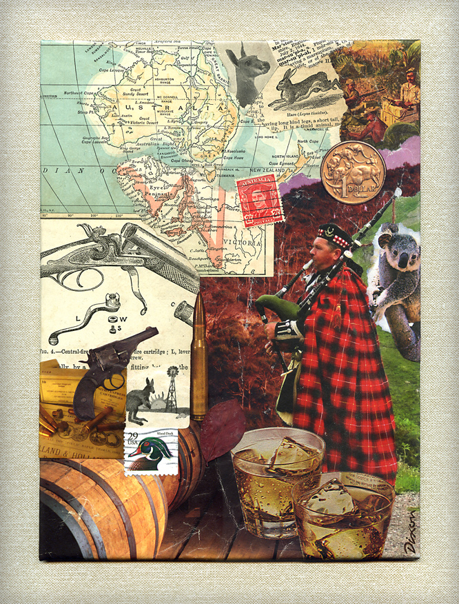
For the second consecutive year, I had the opportunity to create a collage as prize art for the preeminent single-shot rifle match held in Kentucky. Visitors to this blogsite know my ongoing fascination with collage as an ideal medium for total spontaneity. Of course, it also lends itself perfectly to a planned, thematic solution for specific appeal.

I discovered enough ingredients in my stash of papers to cover the Australian topic, but also to entertain a desired level of synchronicity to encompass a few distinctive characteristics of the event. In addition to my personal enjoyment, I am always pleased to see the positive response to collage as art. It has to be more than the element of the unexpected, although, admittedly, collage is never what people anticipate in these situations. I think it may be the particular combination of accessibility, interactivity, and “mystery” so inherent in the medium. I suppose there is more to said about that, but we shall save it for another day.
 

Spencer Gulf ~ J A Dixon

Spencer Gulf
collage miniature by J A Dixon
7 x 9.5 inches
prize art for The Great .310 Australian Cadet Martini Match of 2016
awarded to D Simpson

Much more about JUXTAPOSE . . .

Monday, February 29th, 2016

Friend and fellow collage artist Kathleen O’Brien is in the midst of her countdown to a big solo show in April. She asked me to do a favor and share a guest review as part of her final promotions for JUXTAPOSE before Drawn to the Earth requires her full concentration. As excited as I am about the group exhibition in Danville, it was a tougher post to write than I first anticipated. Collage is not the easiest art form on which to expound, perhaps because it relies on the “logic” of irrational choices.

At any rate, my dedicating a blogsite to that very topic was nobody else’s idea, so I best not complain to those of you kind enough to visit here. Would I rather be making art? Of course. Even so, I cannot constrain my enthusiasm for all things collage. Here’s my take on a great show. Be forewarned: If you’re looking for some criticism, you won’t find it!


I’ll admit it. I can’t get enough of JUXTAPOSE. The current exhibition of collage and assemblage is at the Community Arts Center until April 2nd. That’s not exactly the most humble thing to say, considering it features a dozen works by yours truly, so I won’t pretend that I can offer an unbiased review. Program director Brandon Long has organized a finely curated, must-see destination that brings together over a thousand examples of the two associated mediums (literally, but I’ll explain that in a moment). This is an unprecedented group show for the Bluegrass-based artists involved, and I am thrilled to be exhibiting side-by-side with Kathleen O’Brien, Teri Dryden, Robert Hugh Hunt, Meg Higgins, Connie Beale, Cynthia Carr, and many others. No doubt my enthusiasm has something to do with its location less than a city block from my studio, which bestows the luxury of repeated immersions, and there is over a month left in the duration!

There are more participants than I can profile individually, and far too many artworks to highlight. The best example of this is a room devoted to three complete year-long series of collage-a-day works by O’Brien, Long, and Nan Martindale. Combined with almost one hundred seventy of Robert Hugh Hunt’s provocative collage collaborations, the magnitude of miniature artworks presented in a single space could be overwhelming. As an exhibition designer, Long uses geometric grids, browsing boxes, and two flat-screen displays to make the huge collection comprehensible for viewers. O’Brien’s sensitive, meticulously layered collection of daily two-sided postcards is a journey to which I surrender with pleasure each time I visit, but only after a jolting romp through Hunt’s rarely exhibited Hillbilly Voodoo series with T R Flowers.

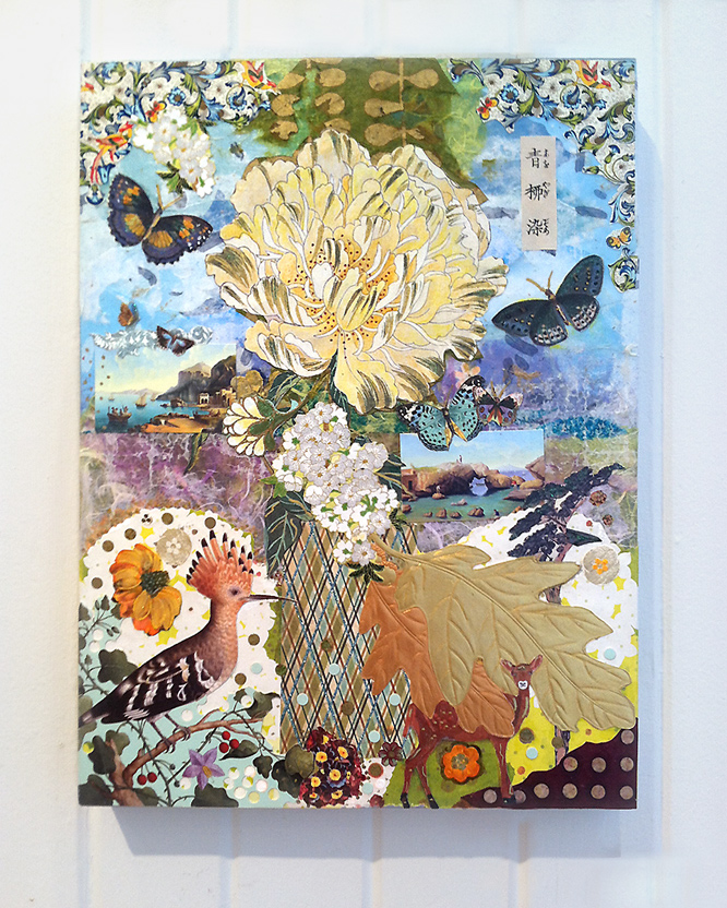
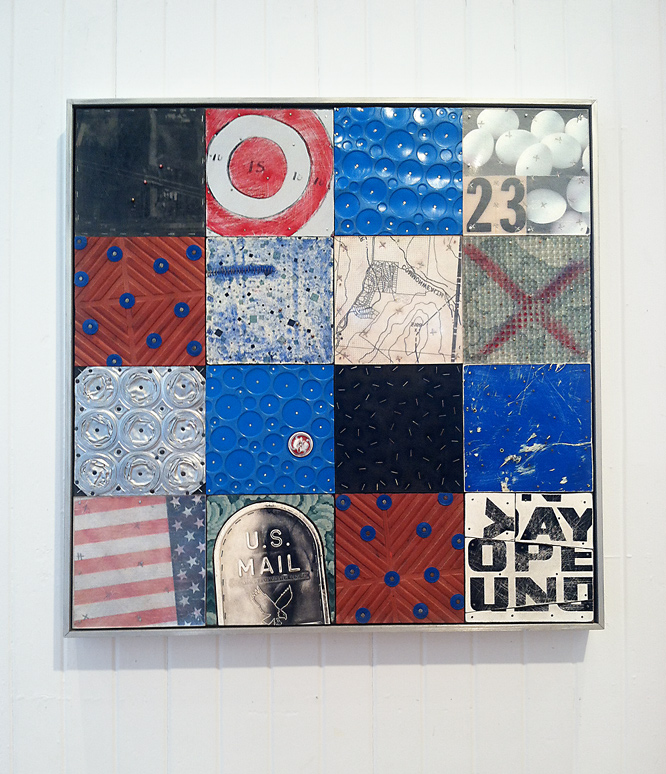
An opportunity to view works by six outstanding Louisville-based artists is worth the trip to Danville. Several major works by Meg Higgins captured my first impression. Two enormous pieces composed with transparent elements sandwiched between Plexiglas are suspended between the vestibule and grand gallery. I was equally impressed by a smaller collage on wood panel, Japanese Peony Goes to Italy, with its exquisite East-West flavor. Brad Devlin’s solid but clever exploitation of found objects yields bold abstractions that simultaneously maintain a strong environmental essence. His Open Sunday is also physically more complex than it first appears, and this allows the artisanship of his assemblage to become a secondary experience deserving of scrutiny. Masters of juxtaposition who reinforce the theme of the exhibition as well as anyone taking part, Patrick Donley, Lisa Austin and Brandon Bass each define a distinctive individual style. Approach to composition, color considerations, and a playful choice of ingredients form undercurrents that tie their pieces together, and Long knows how to modulate the walls in a way that makes groupings of their work satisfying to study. Although she has recently gained attention for her paintings, there are at least seven panels by Teri Dryden from a handsome body of work created from discarded books. Her Monteith’s Marrakesh exemplifies how her investigation successfully transcended the source material. Personally, I hope she rotates to collage again for another dynamic round of re-purposing cast-off items.

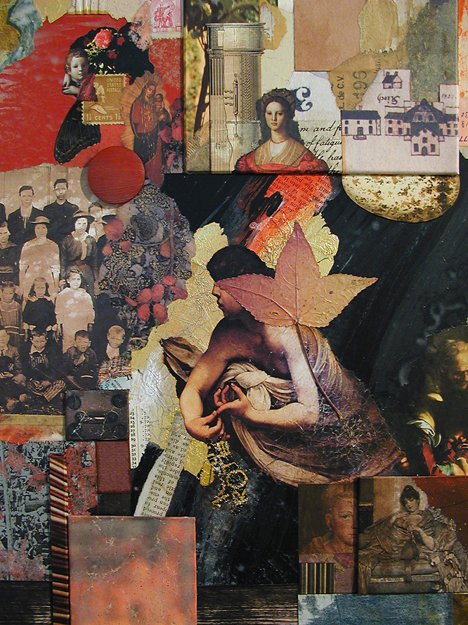
detail from Reliquia ~ collage on framed panel by John A. DixonIn addition to displaying a pair of shadow boxes, my only surrealist assemblage, and six favorite collage miniatures, JUXTAPOSE provides an opportunity to exhibit Bull’s-eye Nosegay for the first time, which I created for the Target Practice Project initiated by L T Holmes. Also, I did two larger collage artworks especially for this show. Each makes more than a fleeting nod to artists who I admire. What is it about Cherry Balm that causes me to think I just might be “tipping my beret” to the inimitable Matthew Rose? Reliquia is my tribute to the late Fred Otnes, a giant within the medium who has been a force in my consciousness since adolescence. Pearallelograms was held over from the previous exhibition at the institution, but the crowning delight for me may well be the presence of Kentucky Madonna, last year’s “finish” by Robert Hugh Hunt to my “start.” The collaborative piece is a companion to one currently hanging with the IT TAKES TWO exhibition of collaborations at the Kentucky Artisan Center in Berea. Robert and I can’t ask for more than to know that both are now available for public observation (unless someone wants to give them a good home).

I am no art historian, but I can’t help but be mindful of the pioneering artists who laid a hundred-year foundation for the sweeping diversity of this exhibition. The creative innovations of Picasso, Braque, Duchamp, Schwitters, Höch, Cornell, Johnson, and Kolář reverberate throughout the building. In many respects, all contemporary collage/assemblage is a tacit homage to these seminal influences, but that is never the only thing at work nor the only phenomena to be perceived when one indulges an exhibition of this scope. Most artists are striving for a personal means of expression informed by those who have made their enduring mark on a medium. I am convinced, more than ever, that what distinguishes contemporary collage/assemblage artists is their keen connection to the mundane “stuff” of culture and the inner need to bring a measure of order and harmony from the sheer volume of material produced by our throw-away society, with its chaotic effect on our sensibilities — to create value where none exists, or to find wonder, meaning, significance, and beauty where none can be expected.
 

Japanese Peony Goes to Italy ~ Meg Higgins, Louisville, Kentucky

Japanese Peony Goes to Italy
Meg Higgins
collage on wood panel

Open Sunday ~ B Devlin

Open Sunday
Brad Devlin
assemblage, found objects

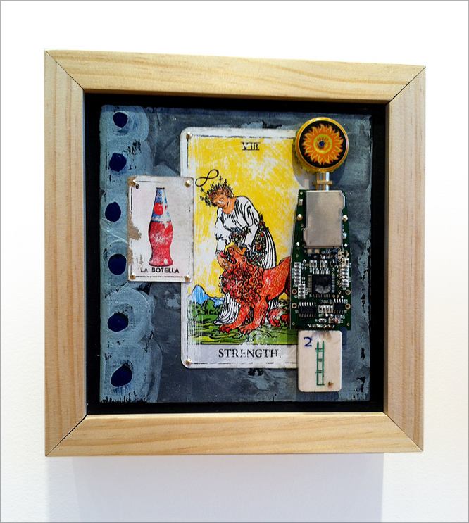
Strength ~ P Donley

Strength
Patrick Donley
mixed-media on wood

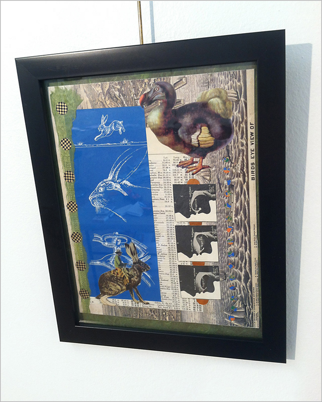
Bird’s Eye View ~ L Austin

Bird’s Eye View
Lisa Austin
collage

Monteith’s Marrakesh ~ T Dryden

Monteith’s Marrakesh
Teri Dryden
collage from discarded books on panel

Cherry Balm ~ John Andrew Dixon, collage artist, Danville, Kentucky

Cherry Balm
John Andrew Dixon
collage on canvas
available for purchase

Reliquia ~ John Andrew Dixon, collage artist, Danville, Kentucky

Reliquia
John Andrew Dixon
collage on framed panel

•  S O L D

Collage and the Meaning of Existence

Sunday, January 31st, 2016

Sorry about that title. I am having a bit of fun with the search engines.

On a serious note, today’s entry is about how collage can be put to the service of more than irony, shock, whimsy, irreverence, or cynicism. Let me say first, if you please, that all those things can be valid, even pleasurable, effects. They are rooted deeply in the history of the medium. One could make the case that a collage artwork is never more than a step or two removed from the essence of dada, surrealism, or popism. On the other hand, for me, there are times when that creative genealogy is best put aside, in favor of a different tone.

Developing works with special meaning to those for which they were intended has always been some of the most fulfilling time I have spent as an artist. Collage has the potential to capture profound significance for a recipient, especially when it is personalized with meaningful artifacts and memorabilia. Also, there is an opportunity for the artist to thoughtfully select and integrate additional ingredient elements for greater depth and layered associations.

The project featured below began with a discussion about how all of us accumulate “stuff” that will never rise to the level of a family heirloom, but cannot be comfortably discarded because it has true meaning in the context of one’s journey in life. The patron took to heart my offer to embed many of these things in an artistic expression that would likely become a treasure for descendants instead of a burden of disposition. With the capacity to transcend the “scrapbook,” fine art collage is ideally suited for such an endeavor.

It was the client’s idea to approach the commission as a triptych, or three separate panels, that would convey the themes of body, mind, and spirit. I wanted the components to work as a total piece, but also for each to have a stand-alone quality. Whether they stay together or part company will be left to future circumstances and decisions. The resulting “legacy collage” is a distinctive creation that preserves images representing the life and guiding principles of a unique individual. It has been my honor to provide that creative service to her.
 

Body (for MJCB) ~ J A Dixon Mind (for MJCB) ~ J A Dixon Spirit (for MJCB) ~ J A Dixon

Body  ~  Mind  ~  Spirit
John Andrew Dixon
three legacy collage artworks on structured panels
16 x 24 inches each
private collection

details from Pearallelograms

Sunday, January 17th, 2016

“The artist is a collector of things imaginary or real. He accumulates things with the same enthusiasm that a little boy stuffs his pockets. The scrap heap and the museum are embraced with equal curiosity.”
— Paul Rand
 

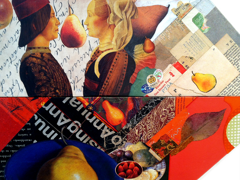
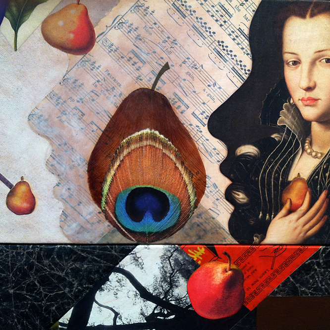
One of my first large-scale collage concepts was an artwork I called Pearallel Universe. When it was purchased by a regional health care system to hang in a new patient facility, I temporarily set aside the “visual pun.” After creating Pearental Discretion last year, I continued to accumulate images in anticipation of another takeoff on the pear theme. I also had been looking to break out of the conventional rectilinear format by exploring thumbnail concepts with polygonal shapes. When the parallelogram repeatedly occurred in my tiny sketches, the two ideas merged, unsurprisingly, as Pearallelograms.

This latest collage construction is another attempt to liberate collage from the typical “framed-behind-glass” approach, to recapture the medium’s painterly roots with an exposed surface that can stand on its own, and to introduce a more three-dimensional context that presents the end result as an “artifact.” I would hope that I had a bit of success at meeting these objectives. So far, the piece has been well received.

In what is becoming a ritual post-mortem for bigger collage artworks, I have repeatedly cropped the composition to explore and internalize aspects that may not have been apparent to me during creative formation. It is something I recommend to fortify intuition. To be honest, I would rather not be thinking consciously about the design dynamics in process, but I can only maintain that orientation by imposing a rational critique on my work after the fact. This sometimes leads to the closing refinement of an unfinished piece. More importantly, it also provides a stronger foundation for spontaneity in the future.
 

detail from Pearallelograms by John Andrew Dixon, Danville, Kentucky ~ internationally known as The Collage Miniaturist

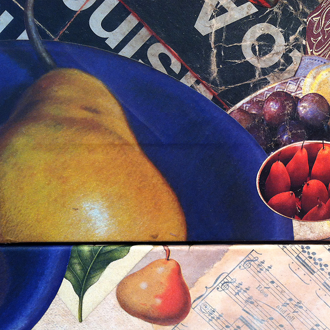
My goal was to use many pears — as design elements,
for thematic rhythm, and as devices for a surreal touch.

detail from Pearallelograms by John Andrew Dixon, Danville, Kentucky ~ internationally known as The Collage Miniaturist

As elements, the chosen thematic objects should oscillate
between representation and abstraction.

detail from Pearallelograms by John Andrew Dixon, Danville, Kentucky ~ internationally known as The Collage Miniaturist

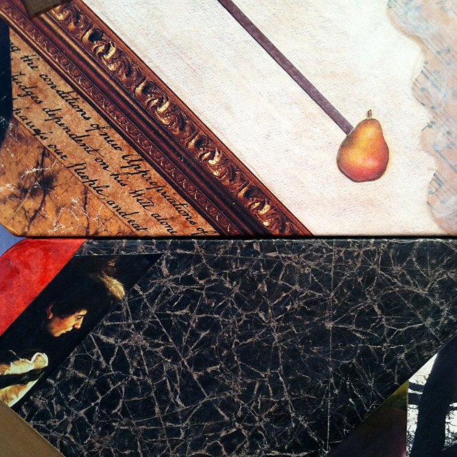
Diagonals with pears as “end points” were applied to
three negative areas that needed more spatial activation.

detail from Pearallelograms by John Andrew Dixon, Danville, Kentucky ~ internationally known as The Collage Miniaturist

The last pear image was positioned between profiles and
resonates with a more literal treatment at the very top.

detail from Pearallelograms by John Andrew Dixon, Danville, Kentucky ~ internationally known as The Collage Miniaturist

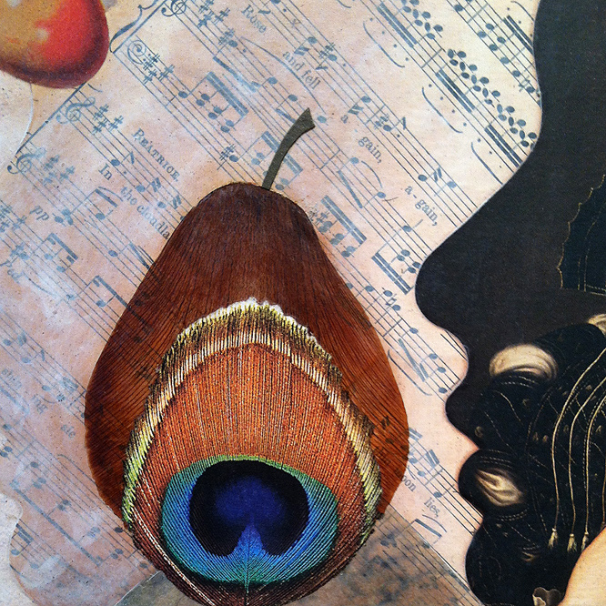
The final subject was “built” with an actual dried iris petal,
the torn image of a peacock feather, and a cut-paper stem.

Thanks for visiting! Forgive me if today’s entry is too verbose, because I generally try to avoid that. If, however, you don’t mind if I wax wordy, please register and comment here to let me know. I promise to reply.

Tender and Wild

Wednesday, December 23rd, 2015

“Art, in itself, is an attempt to bring order out of chaos.”
– Stephen Sondhiem

I was in the “Seasonal Zone,” listening to music and making a batch of hand-made greetings and collage miniatures. I began to recycle Christmas cards from previous years, and I had the idea of trying to visually merge two different but similar images. Nothing seemed to go right as my technique played out. One cannot anticipate nor contrive the “fortunate accidents” inherent in the medium. The resulting effect reminds me of an aging fresco, as if an artist had painted a Madonna and Child over another, with the decay of time and weather taking over. I rarely think too much about these things in process, with reflection arriving later. I especially enjoy when others make observations and symbolic associations of their own. Overall, I think my sweet obsession with collage may be about trying to bring some kind of harmony out of the sense of disorder that pervades much of modern perception, although I should hesitate to generalize about my personal state of being and apply it to the world.

a Christmas collage experiment by John Andrew Dixon

Tender and Wild
collage miniature by J A Dixon
7 x 9.5 inches
private collection

A Kentucky Collaboration

Monday, August 24th, 2015

“I’ve collaborated with many artists over the years but never on a project of this size. The two pieces were to be 24″ x 24″ on structured panels. What made this collaboration successful was the interplay between the two artists. We both sent numerous pictures of our starts in progress and were able to play off the ideas and techniques the other was using, in this we created a true pair of collages instead of two separate pieces.”
— Robert Hugh Hunt
 

Collaboration between collage artists is a widespread, dynamic development within a medium that has shown extraordinary vitality after its centennial milestone in 2012. This very well may be part of a broader phenomenon, due in no small way to the explosion of social media and a greater networking among artists of all kinds. I was not surprised when, earlier this year, here in my home state, the Kentucky Artisan Center at Berea announced a major exhibition called It Takes Two: Collaborations by Kentucky Artisans.

In response to this opportunity, I decided to contact Robert Hugh Hunt, an artist from Richmond, Kentucky whose work I had come to respect after we made a connection through Facebook. Both of us were aware of our geographic proximity, but had not previously met in person, nor had we collaborated remotely on a casual project. Appreciating each other’s prior work is no guarantee that two artists will enjoy the collaborative process or value the creative end result. Only by risking a joint venture will both artists find out if they actually are “on the same wavelength.” I am pleased to report that the results of my teamwork with Robert exceeded our optimistic expectations, and that one of the two pieces we created was selected for the “Takes Two” show.

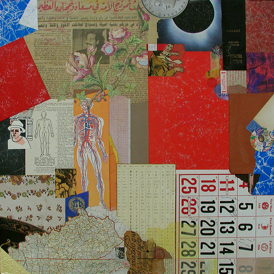
As artists, Robert and I both work regularly with combined mediums, but we chose collage as the foundation of our approach because we recognize how ideally suited it is for collaboration. There was no inclination to think small. We each fabricated larger dimensional panels and created a “start” for the other — to establish the background and organize the two-dimensional space with found material and other recycled/repurposed elements. collage collaboration ~ the start by Robert Hugh Hunt for Kentucky Sovereign ~ collage on structured panelAfter meeting for the first time (with spouses, over lunch at a delightful new Cuban eatery halfway between our studios), we exchanged the unfinished works to complete the compositions with additional ingredients and renderings. Robert’s recognized practice of layering his cut-and-paste collage artworks with mixed-media additions had already caught my attention, and his expressed aim to do the same within our collaboration inspired me to include a hand-rendered element as a focal point in my “finish,” which we titled Kentucky Sovereign. Robert’s finish, Kentucky Madonna, features multiple mixed-media treatments on top of my background shapes. The effect helps to integrate our respective techniques and to bond the artworks as a “true pair,” to use Robert’s phrase.

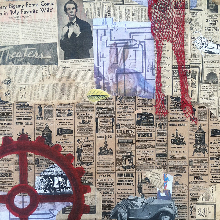
For my start, I began with a section of an Iraqi newspaper brought home by a member of the Kentucky National Guard. Robert made use of clippings from a 1940s-era newspaper that he got from fellow collage artist Ted Tollefson. collage collaboration ~ the start by John Andrew Dixon for Kentucky Madonna ~ collage on structured panelOur range of “merz-strokes” was unfettered, but we shared a desire to “Kentuckify” our choices, although neither of us knew exactly what we meant by that. Other ingredients include magazine scraps, printed papers, antique maps, used packaging, illustrations from discarded books, mesh bag material, tissue, fabric, plastic clasps, wood, gummed labels, metal, emptied tea-bags, produce stickers, foil, wallpaper, digital printouts, a paper doily, and more (with a modest assemblage aspect thrown in for good measure). As with any collaboration, the challenge is to discover a way to enhance the start in a complimentary manner and also to bring one’s personal approach to the finish. Our decision to avoid isolation was a good one. Images exchanged during development kept the creative energy in flux and maintained a visual cord (a common chord?) between the surfaces as they evolved separately. It was a positive experience for both of us and boosted our enthusiasm to continue as active collaborators.

Thanks, Robbo!
 

finish by John Andrew Dixon for Kentucky Sovereign ~ a collaboration with R H Hunt ~ collage on structured panel

Kentucky Sovereign
a collaboration by R H Hunt and J A Dixon
collage on structured panel, 24 x 24 inches
(start by Hunt, finish by Dixon)
selected for It Takes Two: Collaborations by Kentucky Artisans
available for purchase

finish by Robert Hugh Hunt for Kentucky Modonna ~ a collaboration with John Andrew Dixon ~ collage on structured panel

Kentucky Madonna
a collaboration by J A Dixon and R H Hunt
collage on structured panel, 24 x 24 inches
(start by Dixon, finish by Hunt)
available for purchase

Fred Otnes, 1925–2015

Monday, August 17th, 2015

“Otnes abandoned the narrative style… The move set him apart from other commercial artists of his time, and his willingness to embrace the abstract and chaotic nature of collage put him in high demand during one of the most turbulent decades of American history.”
— The Saturday Evening Post, 2015

“Fred Otnes brings to his collage paintings a classical refinement and control that makes poetry out of chance pictorial effects. He dips into early Cubist collage techniques, touches Florentine and Renaissance bases, and reverses Dadaist chaos into gorgeous homages to order.”
— Maureen Mullarkey, 2002
 

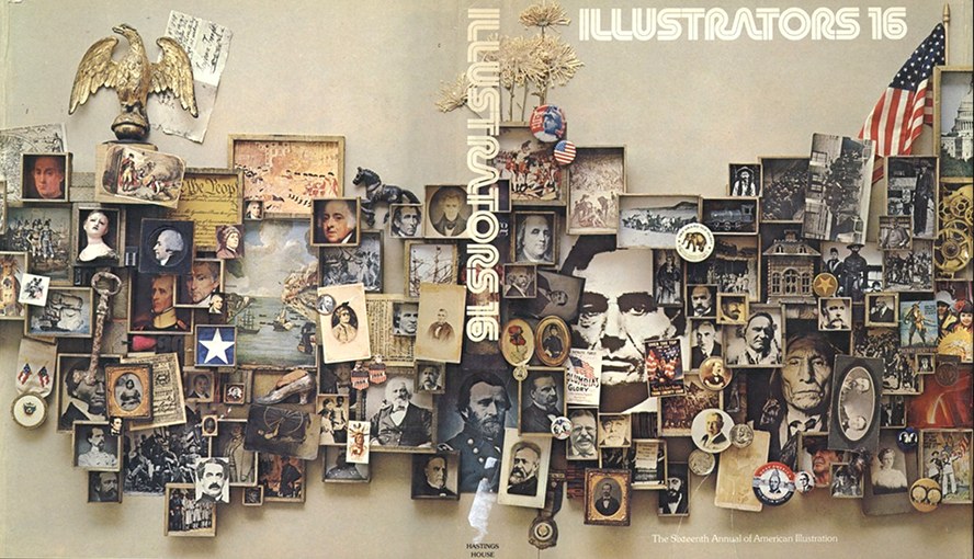
I just learned about the death of artist/illustrator Fred Otnes. I tend to focus here and in my own practice on the acknowledged masters of fine-art collage, but Mr. Otnes certainly had a greater influence on me during my formative years and during the period of my life devoted to “making it” as an independent illustrator and designer. He is rarely included among the seminal figures of 20th-century collage, but he should be. Allow me to back up a bit and reveal some of my own story.

In the 1960s I had four different art teachers in four years of high school. I resist being unkind, but each one of them was worthless. I had some talent, so there was no reason to spend time with me. I was left to fend for myself, because, apparently, it was more urgent to actively babysit the class goof-offs. By sixteen I was investigating the available correspondence coursework. No one thought to tell me about the Dayton Art Institute in the closest big city. I don’t think I even realized how desperate I’d become. What others might have viewed as crass merchandising was a Godsend for me. I responded to an advertisement from the Famous Artists School and completed the test. A representative actually paid a visit to discuss the home-study course that would provide the fundamental art instruction I’d been missing, and I begged my parents to let me give it a shot. They said, “Okay,” and I am grateful for this simple consent — access to legitimate art educators would be mine. I acknowledge now that their “Course For Talented Young People” was a marketing experiment, an attempt to leverage the successful adult course with a younger demographic. That meant nothing to me at the time. This was the school endorsed by Norman Rockwell, and I was a charter student! Although my Mom eventually had to cajole me into keeping abreast of the challenging lessons, a sea change had occurred. I was at long last formally introduced to the world of fine and applied artists. Among those that impressed me most was someone named Fred Otnes.

I was a peculiar kid who got more excited about magazine illustrations, corporate trademarks, television animation, and the Sunday comics than I did about “museum art.” The work of Otnes touched me in a way that would take decades for me to unravel. In my youth, not being able to figure out how an artist created something was usually paired with disinterest, but his work affected me in the opposite way. His graphic synthesis of images, engravings, diagrams, and language exposed a realm that I could aspire to enter. Even as an experienced pro, I continued to find his technique mystifying. I was relieved when legendary illustrator Mark English said, “I don’t even know how he did them, the mechanics of printing, photography and all the things he did to put them together.” Suffice it to say that in a profession biased against the creative explorer, Fred Otnes braved a path that few, if any, realized was there, successfully made it his own, and became one of the most distinctively recognizable, highly honored applied artists of his generation.

For many years, through the Illustrator’s Workshop, Otnes was a teacher and mentor, and, like others in the field, spent his later years expanding his personal style as a gallery artist. Whether applied to editorial or commercial use, the creations embody his profound respect for subject matter. If there is something elusive in his work that will continue to inspire me, it is this — I shall always hold in high regard the sense of “reverence” he brought to each layered plane of expression, to every choice of color or texture, to the symbolic meaning of each ingredient, and to the aesthetic harmony of the whole.
 

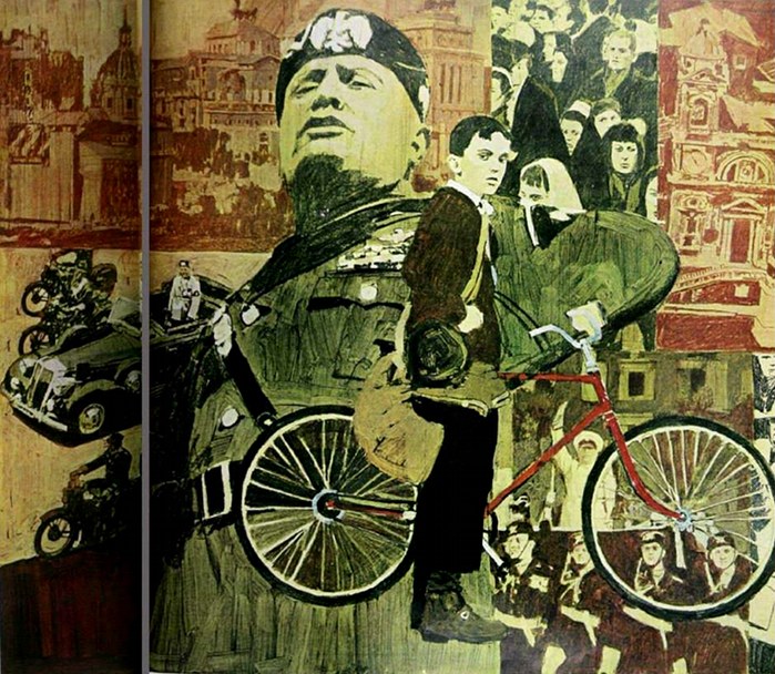
Otnes_Mussolini_1966

The Day Mussolini Dies . . .
Saturday Evening Post illustration by F Otnes, 1966

Society of Illustrators 16th Annual ~ cover by F Otnes

Illustrators 16
Society of Illustrators Annual cover by F Otnes, 1974

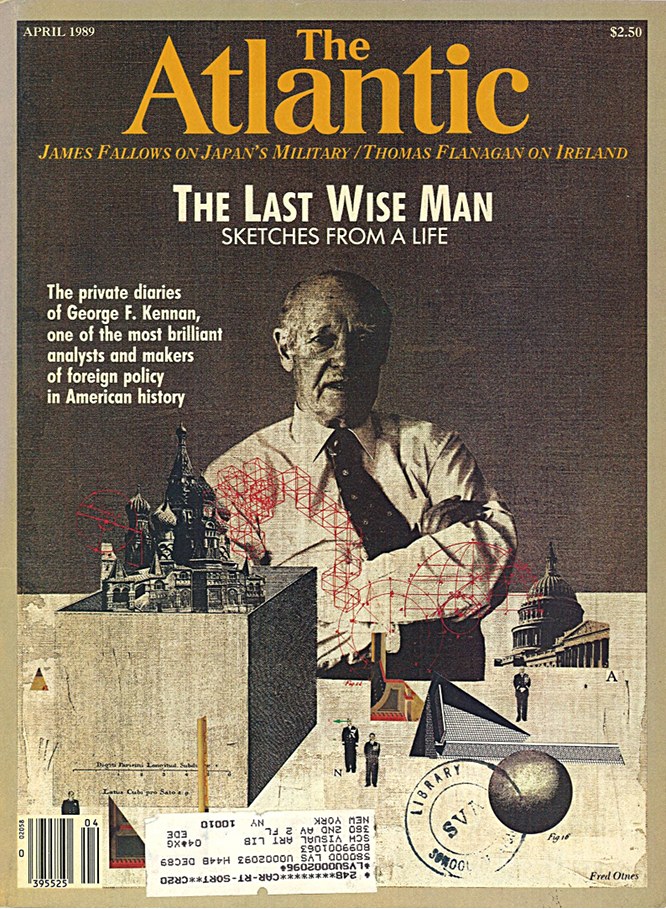
Atlantic cover by Fred Otnes, April, 1989

The Last Wise Man
Atlantic cover by F Otnes, 1989

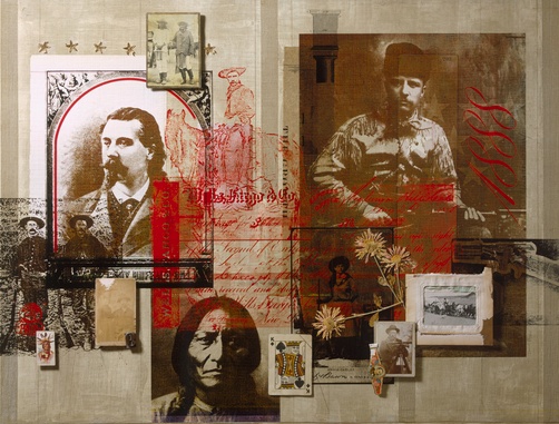
National Geographic illustration by Fred Otnes

(title unknown)
National Geographic illustration by F Otnes (rights managed)

Piero ~ traditional collage by Fred Otnes

Piero
traditional collage by F Otnes, 1994

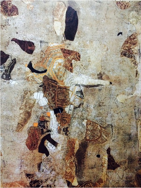
A Tragic Princess ~ collage painting by Fred Otnes

A Tragic Princess
collage painting by F Otnes, date unknown

Liagre ~ Fred Otnes ~ 2002

Liagre
collage painting by F Otnes, 2002

selecting details . .

Thursday, July 16th, 2015

“We do have repeated patterns that arise, in differing ways for different people, every time we create. But how do you get excited by the downturns and turn this into a positive experience?”
— Lyne Marshall

After I finish a larger artwork and its temporary or permanent disposition is settled, I have this tendency to focus on the perceived flaws, the missed opportunities, or that appealing ingredient “left on the cutting room floor.” Diverting my observation to the areas that I prefer, I crop into the design, looking for interesting sub-compositions. I tell myself that I should create spin-off prints or note cards based of a series of details — it must be my built-in bias toward the miniature. In almost every case, I put market-driven notions aside and begin something new. Objective scrutiny usually becomes a catalyst to the creative process. The cycle continues.
 

detail from Selective Fusion ~ John Andrew Dixon


detail from Selective Fusion ~ John Andrew Dixon

two details from Selective Fusion
collage on structured panel by J A Dixon