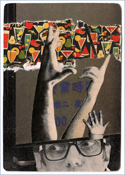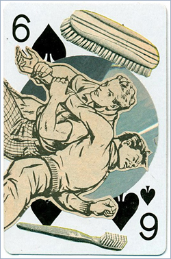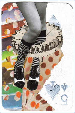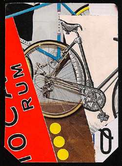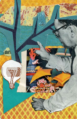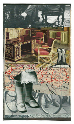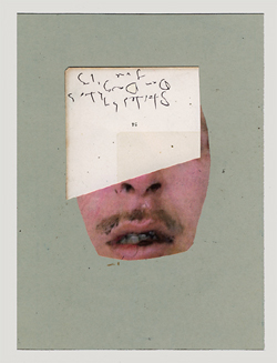
I am pleased to announce that we shall open our studio and gallery to the public on the first weekend of November. For more information, please visit this page.
Archive for the ‘Links’ Category
Wednesday, September 17th, 2014
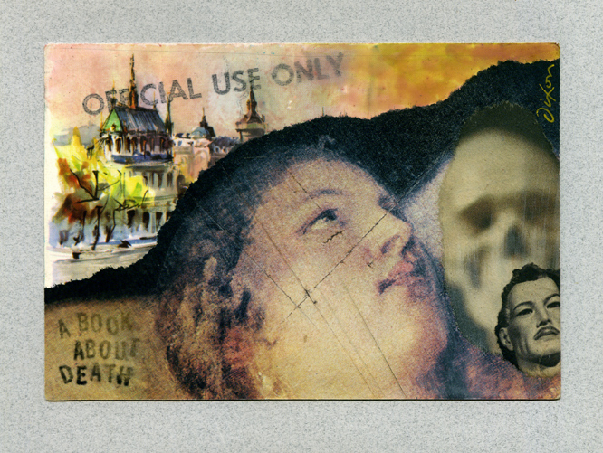
A Book About Death ~ Wales
Thursday, July 3rd, 2014“The project has become The Book About Living.”
—Sonja Benskin Mesher
Ray Johnson, the original “most famous unknown artist in the world,” produced his A Book About Death during the years 1963 to 1965. The pages were randomly mailed and offered for sale. Complete copies were compiled by a rare few. Johnson was a significant bridge between the groundbreaking work of Schwitters, the sensibilities of Cornell, and the emergence of what would become the most widely recognizable features of Pop Art. He was highly influential in the Mail Art, Installation Art, and Performance Art movements, as well as late 20th-century neo-Dadaist trends.
Since 2008, Paris-based Matthew Rose has actively aroused a worldwide interest and vitality that perpetuates the legacy of A Book About Death. A new call to artists from the Royal Cambrian Academy in Wales and the full history of ABAD can be studied at this site. An exhibition at MoMA Machynlleth planned for later this year will include a collage from me (featured below, produced on a 50-year-old postcard). An online archive will share details of the exhibition and record artworks as they come in. Participate! You have until September 30th to mail your contribution.
ABAD 2014
collage on 1964 postcard by J A Dixon
6 x 4 inches, not for sale
“Oh, the Places You’ll Go”
Friday, June 20th, 2014“Art is the only way to run away without leaving home.”
— Twyla Tharp
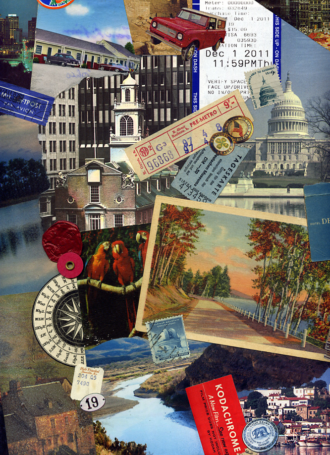
Places to go, ways to travel, and flights of fancy . . . A series of local exhibitions at the Boyle County Public Library’s Mahan Gallery has been an effective catalyst for me to create new pieces based on unifying themes. I have recently experienced mixed emotions about the ubiquity of vintage material in contemporary collage, but the topic of this show had me hunting through my morgue of old postcards and other relics to produce a pair of artworks on canvas. Yes, we all dig the instant “gravitas” of using old stuff, but will art historians say we copped out, if we do not accept the challenge of working with ingredients from our own present-day culture? I am just musing about the state of the medium, not any artist in particular. I see a hundred or more collage artworks posted online each week that rely exclusively on 20th-century material, and much of it seems stuck in a bygone avant-garde style. It is important for all of us to keep in mind that the Dada artists so widely emulated worked with material from their own time. Perhaps the opportune approach is to blend it all together, past and present. As post-centennial collage artists, we also owe each other a bit more constructive criticism than I currently observe. As the details below illustrate, I have absolutely nothing against using vintage material. I think that artists such as Hope Kroll or Fred Free or Matthew Rose (to offer only three examples) are creating some of the more exceptional work in the medium. On the other hand, there are many who seem to be using it as a crutch, over-relying on the antique impression of the ingredient material itself, rather than the juxtapositional synergy or overall aesthetic effect.
As the artworks for “Places” also demonstrate, I continue my effort to liberate a collage from the traditional glass barrier. To do so, it is necessary to find a proper level of protective sealant to balance visual appeal and durability. I prefer to avoid an overly polymerized impression with a finished surface. Because I primarily work with found material, I have had to learn which ingredients can handle direct exposure (for an effect similar to the painted surface). Nevertheless, some are simply too fragile and will always require a safe abode under glass.
left: Here and There (detail)
right: Now and Then (detail)
two collage artworks on canvas by J A Dixon
12 x 12 x 1.5 inches each
available for purchase
Many Waters Under Heaven
Friday, June 13th, 2014“Put stardom and success aside and just go out and do it. It’s like painting. Don’t talk about it. Or, like writing. Put it down.”
— Jonathan Winters“Don’t think about making art, just get it done. Let everyone else decide if it’s good or bad, whether they love it or hate it. While they are deciding, make even more art.”
— Andy Warhol
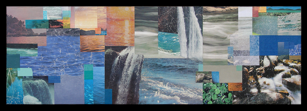
After learning about a call for entries on the theme of “water,” at the new First Southern Community Arts Center in nearby Stanford, Kentucky, I leaped at the theme with a minimum of thought or calculation. I was overdue for the opportunity to create a larger piece, and it was good for me to push aside all the internal questions and mental gyrations which too often intrude on the genesis of a new work or new point of public contact. I mixed a batch of wheat paste, added a stabilizing measure of white glue plus acrylic medium, and dug into my stash of nature images. Hand manipulation of the surface with wet, rectilinear ingredients became an almost papier-mâché-like process that soon involved shapes of pure color. A sort of “low-tech pixelization” began to suggest the gentle clash of primeval and present — a Garden of Eden sweeping forward to the modern digital world.
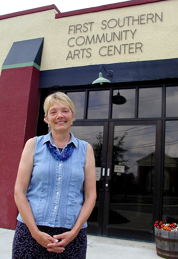
When I delivered my artwork to the gallery and was assisted by a local artist and volunteer, Roni Gilpin, I could not have been treated better. Chasing my passion for collage, meeting pleasant people, and breaking into a new venue — I must remind myself from time to time that this is what it’s all about. I am excited about today’s artist reception, 4 to 7 pm (in downtown Stanford, adjacent to the superb Bluebird Cafe). Family is visiting from Davis, California, and everything is shaping up for an exceptional evening!
Many Waters Under Heaven
mixed-media collage
by J A Dixon
33 x 11.25 x 1.5 inches
Purchase this artwork!
Roni “Sister” Gilpin
volunteering at
First Southern Community
Arts Center
G A B B F
Saturday, May 31st, 2014“Design is moving an existing condition to a preferred one.”
— Milton Glaser
I attended the first Great American Brass Band Festival in 1990 with my wife and partner, Dana, the same summer that we relocated our home-based design business to Danville, Kentucky. Big portions of the previous year had been spent apart, as I developed business contacts in Central Kentucky while she held the fort at our studio in Dayton, Ohio. That inaugural Festival was an opportunity to spend time together in downtown Danville, and the ambiance of that weekend supported all that we were discovering about our new home community. We have been devoted fans of the Festival ever since, and it is now impossible for us to imagine a June in Danville without world-class brass music within walking distance. After that first Festival, my capabilities as a graphic designer and lettering artist came to the attention of the organizers. I have since worked closely with them on establishing the visual identity of the event and creating designs for nine commemorative posters.
The 25th Great American Brass Band Festival will be held next weekend, and I shall be signing posters at the kick-off Gallery Hop Stop. Coming up with a suitable theme for this year’s poster was a challenge. We recognized that the milestone 25th Festival demanded a visual approach that would pay bold tribute to its heritage. No single aspect would do that, so I built a montage of images to salute the key elements of the Festival: the musicians, the parade, the picnic, the patriotism, the balloons, the fireworks, and the long history of enthusiasm for brass. With a quarter century of photography on file, it was a tough editing task. The result is a colorful, celebratory design intended to bring a smile to the face of every fan of the event.
The visual montage and the traditional collage are close cousins, and both techniques inform the other in my work as a fine and applied artist. The blurred boundary between graphic illustration and fine-art collage — conventional and digital — is an intriguing subject that I shall explore from time to time at this site. Please stop back here again (and do drop in at the Community Arts Center on Thursday evening, 5:30 to 7 pm, if you are in the Danville area).
Celebrating 25 Years
commemorative poster design by J A Dixon
available for purchase
Happy Birthday, NB . . .
Saturday, May 3rd, 2014“I am really not famous enough to have a cottage industry devoted to my identity theft.”
— Brendan Adkins
 My sincere greetings to the man behind the curtain at Xorph.com, the domain that brings you The Collage Miniaturist. NB stands for ‘Nephew Brendan,’ the multi-talented, multi-skilled, multi-identitied creative force who somehow manages to keep one of my feet near the leading edge of online communication. You can read his stories, hear his voice, unfollow his tweets, or simply join me today as I tip my hat to his magnanimity. There… Do you think that will get me invited to his birthday party? And can anyone please tell me whether or not the Oregon Boundary Dispute has been settled?
Untitled (NB)
collage miniature by J A Dixon
collection of B C Adkins
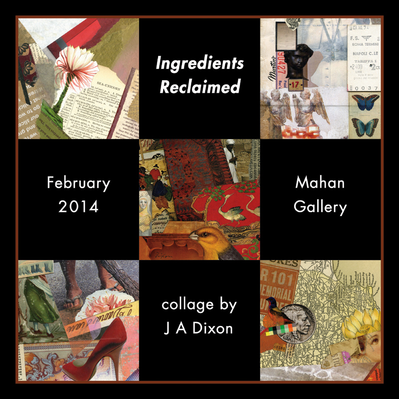
Ingredients Reclaimed
Monday, February 3rd, 2014February 3–28, 2014
Ingredients Reclaimed
Boyle County Public Library
Danville, Kentucky
On reworking a “finished” piece . . .
Wednesday, November 27th, 2013“. . . the completion of a work is only ever an abandonment, a halt that can always be regarded as fortuitous in an evolution that might have been continued.”
— Paul Valéry
Whether one thinks of the anonymous medieval monk embellishing a pre-existing manuscript, of Leonardo da Vinci working on the surface of his older painting, or of George Lucas making alterations to the original Star Wars trilogy,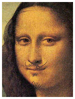 there is a long and sometimes controversial history of “refining” creative works already accepted as finished. I remember reading about Asian masters who thought nothing of making additions to artworks created in earlier eras. Apparently some art historians believe that halos were added to religious masterpieces much later. Duchamp did not draw those whiskers on the actual Mona Lisa, but he might have, had he been able to get away with it. What has all this to do with collage? Perhaps our entire genre came into being with the essential hunch that worthwhile art could result from revising something in contrast to its original purpose or frame of reference.
There is a wide spectrum to consider, if the subject under discussion is “altered art.” We might be talking about anchoring the concept for a collage on a singular appropriated image or transforming a mundane object into a new work of art. (L T Holmes recently shared a multi-part, personal tour of her Don’t Get Jittery On Me.) Or we might be referring to the simple idea of returning to a work already deemed complete and “writing a final chapter” to improve it. Think long enough about this topic and you may ask yourself whether any artwork is ever really done. Going back to Leonardo and Lucas for a moment, both turn up from time to time in attributions that suggest they also may have altered a version of the Valéry quotation more pithy than the poet most likely ever expressed.
“A poem is never finished, only abandoned.” — Paul Valéry
“Art is never finished, only abandoned.” — Leonardo da Vinci
“A movie is never finished, only abandoned.” — George Lucas
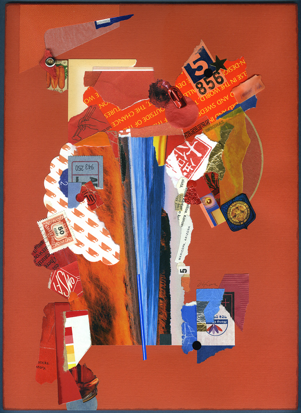
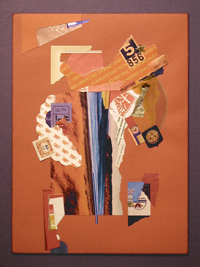
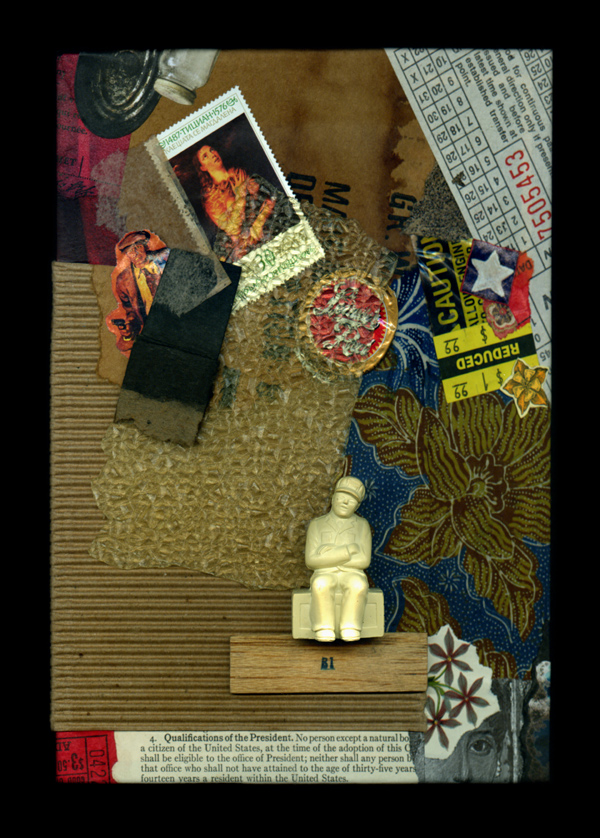
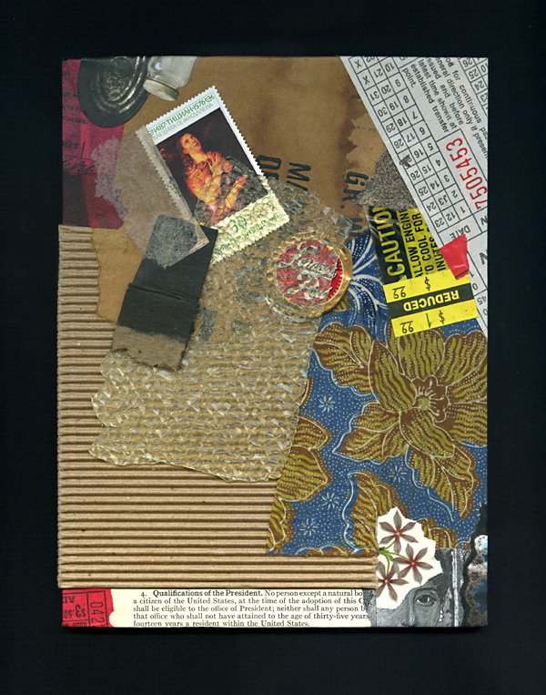
Forgive me if all of this undue rambling merely serves as an opportunity to highlight two “finished” collage artworks that I recently chose to revisit. Both examples also illustrate the complications of visually comparing two images created with different digital devices. After writing about a corresponding issue last week, I have since discovered S Caswell-Pearce’s related words from an April entry at paper with a past. My images for Rhapsody with Fever Chills demonstrate the same scanner/camera differential, although the scan of the new version is a better rendition of the artwork’s strong complementary effects. (This piece is currently on display with the “Seeing Red” exhibit in the McKinney Conference Center at Kentucky’s Constitution Square Historic Site.) The digital documentation of a revised Broken Qualifications, having shared the original version previously at this site, became a bit more challenging the second time around, given the addition of three-dimensional ingredients. At any rate, neither piece had ever felt fully resolved, although I had no specific plans to “reopen the case” until I made a broader reassessment of my inventory. Did I enhance them, ruin them, or just squander my time? You be the judge.
Rhapsody with Fever Chills
collage on paper by J A Dixon
7.5 x 10 inches, available for purchase
Broken Qualifications
collage/assemblage by J A Dixon
6 x 8 inches, available for purchase
The Paris Papers
Friday, November 15th, 2013A recent series of intensive collage investigations undertaken by Cecil Touchon while abroad — resulting in The Paris Papers — are more than worthy of our careful study. One of the medium’s most assiduous practitioners, Mr. Touchon clearly earned a well-deserved break after his significant contributions to the Collage Centennial, and yet it is no surprise for me to learn that he would combine it with such a Herculean self-assignment. We are all the beneficiaries.
p s ~ He also let everyone know the good news that he quit smoking during his month-long adventure hanging out with collaborator Matthew Rose. Amazing.
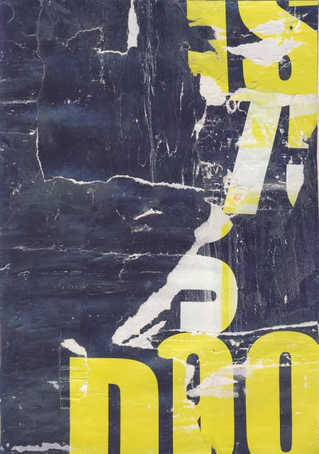
Fusion Series #3384
collage on paper by Cecil Touchon
made with bits of paper from Parisian street posters
8 x 12 inches, 2013
Collaboration in Collage, part 2
Saturday, November 9th, 2013“There has been an increased attention on collaborative practice in the arts in recent times with a perceived increase in artists working in groups or partnerships. For many other artistic enterprises, collaboration is the norm. Musicians form together into ensembles and bands; actors, writers and directors necessarily work in companies; and dancers, choreographers and musicians work in companies too, or in troupes. But for the visual arts the history of collaboration is less dominant, but perhaps, on the rise.”
— Kent Wilson, from the Central Highlands ArtsAtlas
 The Target Practice Project is certainly taking on a life of its own. L T Holmes has established a new blogsite and yesterday she kindly featured me as a “guest blogger.” Thank you, Laura, for your generous spirit.
Several of my entries over the past weeks have illustrated thematic collaborations. How many other kinds are there at play in the contemporary collage scene? Please indulge me as I continue to count the ways.
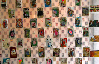
There have been remarkable long-term projects such as Liz Cohn’s Playing with a Full Deck. The playing card format seems to be a perpetual stimulus to interesting collaborations in collage. And then there is always the creative teamwork that simply results from a meeting of improvisational minds. One artist will originate a piece and a partner will complete it. Sometimes the process works in both directions at once. In other cases, a collaborator will select ingredients in order that a fellow “chef” may prepare a delicious “entrée.” Zach Collins has devoted much of a Tumblr site to his prolific joint ventures. Musta Fior is internationally known for his many visual co-conspiracies. Below are representative products of collaboration in the medium that have recently caught the eye of The Collage Miniaturist.
Long have I been convinced that musicians had it all over visual artists when it came to the collaborative urge, but countless exponents of contemporary collage are helping to revise that perception. Ladies and gentlemen, keep jammin’ away!
“Playing with a Full Deck” exhibit
altered playing card collaborations
Gallery 6 PDX, 2013
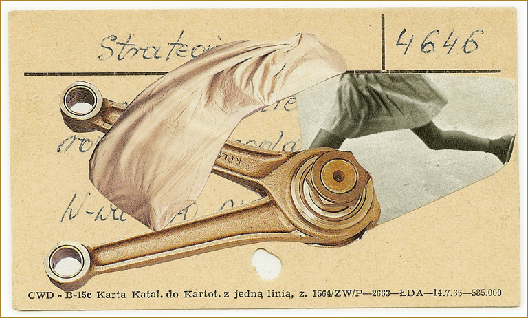
4646
collage collaboration
F Free + J Gall, date unknown
(start and finish, title unknown)
collage collaboration
start by A Bealy, finish by Z Collins, 2013
(title unknown)
altered playing card collaboration
start by G Stadler, finish by Z Collins, 2013
deception
collage collaboration
(©2013 Flore Kunst/Aaron Beebe)
Cute commando 5
altered playing card collaboration
(©2013 Flore Kunst/Musta Fior)
(title unknown)
altered playing card collaboration
M Fior + + L J Miller-Giera, 2013
Ragbrai
altered playing card collaboration
T Tollefson + L J Miller-Giera, 2013
A Dreadful Idea
altered playing card collaboration
L T Holmes + C Chocron, 2013
Bigger Than That
altered playing card collaboration
T R Flowers + L T Holmes, 2013
Channel Crossing
collage collaboration
start by J Ratouin-Lefèvre, finish by D Daughters, 2013
24.2
collage collaboration
D Daughters + I Reitemeyer, 2013
Sweet Contamination
Friday, August 9th, 2013The thematic series has a long tradition in the visual arts. Collage and assemblage are no different, thanks to the groundbreaking legacy of Joseph Cornell. Preparations are under way for me to expand the Silk Road Series that I began in March. Creating variations within a thematic limitation has also become a fixture of current collaboration in collage. An artist will suggest the visual parameter (such as T R Flowers did recently with an “Atomic Bombs” album at facebook) and participants respond with their individual interpretations. Here’s my contribution to that particular series:
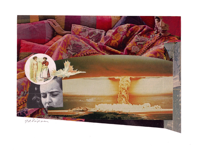
Sweet Contamination
collage miniature by J A Dixon
7.875 x 5.5 inches
Purchase this artwork!
