Archive for the ‘Larger Works’ Category

Cadenza Forte

Sunday, December 22nd, 2013

“Once you establish yourself as an artist, heaven forbid you change the formula too much. Paradoxically, this goes even for artists who ‘broke molds’ on the way up. The German powerhouse painter Gerhard Richter has gotten away with working in many different styles. But the case of 20th-century French chameleon Francis Picabia is a warning. He’s been dead since 1953, and he’s still paying for the fact that his art didn’t look the same from decade to decade.”
— Jen Graves

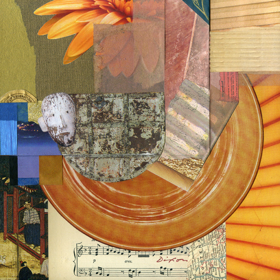
Pre-Christmas sales have accelerated, and there is enough time for local folks to surprise someone with a collage miniature under the tree. Cadenza Forte found a home after six and a half years. The buyer said he wanted an example of my “classic style.”

Hmmm… I need to turn that over in my mind for a bit.
 

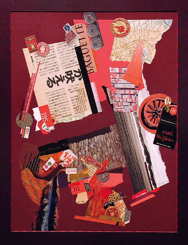
Cadenza Forte
collage artifact by J A Dixon
16 x 20 inches

•  S O L D

this thing we all do . . .

Wednesday, November 20th, 2013

In response to an assertion that his environmental works are impossible to visually document—

James Turrell: “Well, someone has to make up for all the work that photographs better than it is.”
 

Mr. Turrell’s recent quip brings to the forefront a distinct feature of representing or documenting one’s artwork. Does it really look like the image being included with a call for entries, posted at an online marketplace, or shared on a social network? Of course, the photographing of artwork to enhance its appeal did not begin with digital devices or the World Wide Web. Most of us are familiar with the curator’s disclaimer that reserves their right to reject artwork which arrives substantially different than visually represented when proposed. Even non-artists know how easy it is to boost the contrast or color saturation of a digital image. Setting apart from our discussion works that are essentially digital from the outset, it is important for anyone working in the medium of traditional collage to squarely meet this challenge: How do we properly interpret the visual experience of seeing our artwork firsthand?

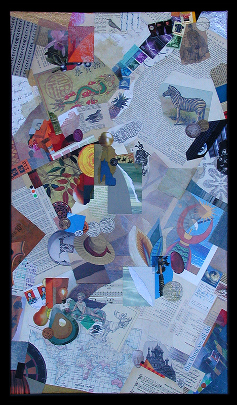
Needless to say, faithfully photographing or scanning conventional artwork is something that professionals face every day, but how can it ever be an exact science? What is the “true” appearance of anything? As the three examples below demonstrate, one of my recent collage artworks photographed differently under three different lighting conditions, before it was delivered. The more neutral version is closer to how it might “typically” appear, but perhaps the most faithful rendition would be an image made in the setting for which the piece was commissioned, under the unique lighting conditions of that particular environment, and then subsequently balanced for a reasonable match to the naked eye.

I review nearly a hundred collage artworks a day, as my eye passes over numerous online displays each week. What percentage of these creations actually look like the corresponding digital image? We all know what it’s like to see something and think, “I wonder if it really looks like that.” On the other hand, we also know what it’s like to scan a piece and think, “Wow. That looks better than I expected.”

All that any of us can do is establish a level of integrity about representing work to others. For those who routinely cheat or push an ethical boundary? Rest assured; the habit will eventually come back to haunt their studios.

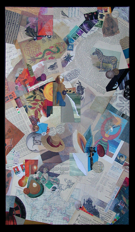
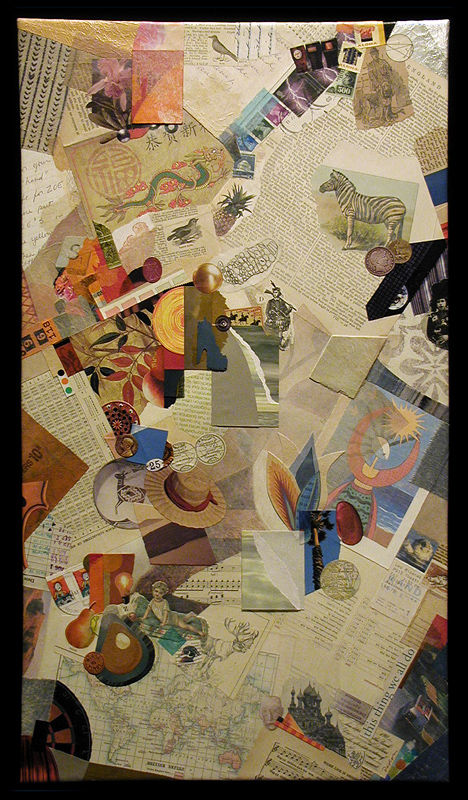
And now, a few words about today’s collage example. I must first express my appreciation to Lee and David Simpson for the commission that resulted in this thing we all do, a mixed media and collage artwork on canvas. To infuse the composition with images that represent aspects of significance to their lives, this piece was personalized by using the clients’ own artifacts and memorabilia, as well as additional ingredients carefully selected from my morgue. Creating works with special meaning to those for which they were intended has always been some of the most fulfilling time I have spent as an artist.


this thing we all do (three different digitals)
collage with combined mediums on canvas by J A Dixon
15.75 x 27.75 inches (22.50 x 34.50 inches, framed)
collection of L and D Simpson

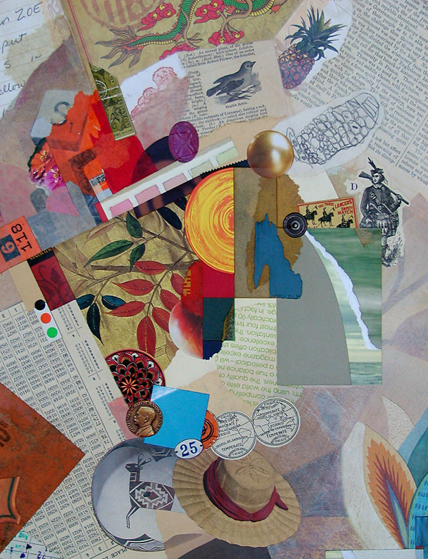
this thing we all do (detail)
collage with combined mediums on canvas by J A Dixon
(photographed and digitally balanced to match original)
 

Autumn Ode (to Merz)

Wednesday, October 23rd, 2013

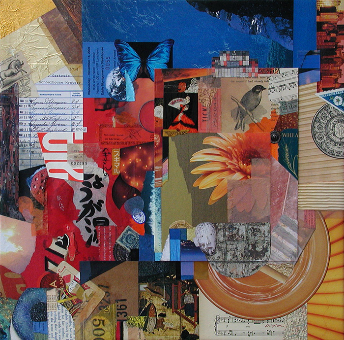
This is a collage artwork that I currently have on display as part of the “Autumn Glory” exhibition in the Mahan Gallery at the Boyle County Public Library. If you find yourself in downtown Danville, please stop by the show. It lasts until December 1st.
 

Autumn Ode (to Merz)
mixed-media collage by J A Dixon
16 x 20 inches, framed
available for purchase

Mystery Solved ~ details

Sunday, May 19th, 2013

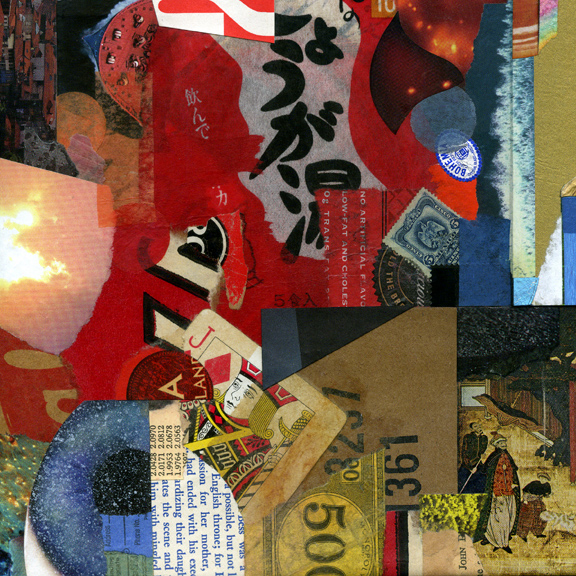
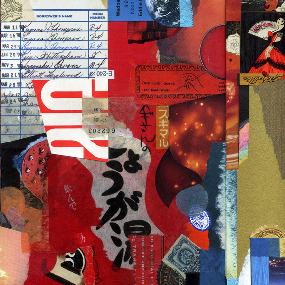
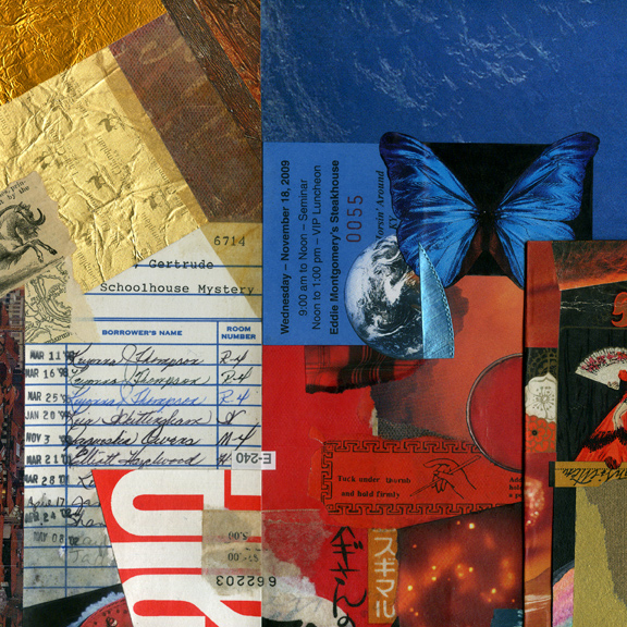
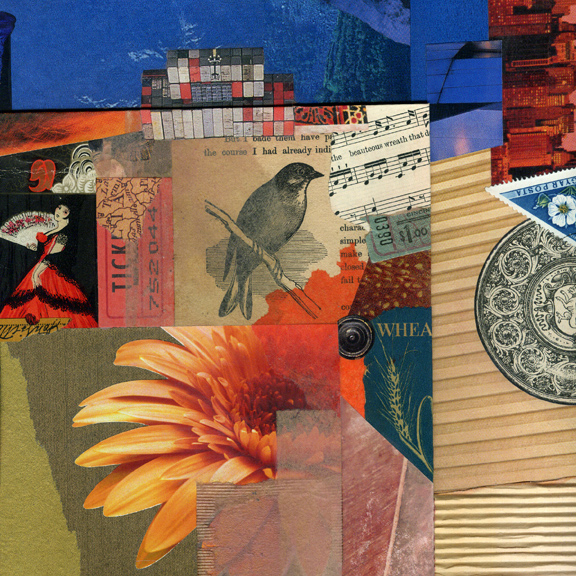
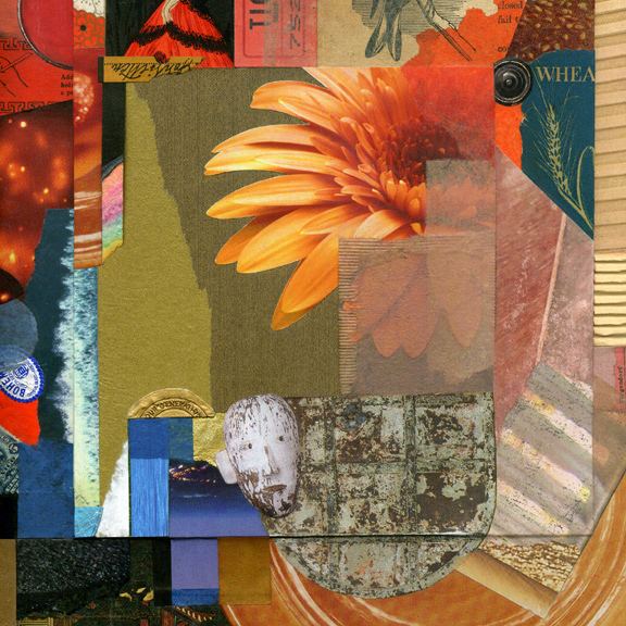
For the full viewing experience, one can never get too close to a collage, but this opinion from a person so enamored with the miniature probably comes as no surprise. When I create a larger piece, lessons learned from the small format have a strong bearing on my approach. As a concluding exercise to hone compositional awareness, it is beneficial to discover croppings that can stand successfully on their own. Before Mystery Solved left the studio, it was interesting to visually isolate six square miniatures, just to see if they might capture in microcosm the essence of the parent design.
 

A ‘Jack of Diamonds’ was too visually outstanding
at first and had to be massaged into balance.

I enjoy creating a montage of linguistic symbols,
but “a-l-e” was accidental (or perhaps subliminal;
one never really knows with collage).

Integration through color: photo of butterfly
specimen + ticket stub + magazine scrap.

Juxtaposition: illustration from an exotic soap
wrapper + book engraving + photo of flower.

The interesting effect of a raised panel: the
illusion of depth versus actual dimensionality.

From diverse sources: combining ingredients
that seem to have always belonged together.

Thanks again for looking. Please share your thoughts, suggestions, or constructive criticism (frankly, our medium of collage always needs a healthy dose of it).

On giving it away . . .

Tuesday, May 14th, 2013

“Giving is an energy that not only helps others but creates even more for the person who is doing the giving. This is a natural law that is true regardless of whether the person who is giving wants or even realizes what is occurring. Any success you have is despite your lack of giving, not because of it. The universe knows what it is doing. Everything you give away will return. With interest!”
— Richard Carlson

Once every two years, I contribute a work to our local arts scholarship fundraising effort. As a fine artist, I limit my charitable involvement to a single event out of numerous worthwhile causes. Creatives have to be very discerning about this type of thing, because, as others have pointed out, organizations have an insatiable appetite for donations of art and the phenomenon is out of control. It is up to each individual to find the proper balance of self-interest and generosity. My suggestion: keep it small, infrequent, and close to home.
 
Mystery Solved ~ J A Dixon

Mystery Solved
collage on canvas by J A Dixon
16 x 16 inches, collection of J Morgan

Diamonds in the Rough ~ details

Wednesday, January 9th, 2013

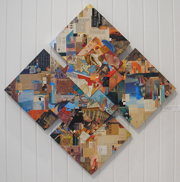
Collage for me is always an intimate viewing experience. You may find me with spectacles off and nose pressed near to the surface of any example within the medium. The scale of Diamonds in the Rough enhances the contrast between an up-close scrutiny and a step-back regard for the entire effect. With a large piece like this, I also enjoy visually cropping areas to create a series of virtual collage miniatures.
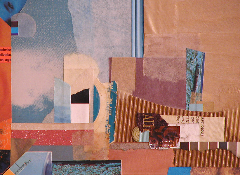
 

This micro view accentuates the ingredient elements, as in a collage miniature.
Visually, larger works are less ingredient centric, but still rely on their qualities.
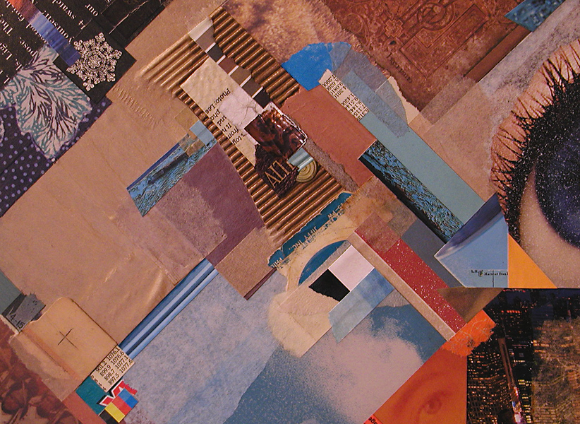
I think my imagination would never tire of working with diagonals.
What is it about the diamond or the triangle that engages my mind’s eye?
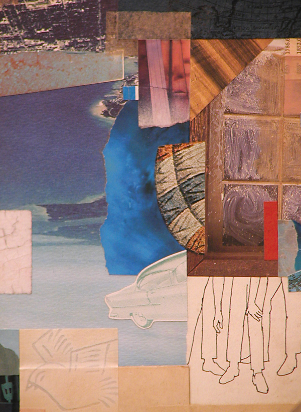
This is one of my favorite areas within the total artwork.
Oddly, the legs and hands resonate with the Tapley drawing in the exhibition.
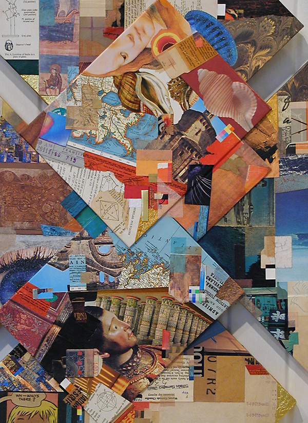
The composition’s focal center projects from the surrounding forms.
It differs energetically from the outer areas of structural perpendicularity.
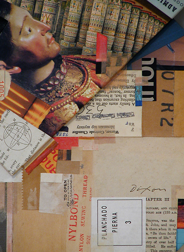
To regularly bestow a new purpose on found material . . .
Without fear of contradiction, one could say that I am hooked.
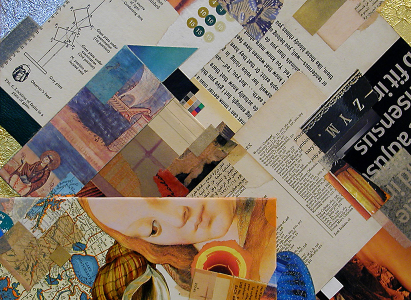
The essence of collage is the contrast of the mundane and sublime.
At any rate, this is often how I perceive it.
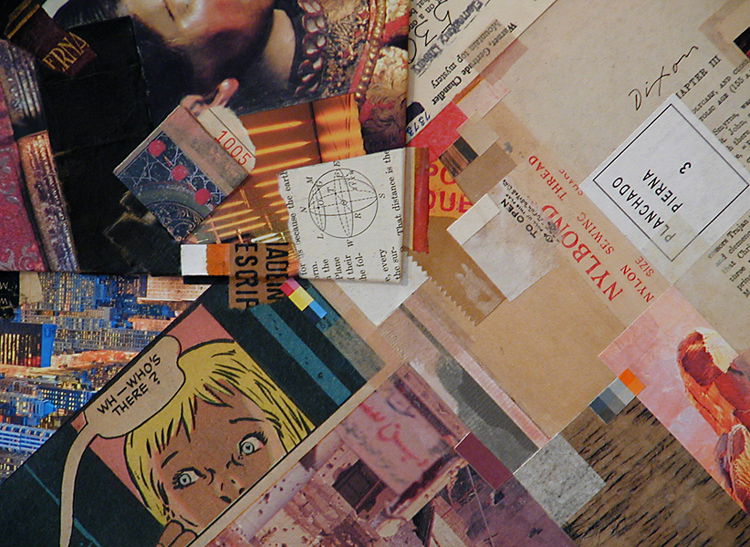
WH—WHO’S THERE? (Look closely: Milt Caniff, that’s who.)
Somebody saw this as an homage to Roy, but Kurt used comics first.
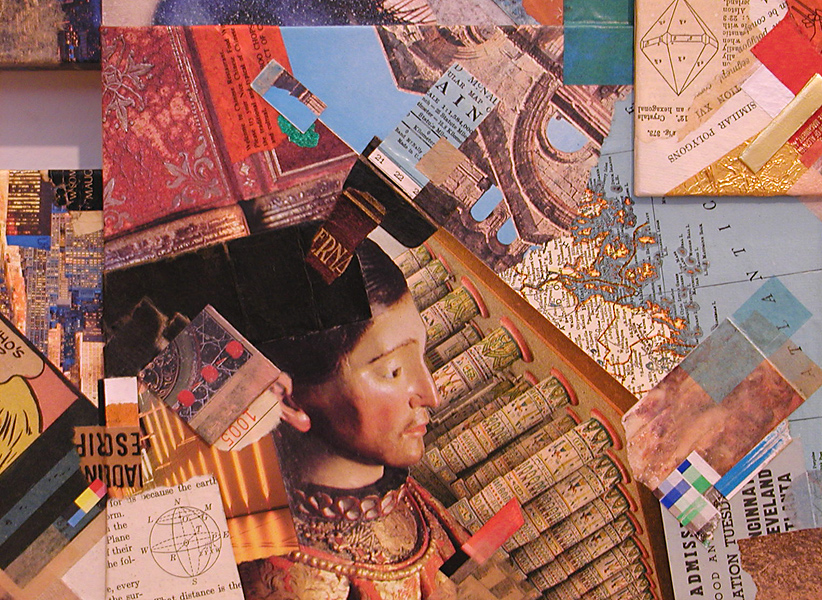
A collage can rest divertingly upon layers of symbolic meaning.
Or it can be simply the harmonious resolution of aesthetic factors.
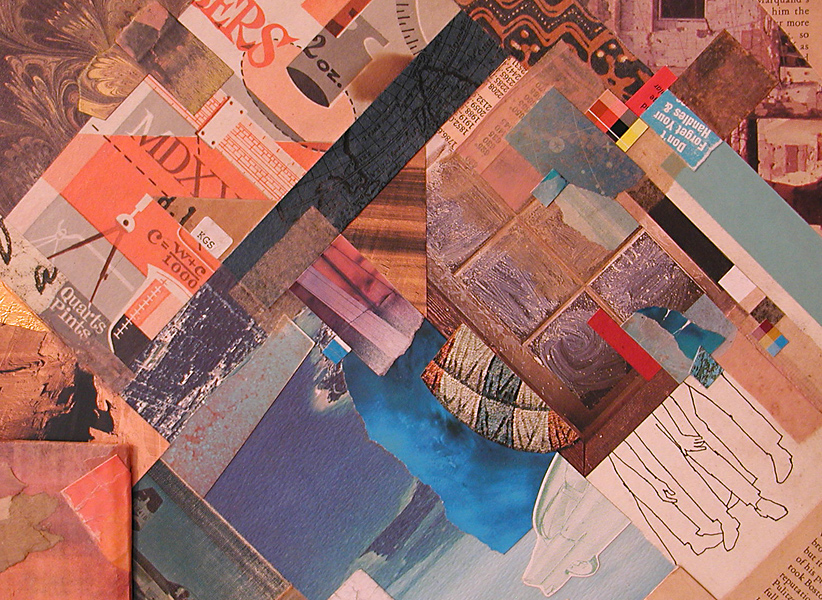
The dynamics of complementarity. (Is that a real word?)
More than one astute eye discovered my warm-cool “horizon.”
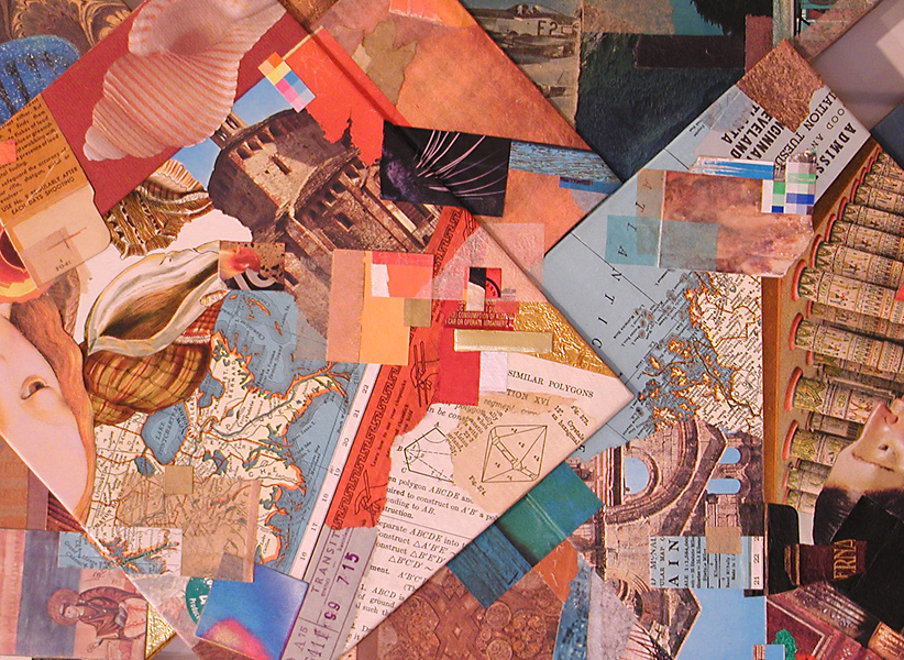
Composing with shape, color, contrast, rhythm, dimension.
At times, it need be about nothing more than that.
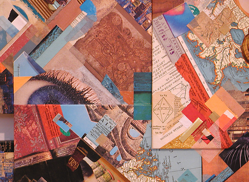
This image isolates a microcosm of the whole effect.
Are my larger works just a aggregation of collage miniatures?

Thanks for looking. Let me know what you think. Constructive criticism is encouraged at this site. To be honest, the medium of collage needs a bit more of it.
First exhibition of 2013

Saturday, January 5th, 2013

“What makes a painting meaningful is the spectacle of the ordinary content living together with the equally important life of the picture plane and the unity of the whole surface.”
— Gillian Pederson Krag

It pleases me to say that my most recent large-scale artwork will be on display and available for purchase as part of an invitational exhibition now hanging in my hometown.

NEW YEAR NEW ART ~ Community Arts Center, Danville, Kentucky
January 2 to 26, 2013 ~ Reception: January 10, 6–8 pm

The invitation to participate is an honor for two reasons. It is always good for one to know that local people appreciate collage, especially the more esoteric kind. Even more humbling is to be included among some truly outstanding Kentucky artists, such as Sheldon Tapley, Helene Steene, Kathleen O’Brien, and Marianna McDonald. I’m looking forward to the reception this Thursday. Mayor Steven Connelly of nearby Berea will speak on the powerful effect the arts can have on local economies. According to Programming Director Brandon Long, the intention is to showcase “fresh, new art that has the kind of excitement and energy of artists who know their work will go on display.” Many of the diverse works were created specifically for the exhibition, and that includes mine. Everything accepted had to have been executed since September.

Diamonds in the Rough is a composite of panels and stretchers. It is my latest effort to free collage from behind glass and approach the medium in a manner similar to the painted surface that stands on its own. I also departed from my typical rectilinear format, yet sought to maintain the type of perpendicularity that I frequently exploit for a unified structure. As usual, the color balance of found material plays a vital role in my overall composition. The lineage of the collage miniature is strong here. In fact, nearly everything I do to produce a major work comes from what I have learned from the small-format approach. This recognition is not meant in any way to devalue the miniature. I would hope that you have come to know my penchant well enough by now to appreciate that.

The next entry will include some detail crops and perhaps a few remarks about the process, too.
 
Diamonds in the Rough ~ J A Dixon

Diamonds in the Rough
collage construction by J A Dixon
36 x 36 inches
available for purchase