Archive for the ‘Ingredients’ Category

A Kentucky Collaboration

Monday, August 24th, 2015

“I’ve collaborated with many artists over the years but never on a project of this size. The two pieces were to be 24″ x 24″ on structured panels. What made this collaboration successful was the interplay between the two artists. We both sent numerous pictures of our starts in progress and were able to play off the ideas and techniques the other was using, in this we created a true pair of collages instead of two separate pieces.”
— Robert Hugh Hunt
 

Collaboration between collage artists is a widespread, dynamic development within a medium that has shown extraordinary vitality after its centennial milestone in 2012. This very well may be part of a broader phenomenon, due in no small way to the explosion of social media and a greater networking among artists of all kinds. I was not surprised when, earlier this year, here in my home state, the Kentucky Artisan Center at Berea announced a major exhibition called It Takes Two: Collaborations by Kentucky Artisans.

In response to this opportunity, I decided to contact Robert Hugh Hunt, an artist from Richmond, Kentucky whose work I had come to respect after we made a connection through Facebook. Both of us were aware of our geographic proximity, but had not previously met in person, nor had we collaborated remotely on a casual project. Appreciating each other’s prior work is no guarantee that two artists will enjoy the collaborative process or value the creative end result. Only by risking a joint venture will both artists find out if they actually are “on the same wavelength.” I am pleased to report that the results of my teamwork with Robert exceeded our optimistic expectations, and that one of the two pieces we created was selected for the “Takes Two” show.

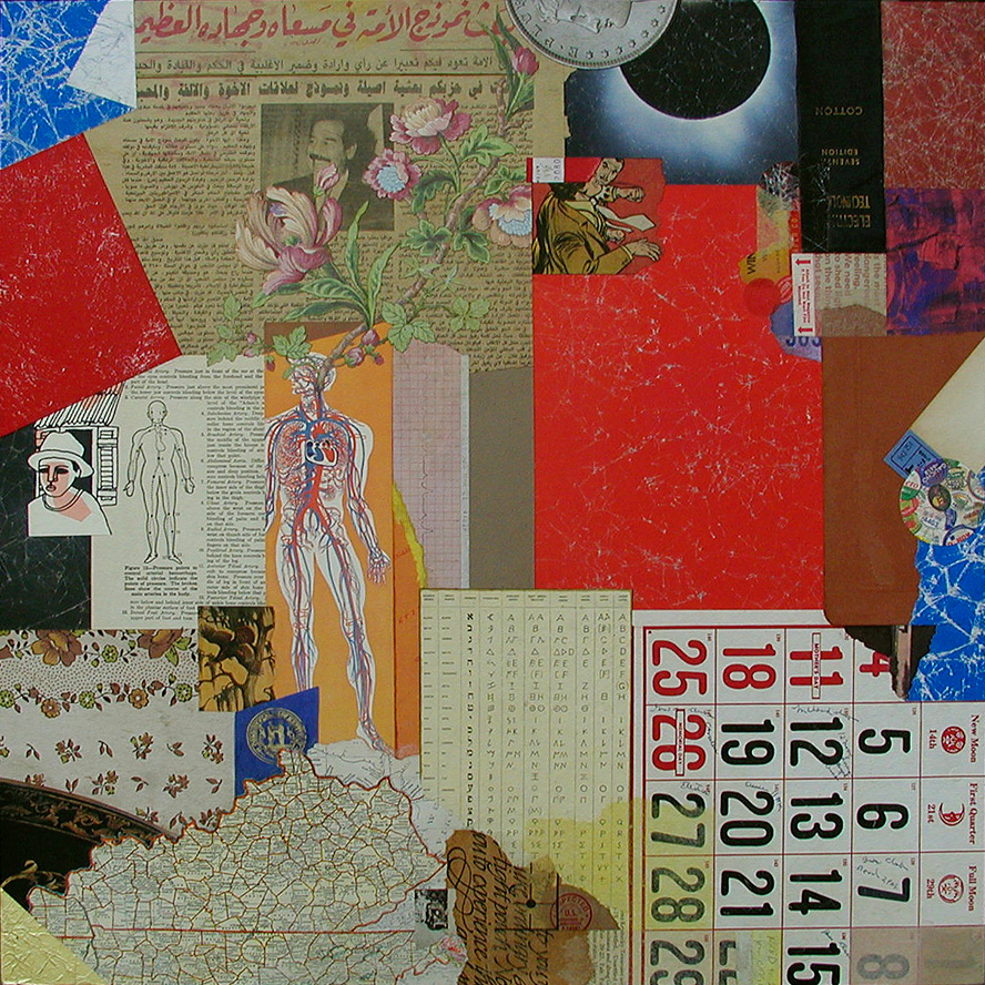
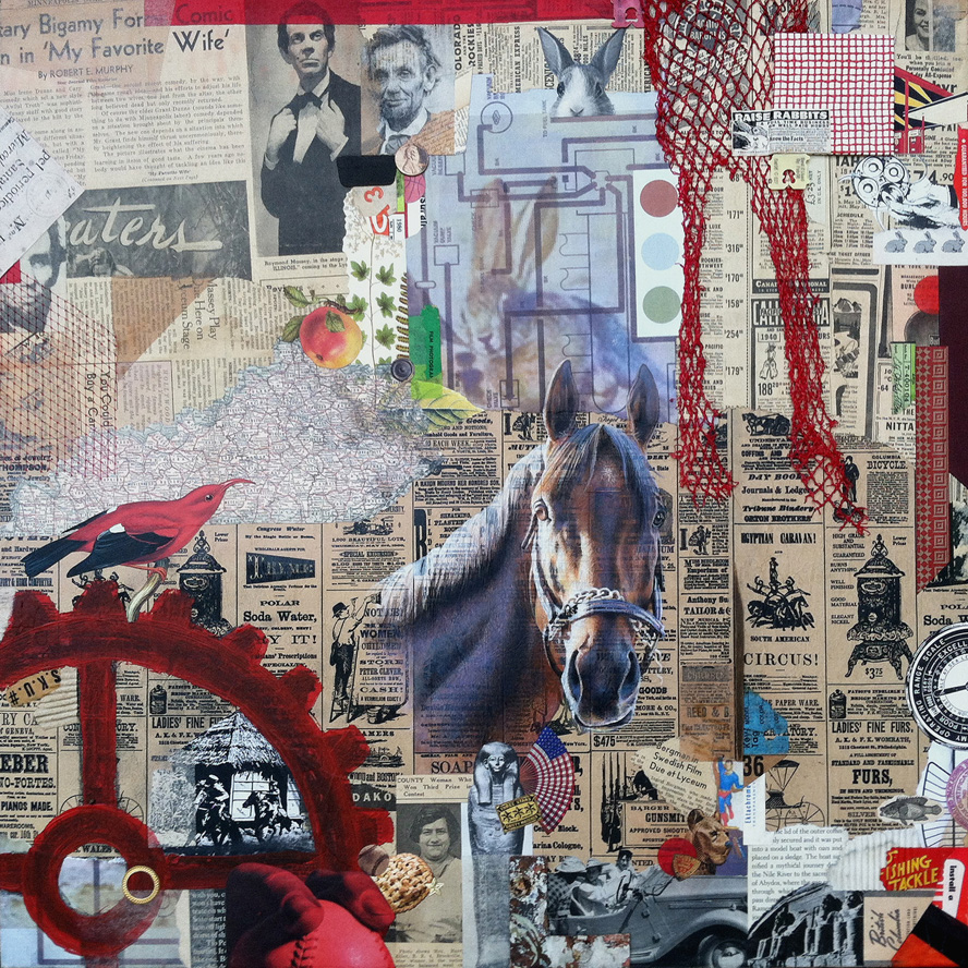
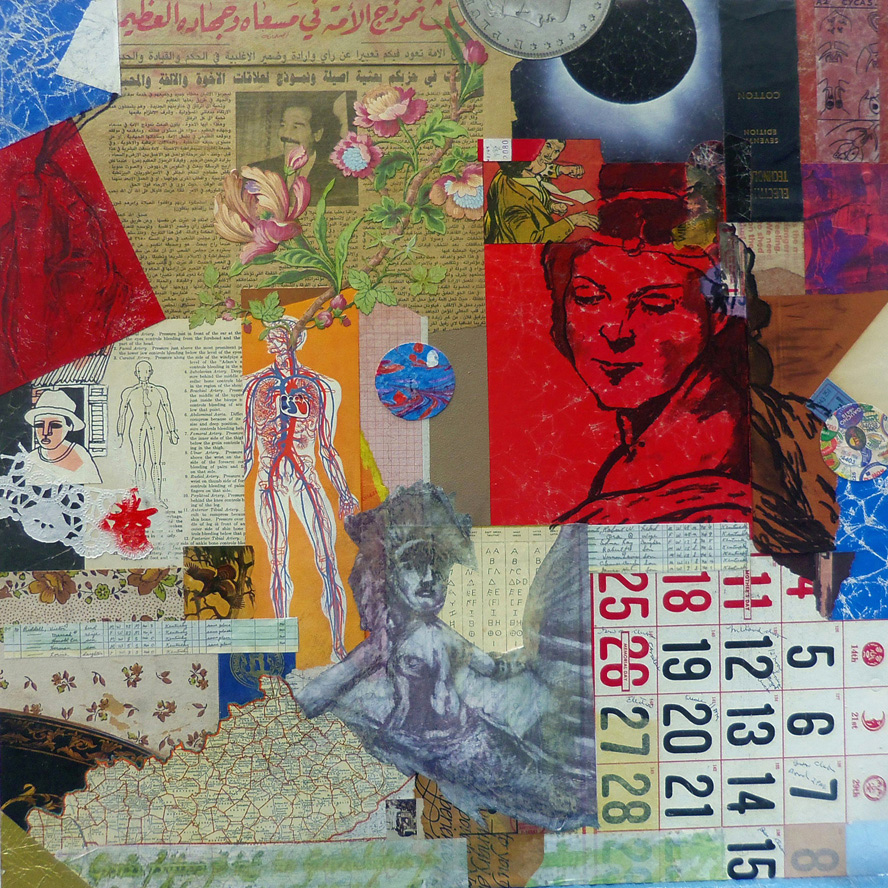
As artists, Robert and I both work regularly with combined mediums, but we chose collage as the foundation of our approach because we recognize how ideally suited it is for collaboration. There was no inclination to think small. We each fabricated larger dimensional panels and created a “start” for the other — to establish the background and organize the two-dimensional space with found material and other recycled/repurposed elements. collage collaboration ~ the start by Robert Hugh Hunt for Kentucky Sovereign ~ collage on structured panelAfter meeting for the first time (with spouses, over lunch at a delightful new Cuban eatery halfway between our studios), we exchanged the unfinished works to complete the compositions with additional ingredients and renderings. Robert’s recognized practice of layering his cut-and-paste collage artworks with mixed-media additions had already caught my attention, and his expressed aim to do the same within our collaboration inspired me to include a hand-rendered element as a focal point in my “finish,” which we titled Kentucky Sovereign. Robert’s finish, Kentucky Madonna, features multiple mixed-media treatments on top of my background shapes. The effect helps to integrate our respective techniques and to bond the artworks as a “true pair,” to use Robert’s phrase.
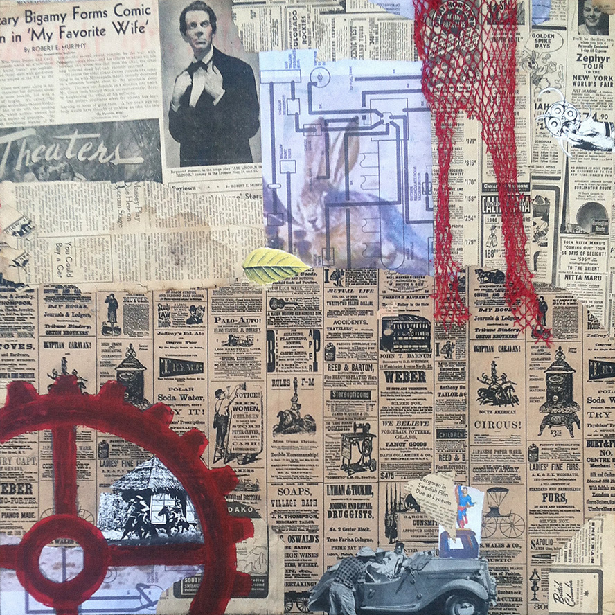
For my start, I began with a section of an Iraqi newspaper brought home by a member of the Kentucky National Guard. Robert made use of clippings from a 1940s-era newspaper that he got from fellow collage artist Ted Tollefson. collage collaboration ~ the start by John Andrew Dixon for Kentucky Madonna ~ collage on structured panelOur range of “merz-strokes” was unfettered, but we shared a desire to “Kentuckify” our choices, although neither of us knew exactly what we meant by that. Other ingredients include magazine scraps, printed papers, antique maps, used packaging, illustrations from discarded books, mesh bag material, tissue, fabric, plastic clasps, wood, gummed labels, metal, emptied tea-bags, produce stickers, foil, wallpaper, digital printouts, a paper doily, and more (with a modest assemblage aspect thrown in for good measure). As with any collaboration, the challenge is to discover a way to enhance the start in a complimentary manner and also to bring one’s personal approach to the finish. Our decision to avoid isolation was a good one. Images exchanged during development kept the creative energy in flux and maintained a visual cord (a common chord?) between the surfaces as they evolved separately. It was a positive experience for both of us and boosted our enthusiasm to continue as active collaborators.
Thanks, Robbo!
 

finish by John Andrew Dixon for Kentucky Sovereign ~ a collaboration with R H Hunt ~ collage on structured panel

Kentucky Sovereign
a collaboration by R H Hunt and J A Dixon
collage on structured panel, 24 x 24 inches
(start by Hunt, finish by Dixon)
selected for It Takes Two: Collaborations by Kentucky Artisans
available for purchase

finish by Robert Hugh Hunt for Kentucky Modonna ~ a collaboration with John Andrew Dixon ~ collage on structured panel

Kentucky Madonna
a collaboration by J A Dixon and R H Hunt
collage on structured panel, 24 x 24 inches
(start by Dixon, finish by Hunt)
available for purchase
Fred Otnes, 1925–2015

Monday, August 17th, 2015

“Otnes abandoned the narrative style… The move set him apart from other commercial artists of his time, and his willingness to embrace the abstract and chaotic nature of collage put him in high demand during one of the most turbulent decades of American history.”
— The Saturday Evening Post, 2015

“Fred Otnes brings to his collage paintings a classical refinement and control that makes poetry out of chance pictorial effects. He dips into early Cubist collage techniques, touches Florentine and Renaissance bases, and reverses Dadaist chaos into gorgeous homages to order.”
— Maureen Mullarkey, 2002
 

I just learned about the death of artist/illustrator Fred Otnes. I tend to focus here and in my own practice on the acknowledged masters of fine-art collage, but Mr. Otnes certainly had a greater influence on me during my formative years and during the period of my life devoted to “making it” as an independent illustrator and designer. He is rarely included among the seminal figures of 20th-century collage, but he should be. Allow me to back up a bit and reveal some of my own story.

In the 1960s I had four different art teachers in four years of high school. I resist being unkind, but each one of them was worthless. I had some talent, so there was no reason to spend time with me. I was left to fend for myself, because, apparently, it was more urgent to actively babysit the class goof-offs. By sixteen I was investigating the available correspondence coursework. No one thought to tell me about the Dayton Art Institute in the closest big city. I don’t think I even realized how desperate I’d become. What others might have viewed as crass merchandising was a Godsend for me. I responded to an advertisement from the Famous Artists School and completed the test. A representative actually paid a visit to discuss the home-study course that would provide the fundamental art instruction I’d been missing, and I begged my parents to let me give it a shot. They said, “Okay,” and I am grateful for this simple consent — access to legitimate art educators would be mine. I acknowledge now that their “Course For Talented Young People” was a marketing experiment, an attempt to leverage the successful adult course with a younger demographic. That meant nothing to me at the time. This was the school endorsed by Norman Rockwell, and I was a charter student! Although my Mom eventually had to cajole me into keeping abreast of the challenging lessons, a sea change had occurred. I was at long last formally introduced to the world of fine and applied artists. Among those that impressed me most was someone named Fred Otnes.

I was a peculiar kid who got more excited about magazine illustrations, corporate trademarks, television animation, and the Sunday comics than I did about “museum art.” The work of Otnes touched me in a way that would take decades for me to unravel. In my youth, not being able to figure out how an artist created something was usually paired with disinterest, but his work affected me in the opposite way. His graphic synthesis of images, engravings, diagrams, and language exposed a realm that I could aspire to enter. Even as an experienced pro, I continued to find his technique mystifying. I was relieved when legendary illustrator Mark English said, “I don’t even know how he did them, the mechanics of printing, photography and all the things he did to put them together.” Suffice it to say that in a profession biased against the creative explorer, Fred Otnes braved a path that few, if any, realized was there, successfully made it his own, and became one of the most distinctively recognizable, highly honored applied artists of his generation.

For many years, through the Illustrator’s Workshop, Otnes was a teacher and mentor, and, like others in the field, spent his later years expanding his personal style as a gallery artist. Whether applied to editorial or commercial use, the creations embody his profound respect for subject matter. If there is something elusive in his work that will continue to inspire me, it is this — I shall always hold in high regard the sense of “reverence” he brought to each layered plane of expression, to every choice of color or texture, to the symbolic meaning of each ingredient, and to the aesthetic harmony of the whole.
 

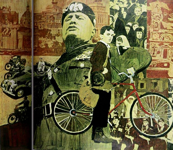
Otnes_Mussolini_1966

The Day Mussolini Dies . . .
Saturday Evening Post illustration by F Otnes, 1966

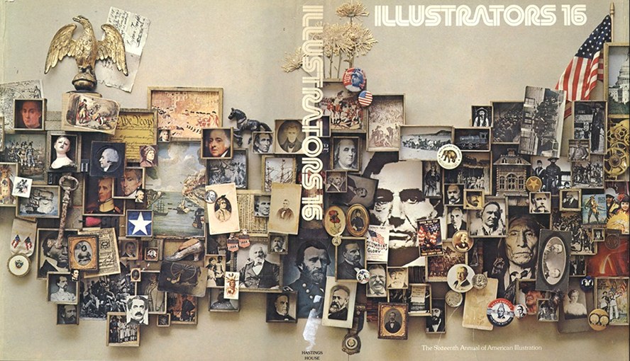
Society of Illustrators 16th Annual ~ cover by F Otnes

Illustrators 16
Society of Illustrators Annual cover by F Otnes, 1974

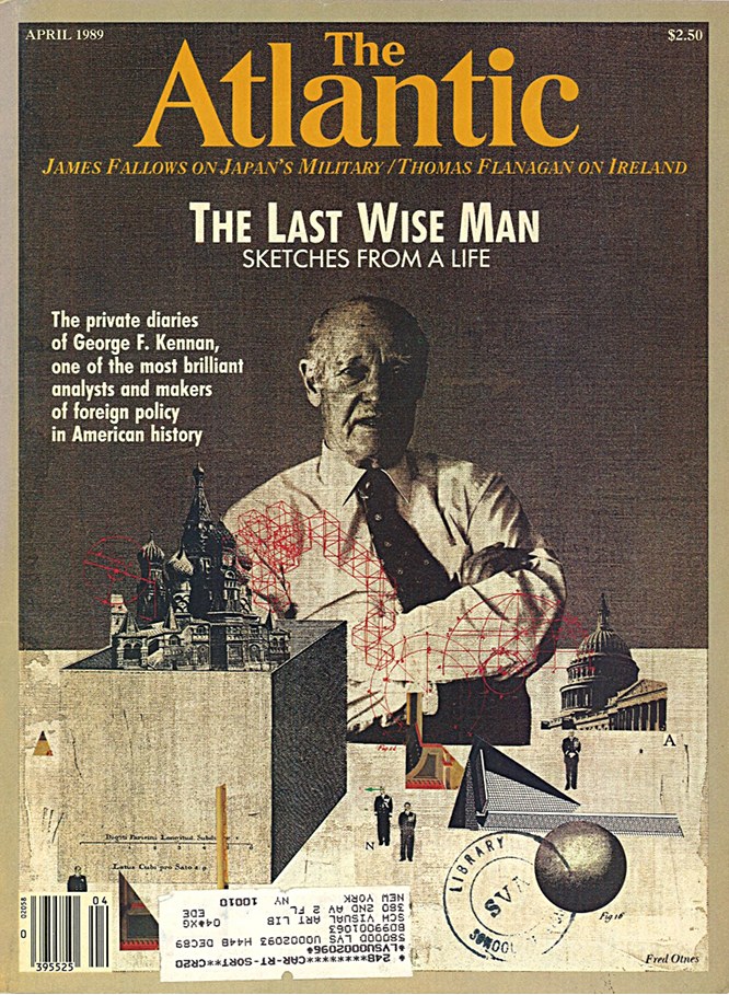
Atlantic cover by Fred Otnes, April, 1989

The Last Wise Man
Atlantic cover by F Otnes, 1989

National Geographic illustration by Fred Otnes

(title unknown)
National Geographic illustration by F Otnes (rights managed)

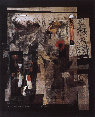
Piero ~ traditional collage by Fred Otnes

Piero
traditional collage by F Otnes, 1994

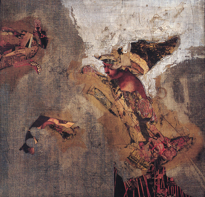
A Tragic Princess ~ collage painting by Fred Otnes

A Tragic Princess
collage painting by F Otnes, date unknown

Liagre ~ Fred Otnes ~ 2002

Liagre
collage painting by F Otnes, 2002

Not So Big

Monday, August 3rd, 2015

“Shadow boxes become poetic theater or settings wherein are metamorphosed the elements of a childhood pastime.”
— Joseph Cornell
 

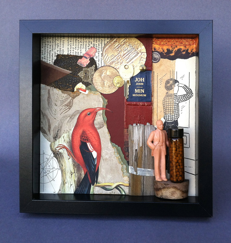
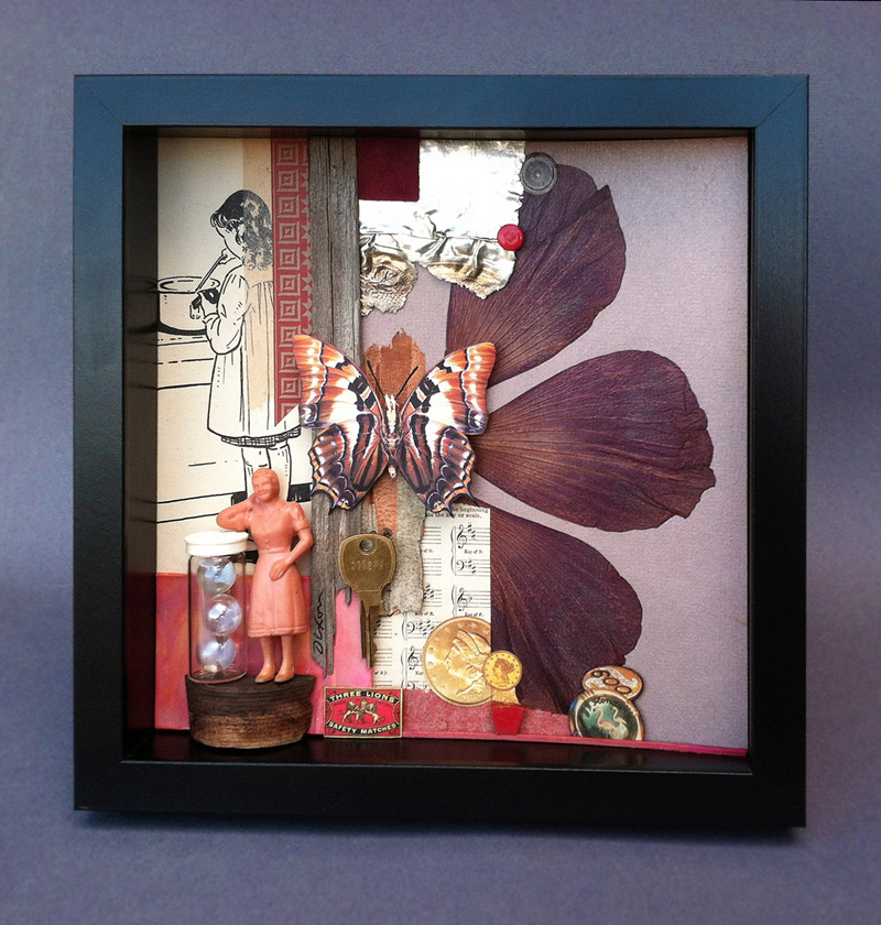
The creations of Joseph Cornell are small, and remained so throughout his unusual life as an artist, even as many of his contemporaries responded to the fashion of producing ever larger works. For me, a salute to this influential American seemed like the fitting approach when I decided to enter notBIG(3), an annual juried exhibition devoted to small art. I am pleased to have had a piece accepted to this show, which hangs from 8/11 to 9/11 at Lexington’s M S Rezny Studio/Gallery.

The “poetic theater” of little shadow boxes is not an isolated medium in collage/assemblage. To consider one’s activity in this comprehensive oeuvre as anything but an homage to Cornell would be an act of mild self-delusion. His singular, enduring presence overarching the genre must be acknowledged. There was a concern that my taking this approach with the notBIG(3) entry might appear to the juror as too derivative, but I pushed ahead with the “sincere flattery” of my plan. I had failed to crack this competition in its previous calls to artists, and I had hopes that the third time would be a charm for me. In addition, I wanted to assemble a range of ingredients outside my norm, including metal, wood, organic material, glass vials, and vinyl dimestore figures.

I created and entered two works as a pair — Histopia and Hertopia — a dual allusion to Utopia Parkway and its significance to the art history of the 20th century. It was not possible to enter both as a combined entry because the dimensions would have exceeded the size limitation of 12 x 12 inches. Only the first shadow box was selected. I was delighted to learn of my getting in the show, but it came with a small serving of disappointment, knowing that the gender balance of my overall idea would be lost with the “boy scene” presented to viewers by itself. It is something I can accept. Out of 380 works submitted, the 45 artists who make up the exhibition have a single artwork included. At any rate, this is what blogsites are for. Both pieces can be viewed together, and I have the opportunity to explain the whole thing to anyone kind enough to read this far. I also anticipate that many of you will be able to visit what appears to be shaping up as a strong exhibition. The opening reception is Friday evening, August 14th, 5 to 8 pm.
 

Histopia ~ collage/assemblage in shadow box frame by John Andrew Dixon

Histopia
collage/assemblage in shadow-box frame by J A Dixon
10 x 10 x 1.75 inches, available for purchase

Hertopia ~ collage/assemblage in shadow box frame by John Andrew Dixon

Hertopia
collage/assemblage in shadow-box frame by J A Dixon
10 x 10 x 1.75 inches, available for purchase
selecting details . .

Thursday, July 16th, 2015

“We do have repeated patterns that arise, in differing ways for different people, every time we create. But how do you get excited by the downturns and turn this into a positive experience?”
— Lyne Marshall

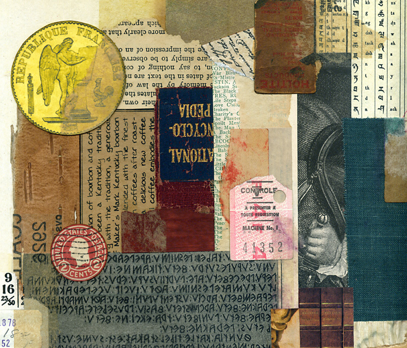
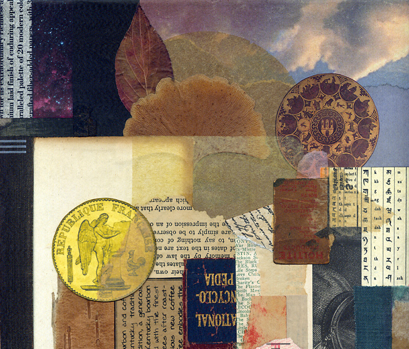
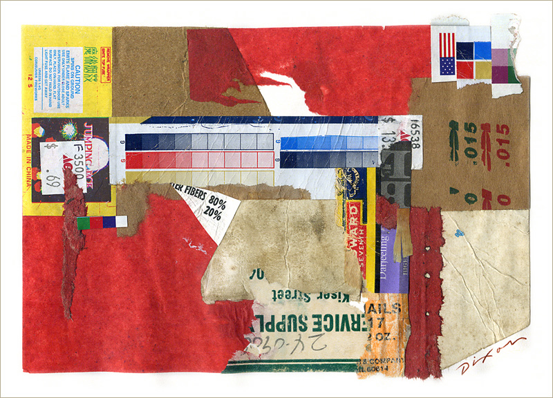
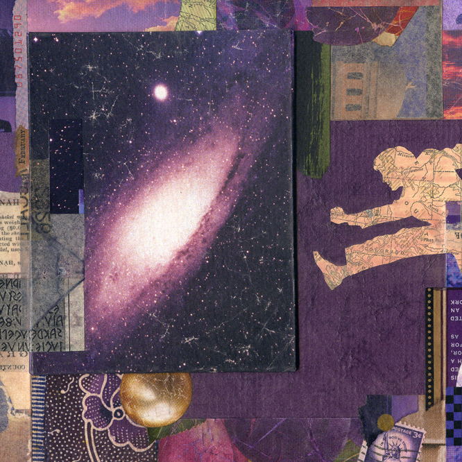
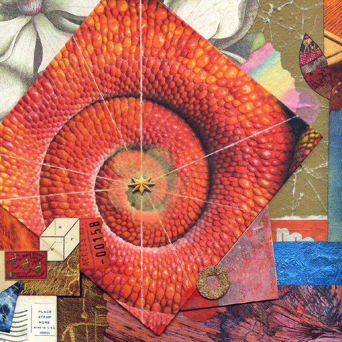
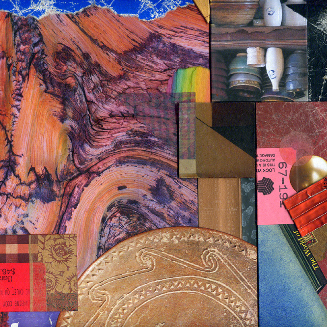
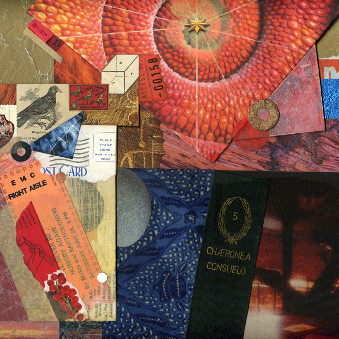
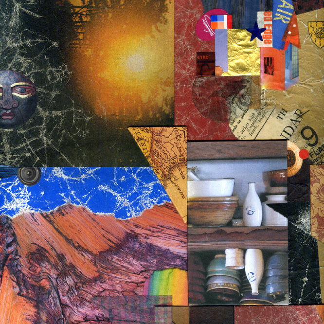
After I finish a larger artwork and its temporary or permanent disposition is settled, I have this tendency to focus on the perceived flaws, the missed opportunities, or that appealing ingredient “left on the cutting room floor.” Diverting my observation to the areas that I prefer, I crop into the design, looking for interesting sub-compositions. I tell myself that I should create spin-off prints or note cards based of a series of details — it must be my built-in bias toward the miniature. In almost every case, I put market-driven notions aside and begin something new. Objective scrutiny usually becomes a catalyst to the creative process. The cycle continues.
 

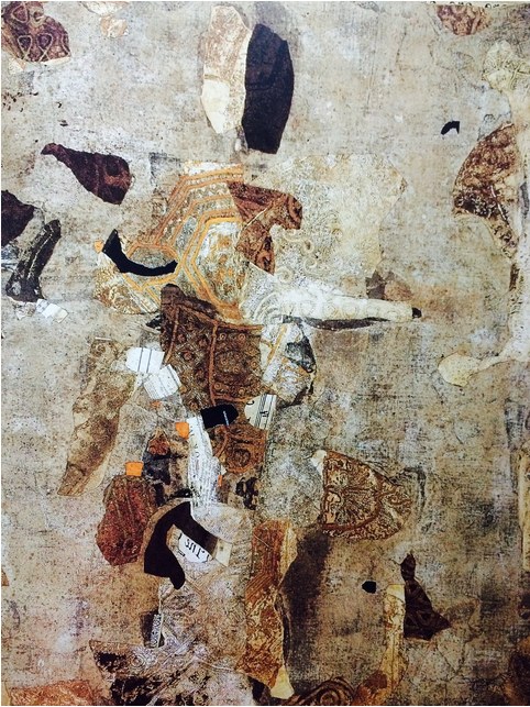
detail from Selective Fusion ~ John Andrew Dixon


detail from Selective Fusion ~ John Andrew Dixon

two details from Selective Fusion
collage on structured panel by J A Dixon

another “trip collage” exercise

Monday, June 29th, 2015

“The absence of limitations is the enemy of art.”
– Orson Welles

Here is another journal experiment based on ingredient constraints. It has a more abstract emphasis, in contrast to the previous example. There are numerous ways to impose this instructive limitation. Some collage artists have been known to create a composition restricted to the random scraps found on their work surface. Others make it into collaborative play, swapping an envelope of ingredients within which to work. A speed requirement will reveal more aspects of creative decision making and give rise to other insights. Paradoxically, there is no limit to how limitations can unlock the freedom of artistic expression.
 

journal experiment ~ John Andrew Dixon

results of a “trip collage” exercise
journal experiment by J A Dixon
7.25 x 5.25 inches

more leaps . . .

Monday, June 15th, 2015

“Different themes inevitably require different methods of expression. This does not imply either evolution or progress; it is a matter of following the idea one wants to express and the way in which one wants to express it.”
— Pablo Picasso

The quick sale of Rhetorical Leap was among several factors that would cause me to create a slightly larger piece with similar themes. It was an interesting experience on multiple levels. I had the opportunity to revisit my original intuitive process in a more rational way. It is not for me to judge the relative “success” of either work. I prefer to focus on what it was like to make the journey a second time. Personally, I find the effort to recapture nearly any aspect of life to be a hit-or-miss proposition. For every time one scores the same enjoyment or sense of fulfillment, there is another that falls short of expectations. For this reason, I tend to resist variations on a theme or a defined series when approaching collage artwork. At any rate, that is my tendency, although the practice retains a special appeal that I have no reason to resist. Ideally, one’s entire body of work might be seen by others as an extended series of thematic variations. It is only natural for most observers to put emphasis on the end products, rather than the more obscure goings-on that make up the creative process.
 

detail from Rhetorical Leap ~ John Andrew Dixon  detail from Leap of Faith ~ John Andrew Dixon

left: Rhetorical Leap (detail)
right: Leap of Faith (detail)
two collage artworks on canvas by J A Dixon

Contemplation Ajar ~ details

Monday, June 1st, 2015

“It’s the little details that are vital. Little things make big things happen.”
— John Wooden

One of my favorite things to do with an image of a collage is to explore alternative compositions by cropping. We can never stop training the eye. Visual ingredients are always elements in context and their character can change with different design relationships. The more we do this, the more a sense of balance and spatial harmony are internalized. As a bonus, any ideas that emerge can become the basis for new investigations.
 

square crop ~ detail from Contemplation Ajar ~ John Andrew Dixon ~ The Collage Miniaturist


square crop ~ detail from Contemplation Ajar ~ John Andrew Dixon ~ The Collage Miniaturist


square crop ~ detail from Contemplation Ajar ~ John Andrew Dixon ~ The Collage Miniaturist


square crop ~ detail from Contemplation Ajar ~ John Andrew Dixon ~ The Collage Miniaturist

four squares from Contemplation Ajar
collage on structured panel by J A Dixon
collection of J Wood

Collage Miniature Collaboration Number One

Saturday, April 4th, 2015

“I am most interested in discovering new ways to tell an old story, with humor, irony, and a dash of anarchy!”
— Allan Bealy

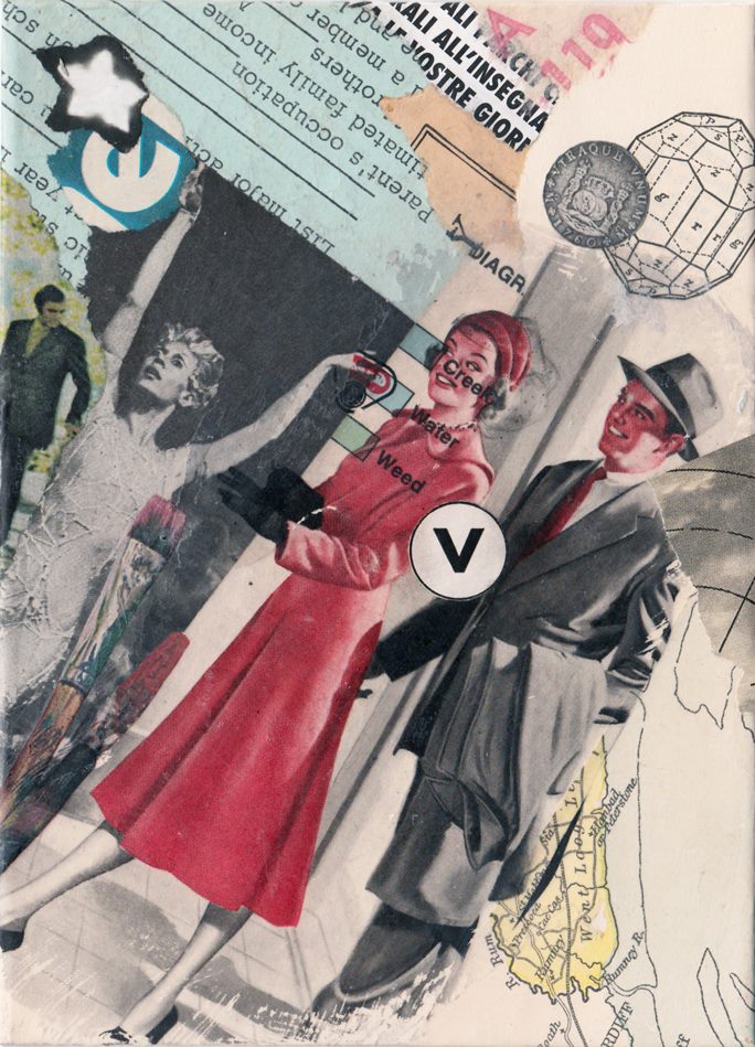
It was a pleasure to take a step deeper into the collaboration zone with Brooklyn-based artist and art director Allan Bealy. Take a look at my March 1st entry to see the starters that I sent Allan. His finished artworks are delightfully effective. The rugged, floating pear is a fine touch, and decisively positioned, too. His rhythmic figures are splendid in the second collage, and the “circle v” anchors the whole composition. Thank you, Allan. Now it’s time for me to tackle the items you sent for me to complete!
 

A collage miniature collaboration by John Andrew Dixon and Allan Bealy

Untitled (rugged pear)
a collage miniature collaboration by J A Dixon and A Bealy
(start by Dixon, finish by Bealy)
5 x 7 inches, collection of J A Dixon

A collage miniature collaboration by John Andrew Dixon and Allan Bealy

Untitled (rhythmic figures)
a collage miniature collaboration by J A Dixon and A Bealy
(start by Dixon, finish by Bealy)
5 x 7 inches, collection of A Bealy

A universal antidote . . .

Saturday, January 17th, 2015

“Self-consciousness is the enemy of all art, be it
acting, writing, painting, or living itself, which is
the greatest art of all.”
— Ray Bradbury

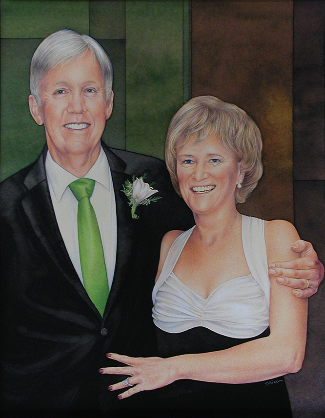
I was honored, but also thrilled, to accept my third invitation for the “New Year New Art” exhibition at our local Community Arts Center, one of the outstanding cultural institutions in Central Kentucky. The extraordinary thing about this annual show is a freedom to display, The Barretts ~ a portrait by John Andrew Dixonwithout juried appraisal, one or two pieces for which one has passion. The only restriction is that the work not be over four months old. I decided to create something around the holidays specifically for the opportunity, and, because I had just completed a difficult portrait commission in watercolor and pencil, a more personal form of expression was a welcome idea. I had used an illustrative, “news-magazine-cover” style that always has had great appeal to me, but that over the years has challenged my self confidence and repeatedly has put my perfectionist tendencies to a stress test. Fortunately, I have discovered a universal antidote for all that — collage.

For the January exhibition I wanted to do something fresh, to surprise myself, but also, as most artists prefer, to create something that would please others, that would excite an individual’s subjective response. Mixed-media collage is a medium that people find both provocative and delightful, and to which I am strongly committed, but that should be no surprise to anyone who follows this site. As a working designer and graphic artist, I return to collage on a nearly daily basis as fuel for my creative life and a potent solvent for that side of myself which continually flirts with self doubt if something might not turn out exactly as I imagine it should. All that nonsense fades away when I incite the spontaneity of this magnificent medium.

Of course, I remain captivated by the ability to make something of value from material that otherwise would be thrown away or recycled. I enjoy creating artwork that has bold visual appeal from across a room, but that also provides a depth of interest at close observation, with many stimulating details within an intimate viewing distance. “Matthew’s Touchonic Lodge” is primarily an abstract composition, and I salute two collage artists whose work I admire with my title and embedded allusions. “Apparition Rising” uses ingredients that are more whimsical, but perhaps slightly “spooky” at the same time. A phrase from a song that I like sparked the genesis of its assembly. Both are significantly larger than my typical miniature, more dimensional than a standard flat surface, and, as with all my designs, I worked intuitively with color, contrast, and the activation of space. In addition, I continue to push the effect of collage as a stand-alone treatment that does not demand the protective glass barrier. Please let me know what you think of these new works.
 

Dixon_TouchonicLodge

Matthew’s Touchonic Lodge
mixed-media collage by J A Dixon
22.5 x 20 inches, December 2014
title source: homage to artists M Rose and C Touchon
Purchase this artwork!

Dixon_ApparitionRising

Apparition Rising
mixed-media collage by J A Dixon
19.5 x 27.5 inches, December 2014
title source: from the song “Ghost Town” by J Brasfield
also available for purchase
Arbitrary Mischief

Sunday, October 5th, 2014

“As we mature, all of us learn to ‘put away childish things.’ Often, though, we do such a good job of growing up that we lose contact with our spontaneity, teaching ourselves to follow rules and habits that inhibit us from acting on our hunches and intuition.”
— W. Clement Stone

One of my earliest entries at this site made mention of the intuitive response in our process of collage creation. I have continued to ponder this idea of making visual decisions without conscious thought, especially after a lengthy discussion at the Collage Critique group in the facebook realm. There is something to be said for intuitive spontaneity with no preconceived notions, in contrast to the methodical execution of a concept. Collage as a medium is diverse enough to embody both approaches and everything in between. In my opinion, there is ample “non-thought thinking” taking place, even when no “idea” is driving the process. On the other hand, most of us can tell when a piece is struggling to be more than a mere stew of ingredients and the temptation to declare it “finished” should be resisted.

Personally, it is no longer possible for me to imagine coming to this activity without the foundation of art education, a rigorous training in graphic design, and 40 years of practice as a creative professional. I suspect that I have internalized all this to become part of an inner resource, so that when, at the conscious level, I put all of it out of mind, it still informs each spontaneous visual choice and the sense of something appearing “right” to the eye. Deciding that “an ingredient in play” has the right color, the right value, the right shape, the right texture, or the right spatial role often happens without rational awareness. That is my goal, at any rate, to keep such “non-thinking thought” in motion for as long as possible before I find myself falling back into outer rumination. It is not only a matter of aesthetics. The same phenomenon applies to thematic or symbolic associations, and the overall process of ingredient acquisition and selection that initiates and sustains the whole affair. Not that there is anything undesirable or distasteful about planning, calculation, and a deliberate methodology. Far from it. Nearly every work of art will involve some of that. It just happens to be that what I am most hoping to take place is something else — that the flow of assembly leading to a stimulating but balanced effect is the result of an artistic intention deeper than conscious decision making.
 

hand-crafted collage by John Andrew Dixon, The Collage Miniaturist

Arbitrary Mischief
collage on panel by J A Dixon
8 x 10 inches
 
Purchase this artwork!

Even more Haus of Cards

Wednesday, July 23rd, 2014

“Somebody said once or wrote once: ‘We’re all of us children in a vast kindergarten trying to spell God’s name with the wrong alphabet blocks!’”
― Tennessee Williams, Suddenly Last Summer

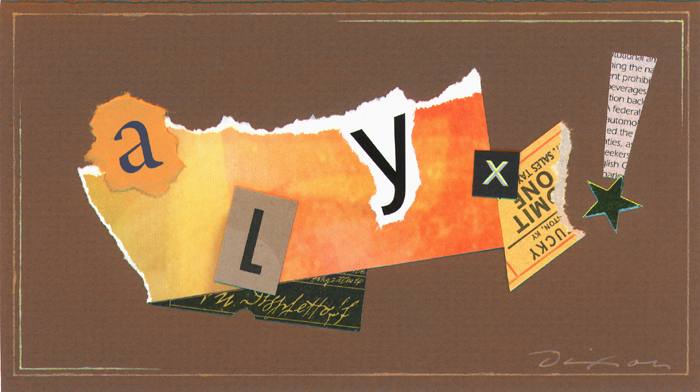
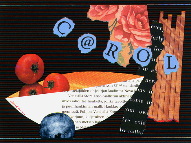
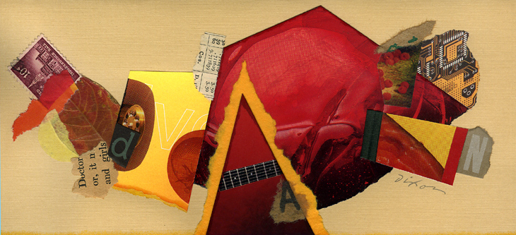
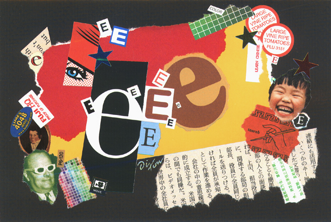
As is true with many graphic artists, I have been fascinated by letterforms since childhood. The first time I rendered the word “ICE” with frozen encrustations, it felt like a rite of passage for me. One of the reasons I shunned store-bought greeting cards in favor of my hand-crafted versions was to indulge a love affair with custom lettering. As collage miniatures began to dominate the character of my card making, the alphabet remained a key part of the visual vocabulary. As my enthusiasm for the medium of collage continued to expand, symbolic language became a re-occurring, vital ingredient in nearly all my artistic compositions.

 
a collage greeting by J A Dixon

collage miniature by J A Dixon
collection of A D Kenner

a collage greeting by J A Dixon

collage miniature by J A Dixon
collection of C Dixon

a collage greeting by J A Dixon

collage miniature by J A Dixon
collection of D R Dixon

a collage greeting by J A Dixon

collage miniature by J A Dixon
collection of E Debarone

a collage greeting by J A Dixon

collage miniature by J A Dixon
collection of R W Breidenbach