Archive for the ‘Assemblage’ Category

Much more about JUXTAPOSE . . .

Monday, February 29th, 2016

Friend and fellow collage artist Kathleen O’Brien is in the midst of her countdown to a big solo show in April. She asked me to do a favor and share a guest review as part of her final promotions for JUXTAPOSE before Drawn to the Earth requires her full concentration. As excited as I am about the group exhibition in Danville, it was a tougher post to write than I first anticipated. Collage is not the easiest art form on which to expound, perhaps because it relies on the “logic” of irrational choices.

At any rate, my dedicating a blogsite to that very topic was nobody else’s idea, so I best not complain to those of you kind enough to visit here. Would I rather be making art? Of course. Even so, I cannot constrain my enthusiasm for all things collage. Here’s my take on a great show. Be forewarned: If you’re looking for some criticism, you won’t find it!
 

I’ll admit it. I can’t get enough of JUXTAPOSE. The current exhibition of collage and assemblage is at the Community Arts Center until April 2nd. That’s not exactly the most humble thing to say, considering it features a dozen works by yours truly, so I won’t pretend that I can offer an unbiased review. Program director Brandon Long has organized a finely curated, must-see destination that brings together over a thousand examples of the two associated mediums (literally, but I’ll explain that in a moment). This is an unprecedented group show for the Bluegrass-based artists involved, and I am thrilled to be exhibiting side-by-side with Kathleen O’Brien, Teri Dryden, Robert Hugh Hunt, Meg Higgins, Connie Beale, Cynthia Carr, and many others. No doubt my enthusiasm has something to do with its location less than a city block from my studio, which bestows the luxury of repeated immersions, and there is over a month left in the duration!

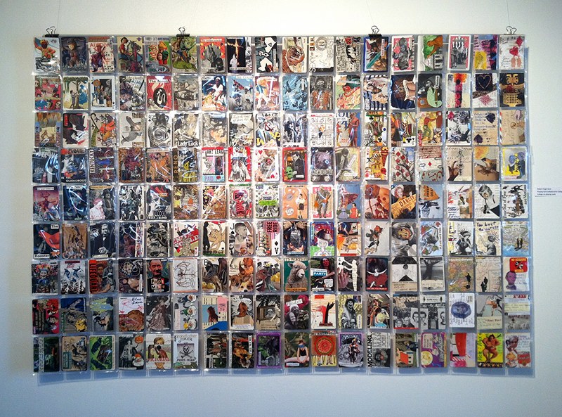
There are more participants than I can profile individually, and far too many artworks to highlight. The best example of this is a room devoted to three complete year-long series of collage-a-day works by O’Brien, Long, and Nan Martindale. Combined with almost one hundred seventy of Robert Hugh Hunt’s provocative collage collaborations, the magnitude of miniature artworks presented in a single space could be overwhelming. As an exhibition designer, Long uses geometric grids, browsing boxes, and two flat-screen displays to make the huge collection comprehensible for viewers. O’Brien’s sensitive, meticulously layered collection of daily two-sided postcards is a journey to which I surrender with pleasure each time I visit, but only after a jolting romp through Hunt’s rarely exhibited Hillbilly Voodoo series with T R Flowers.

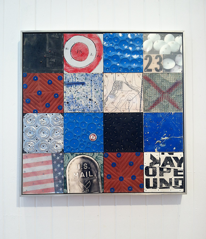
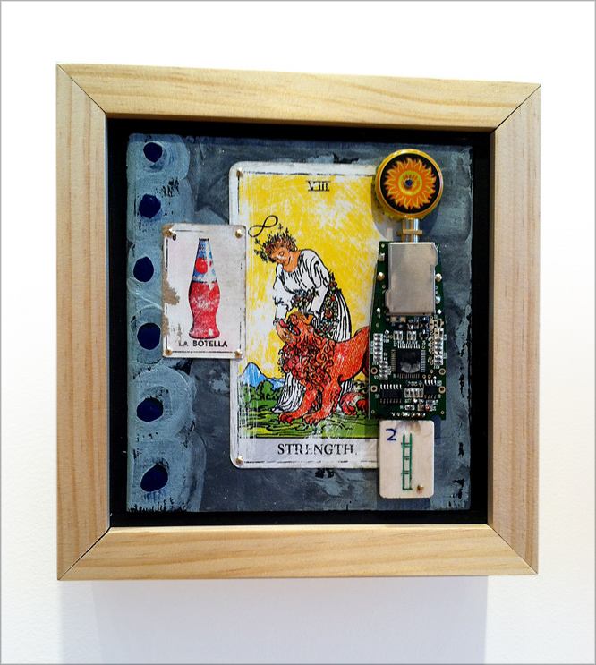
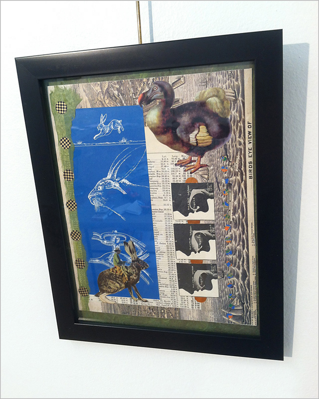
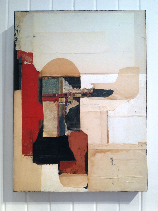
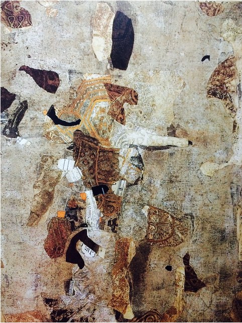
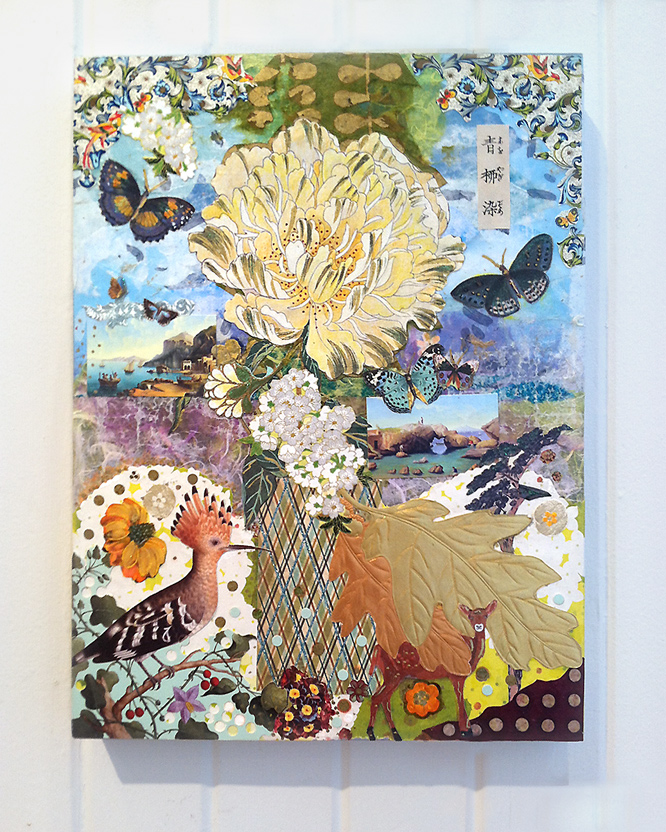
An opportunity to view works by six outstanding Louisville-based artists is worth the trip to Danville. Several major works by Meg Higgins captured my first impression. Two enormous pieces composed with transparent elements sandwiched between Plexiglas are suspended between the vestibule and grand gallery. I was equally impressed by a smaller collage on wood panel, Japanese Peony Goes to Italy, with its exquisite East-West flavor. Brad Devlin’s solid but clever exploitation of found objects yields bold abstractions that simultaneously maintain a strong environmental essence. His Open Sunday is also physically more complex than it first appears, and this allows the artisanship of his assemblage to become a secondary experience deserving of scrutiny. Masters of juxtaposition who reinforce the theme of the exhibition as well as anyone taking part, Patrick Donley, Lisa Austin and Brandon Bass each define a distinctive individual style. Approach to composition, color considerations, and a playful choice of ingredients form undercurrents that tie their pieces together, and Long knows how to modulate the walls in a way that makes groupings of their work satisfying to study. Although she has recently gained attention for her paintings, there are at least seven panels by Teri Dryden from a handsome body of work created from discarded books. Her Monteith’s Marrakesh exemplifies how her investigation successfully transcended the source material. Personally, I hope she rotates to collage again for another dynamic round of re-purposing cast-off items.
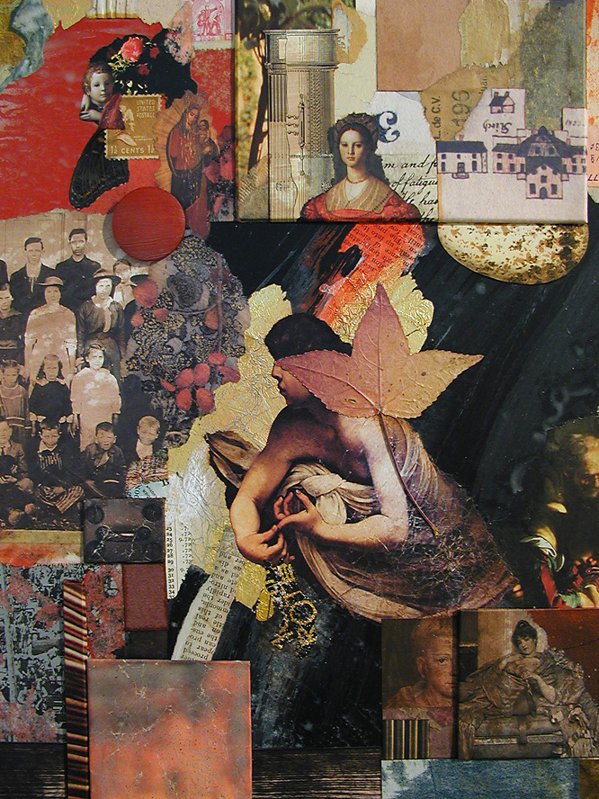
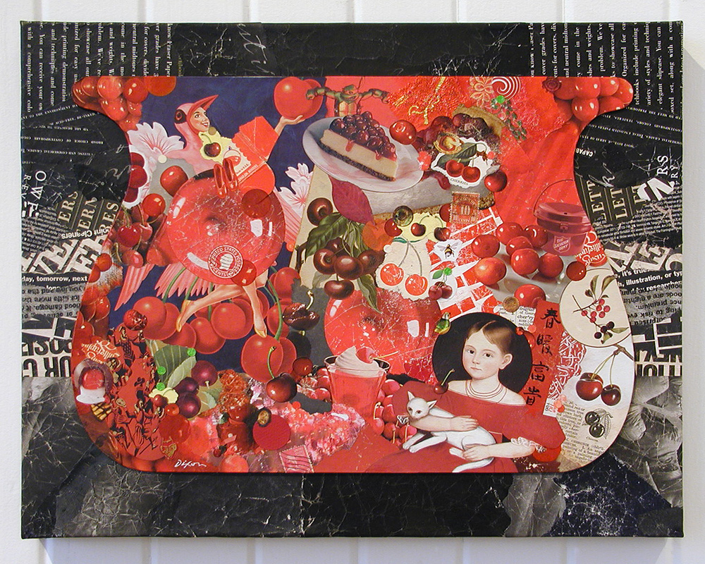
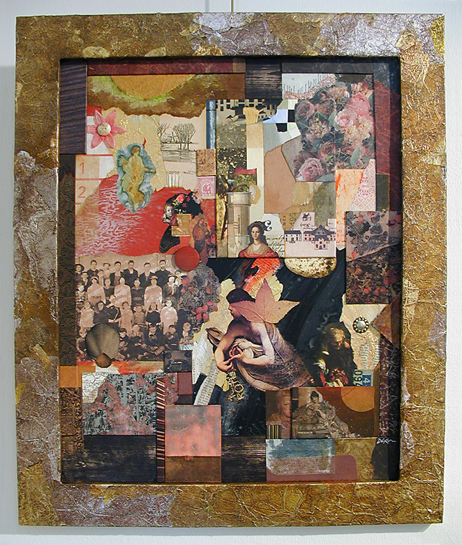
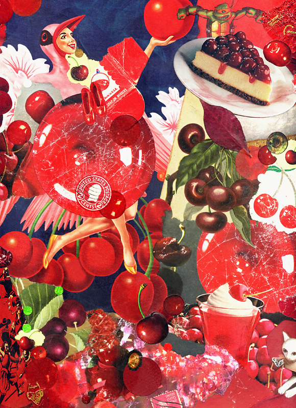
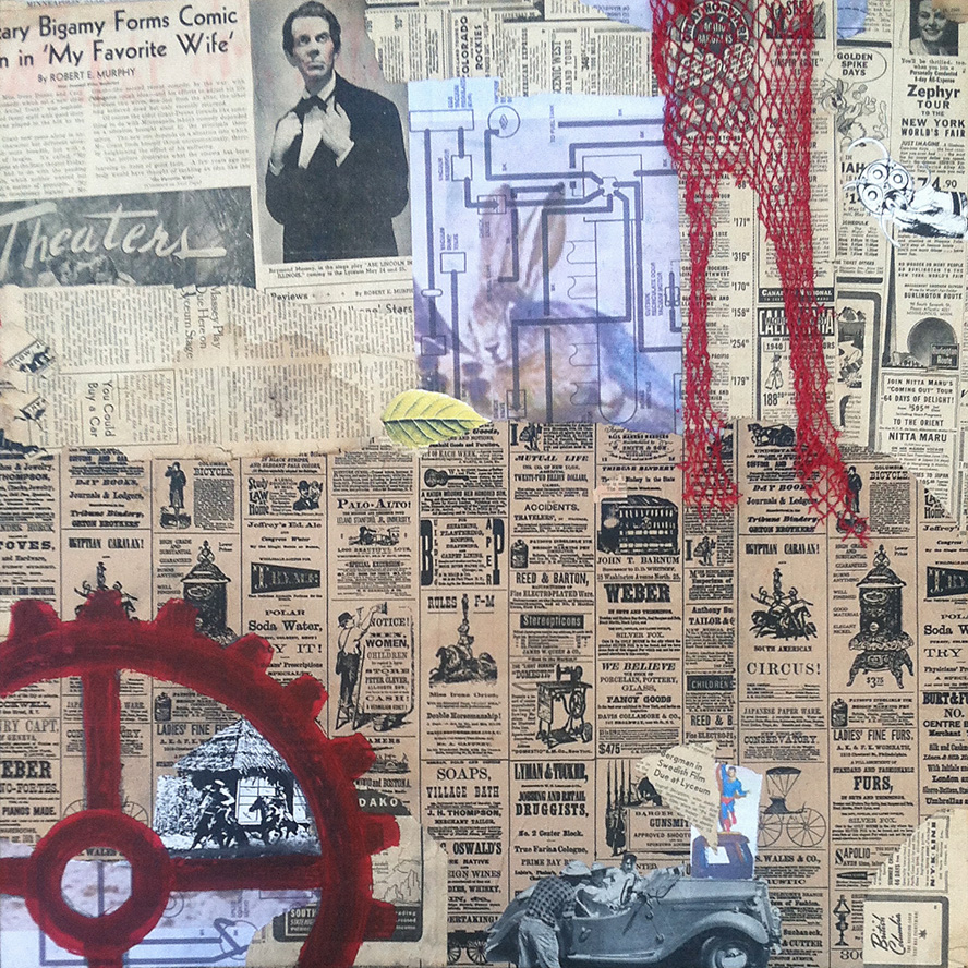
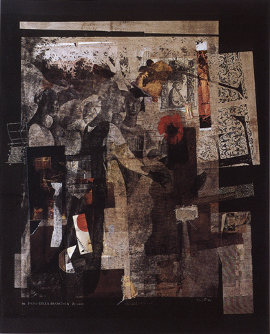
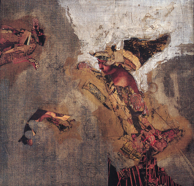
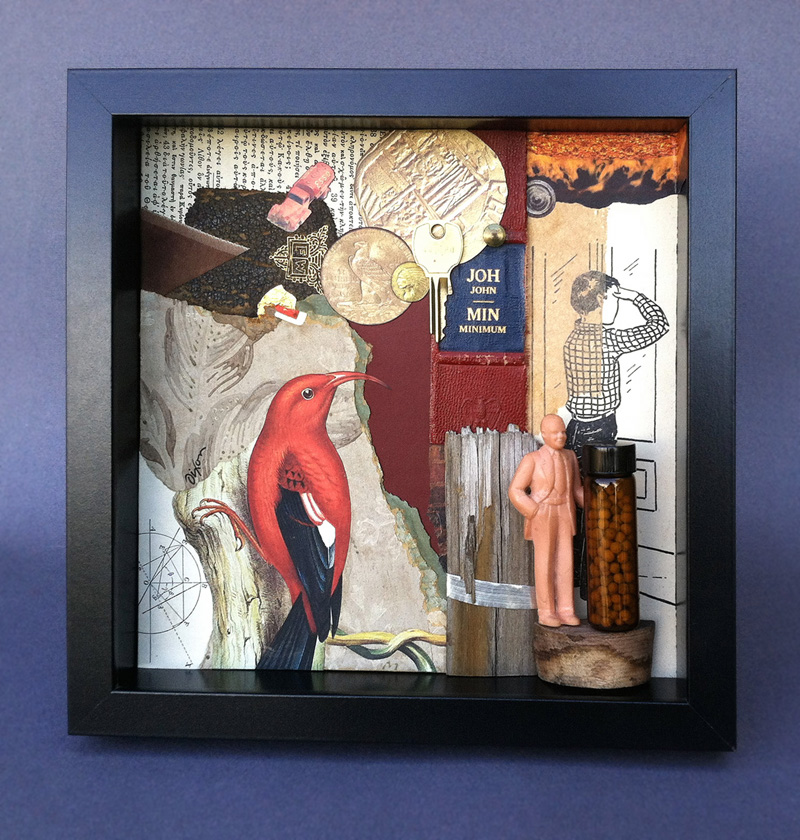
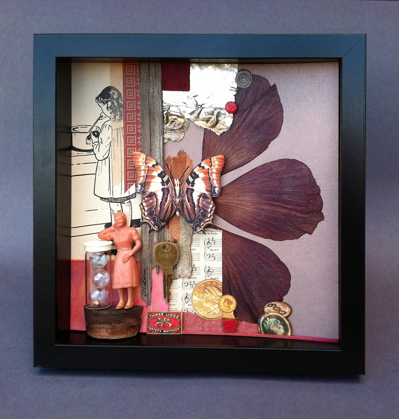
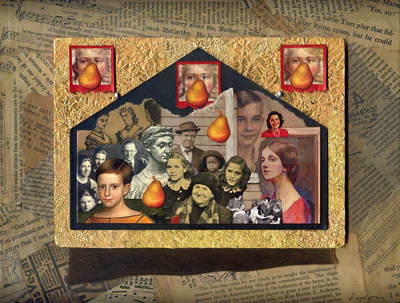
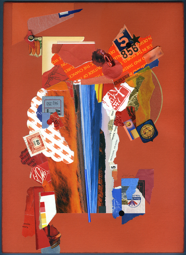
detail from Reliquia ~ collage on framed panel by John A. DixonIn addition to displaying a pair of shadow boxes, my only surrealist assemblage, and six favorite collage miniatures, JUXTAPOSE provides an opportunity to exhibit Bull’s-eye Nosegay for the first time, which I created for the Target Practice Project initiated by L T Holmes. Also, I did two larger collage artworks especially for this show. Each makes more than a fleeting nod to artists who I admire. What is it about Cherry Balm that causes me to think I just might be “tipping my beret” to the inimitable Matthew Rose? Reliquia is my tribute to the late Fred Otnes, a giant within the medium who has been a force in my consciousness since adolescence. Pearallelograms was held over from the previous exhibition at the institution, but the crowning delight for me may well be the presence of Kentucky Madonna, last year’s “finish” by Robert Hugh Hunt to my “start.” The collaborative piece is a companion to one currently hanging with the IT TAKES TWO exhibition of collaborations at the Kentucky Artisan Center in Berea. Robert and I can’t ask for more than to know that both are now available for public observation (unless someone wants to give them a good home).

I am no art historian, but I can’t help but be mindful of the pioneering artists who laid a hundred-year foundation for the sweeping diversity of this exhibition. The creative innovations of Picasso, Braque, Duchamp, Schwitters, Höch, Cornell, Johnson, and Kolář reverberate throughout the building. In many respects, all contemporary collage/assemblage is a tacit homage to these seminal influences, but that is never the only thing at work nor the only phenomena to be perceived when one indulges an exhibition of this scope. Most artists are striving for a personal means of expression informed by those who have made their enduring mark on a medium. I am convinced, more than ever, that what distinguishes contemporary collage/assemblage artists is their keen connection to the mundane “stuff” of culture and the inner need to bring a measure of order and harmony from the sheer volume of material produced by our throw-away society, with its chaotic effect on our sensibilities — to create value where none exists, or to find wonder, meaning, significance, and beauty where none can be expected.
 

Japanese Peony Goes to Italy ~ Meg Higgins, Louisville, Kentucky

Japanese Peony Goes to Italy
Meg Higgins
collage on wood panel

Open Sunday ~ B Devlin

Open Sunday
Brad Devlin
assemblage, found objects

Strength ~ P Donley

Strength
Patrick Donley
mixed-media on wood

Bird’s Eye View ~ L Austin

Bird’s Eye View
Lisa Austin
collage

Monteith’s Marrakesh ~ T Dryden

Monteith’s Marrakesh
Teri Dryden
collage from discarded books on panel

Cherry Balm ~ John Andrew Dixon, collage artist, Danville, Kentucky

Cherry Balm
John Andrew Dixon
collage on canvas
available for purchase

Reliquia ~ John Andrew Dixon, collage artist, Danville, Kentucky

Reliquia
John Andrew Dixon
collage on framed panel

•  S O L D
Spot Checker

Monday, February 22nd, 2016

“I force myself to contradict myself in order to avoid conforming to my own taste.”
— Marcel Duchamp

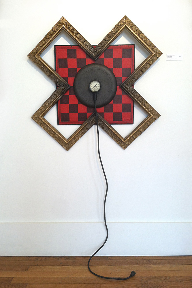
The generous invitation to create new works for JUXTAPOSE had me thinking about constructing my first surrealist assemblage, but I had no specific concept in mind. I had some ruined wood frames, ornate in style, and started cutting them with a mitre saw to form a Swiss cross. To be honest, I didn’t want to use that symbol, so it was easy to “cancel” the idea by rotating it 45 degrees, and now I had an X to “mark the spot.” Dead end? There had to be more to it than that. I shifted my attention to completing a collage, and I must have unwittingly assigned the problem to my subconscious, because I awoke after a night’s sleep with the total solution in my head. How can one explain something like that (or Dada, for that matter)?

A few words of caution, however: Don’t actually plug it in.
 
Dixon_SpotChecker

Spot Checker
assemblage by J A Dixon
30 x 30 inches (+ “tail”)
available for purchase

JUXTAPOSE opens in Danville, Kentucky

Friday, February 12th, 2016

An outstanding group show of Kentucky-based collage and assemblage artists has opened in my hometown at the local Community Arts Center, and it is an unprecedented exhibit of these mediums for our geographic area. Thanks to the support of the Corning Incorporated Foundation, curator Brandon Long has organized a must-see destination, and I am thrilled and gratified to be a part of it, along with Robert Hugh Hunt, Teri Dryden, Kathleen O’Brien, Lisa Austin, Patrick Donley, Brad Devlin, and others. With create-your-own-collage installations and multiple sets of 365 miniatures from full-year collage-a-day challenges, it is more than a typical exhibition. And where else can one experience 162 cards made available for public viewing by prolific collage collaborator Hunt, including items from his Hillbilly Voodoo series? Please pay a return visit here at this site for much more about this show!
 
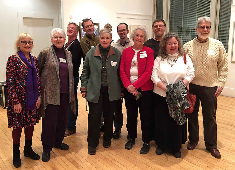
Kentucky-based collage and assemblage artists at the Juxtapose reception, Community Arts Center, Danville, Kentucky

JUXTAPOSE collage and assemblage artists at the opening reception—
Front row, left to right: Meg Higgins, Virginia Birney, Cynthia Carr,
Nan Martindale, Kathleen O’Brien. Back row: Patrick Donley, Brad Devlin,
Brandon Long, Robert Hugh Hunt, John Andrew Dixon.

162 collage collaborations
R H Hunt, T R Flowers, and various artists

detail of Cherry Balm ~ J A Dixon

Cherry Balm (detail)
collage on canvas by J A Dixon
20 x 16 inches

A Kentucky Collaboration

Monday, August 24th, 2015

“I’ve collaborated with many artists over the years but never on a project of this size. The two pieces were to be 24″ x 24″ on structured panels. What made this collaboration successful was the interplay between the two artists. We both sent numerous pictures of our starts in progress and were able to play off the ideas and techniques the other was using, in this we created a true pair of collages instead of two separate pieces.”
— Robert Hugh Hunt
 

Collaboration between collage artists is a widespread, dynamic development within a medium that has shown extraordinary vitality after its centennial milestone in 2012. This very well may be part of a broader phenomenon, due in no small way to the explosion of social media and a greater networking among artists of all kinds. I was not surprised when, earlier this year, here in my home state, the Kentucky Artisan Center at Berea announced a major exhibition called It Takes Two: Collaborations by Kentucky Artisans.

In response to this opportunity, I decided to contact Robert Hugh Hunt, an artist from Richmond, Kentucky whose work I had come to respect after we made a connection through Facebook. Both of us were aware of our geographic proximity, but had not previously met in person, nor had we collaborated remotely on a casual project. Appreciating each other’s prior work is no guarantee that two artists will enjoy the collaborative process or value the creative end result. Only by risking a joint venture will both artists find out if they actually are “on the same wavelength.” I am pleased to report that the results of my teamwork with Robert exceeded our optimistic expectations, and that one of the two pieces we created was selected for the “Takes Two” show.

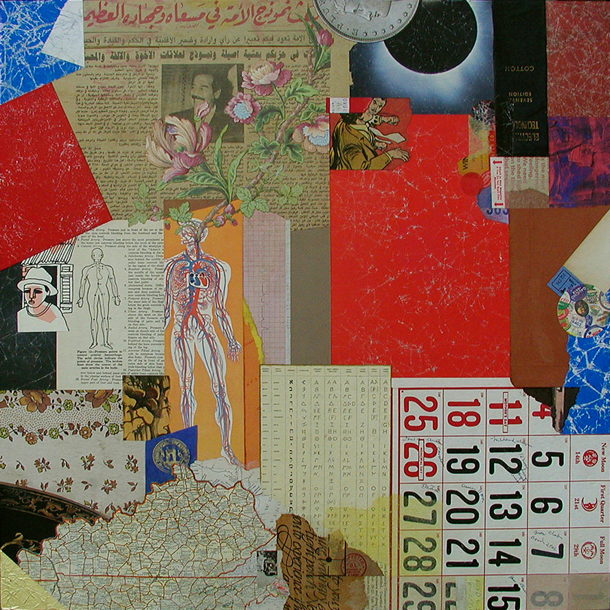
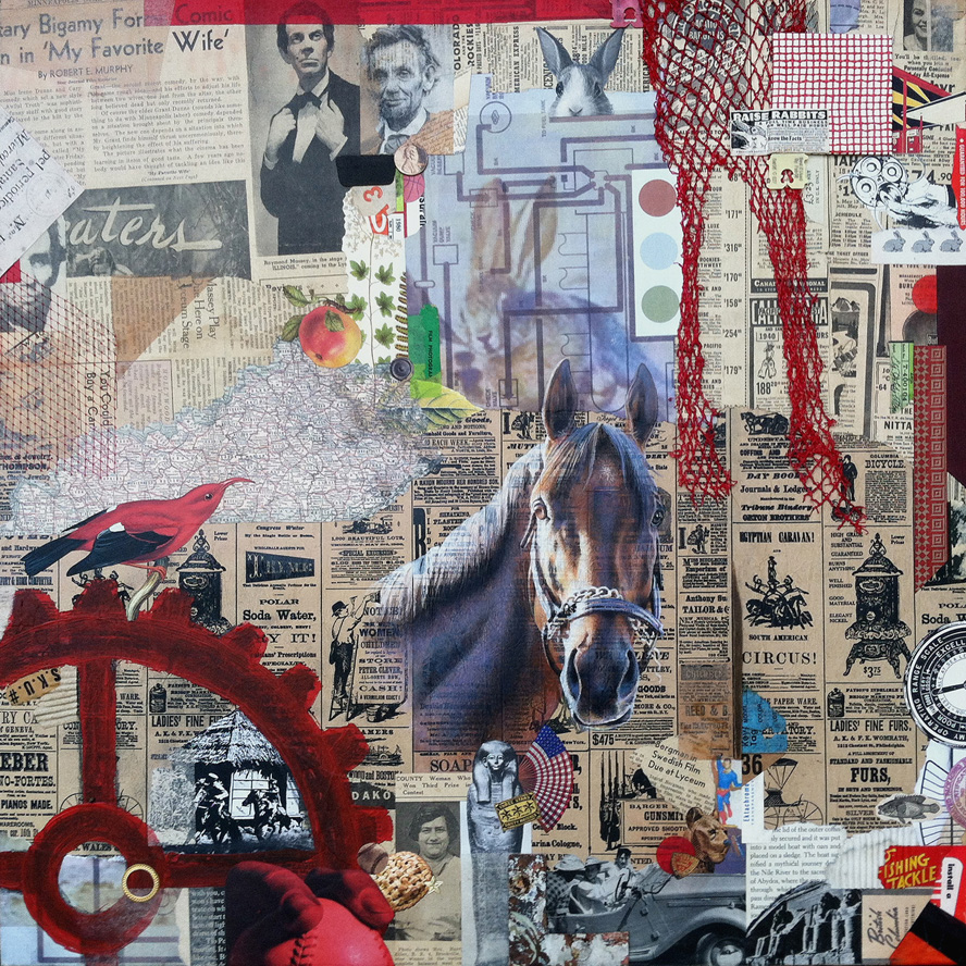
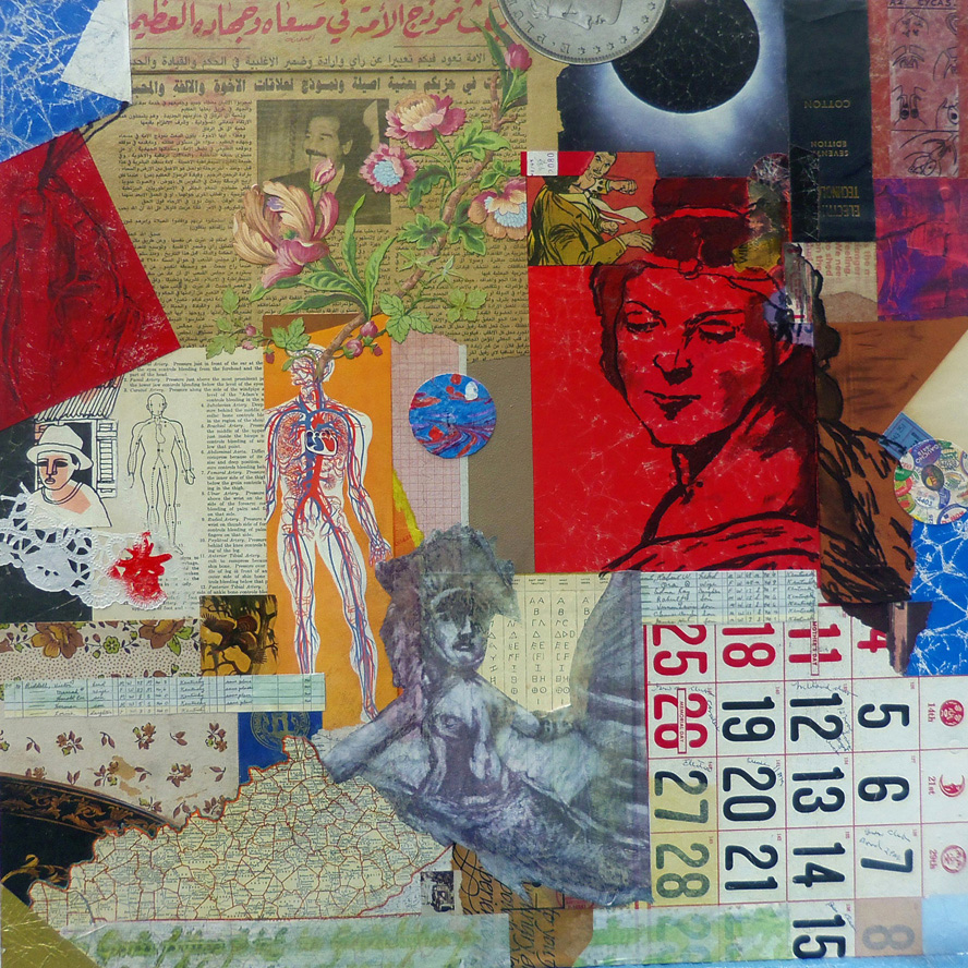
As artists, Robert and I both work regularly with combined mediums, but we chose collage as the foundation of our approach because we recognize how ideally suited it is for collaboration. There was no inclination to think small. We each fabricated larger dimensional panels and created a “start” for the other — to establish the background and organize the two-dimensional space with found material and other recycled/repurposed elements. collage collaboration ~ the start by Robert Hugh Hunt for Kentucky Sovereign ~ collage on structured panelAfter meeting for the first time (with spouses, over lunch at a delightful new Cuban eatery halfway between our studios), we exchanged the unfinished works to complete the compositions with additional ingredients and renderings. Robert’s recognized practice of layering his cut-and-paste collage artworks with mixed-media additions had already caught my attention, and his expressed aim to do the same within our collaboration inspired me to include a hand-rendered element as a focal point in my “finish,” which we titled Kentucky Sovereign. Robert’s finish, Kentucky Madonna, features multiple mixed-media treatments on top of my background shapes. The effect helps to integrate our respective techniques and to bond the artworks as a “true pair,” to use Robert’s phrase.

For my start, I began with a section of an Iraqi newspaper brought home by a member of the Kentucky National Guard. Robert made use of clippings from a 1940s-era newspaper that he got from fellow collage artist Ted Tollefson. collage collaboration ~ the start by John Andrew Dixon for Kentucky Madonna ~ collage on structured panelOur range of “merz-strokes” was unfettered, but we shared a desire to “Kentuckify” our choices, although neither of us knew exactly what we meant by that. Other ingredients include magazine scraps, printed papers, antique maps, used packaging, illustrations from discarded books, mesh bag material, tissue, fabric, plastic clasps, wood, gummed labels, metal, emptied tea-bags, produce stickers, foil, wallpaper, digital printouts, a paper doily, and more (with a modest assemblage aspect thrown in for good measure). As with any collaboration, the challenge is to discover a way to enhance the start in a complimentary manner and also to bring one’s personal approach to the finish. Our decision to avoid isolation was a good one. Images exchanged during development kept the creative energy in flux and maintained a visual cord (a common chord?) between the surfaces as they evolved separately. It was a positive experience for both of us and boosted our enthusiasm to continue as active collaborators.

Thanks, Robbo!
 

finish by John Andrew Dixon for Kentucky Sovereign ~ a collaboration with R H Hunt ~ collage on structured panel

Kentucky Sovereign
a collaboration by R H Hunt and J A Dixon
collage on structured panel, 24 x 24 inches
(start by Hunt, finish by Dixon)
selected for It Takes Two: Collaborations by Kentucky Artisans
available for purchase

finish by Robert Hugh Hunt for Kentucky Modonna ~ a collaboration with John Andrew Dixon ~ collage on structured panel

Kentucky Madonna
a collaboration by J A Dixon and R H Hunt
collage on structured panel, 24 x 24 inches
(start by Dixon, finish by Hunt)
available for purchase

Fred Otnes, 1925–2015

Monday, August 17th, 2015

“Otnes abandoned the narrative style… The move set him apart from other commercial artists of his time, and his willingness to embrace the abstract and chaotic nature of collage put him in high demand during one of the most turbulent decades of American history.”
— The Saturday Evening Post, 2015

“Fred Otnes brings to his collage paintings a classical refinement and control that makes poetry out of chance pictorial effects. He dips into early Cubist collage techniques, touches Florentine and Renaissance bases, and reverses Dadaist chaos into gorgeous homages to order.”
— Maureen Mullarkey, 2002
 

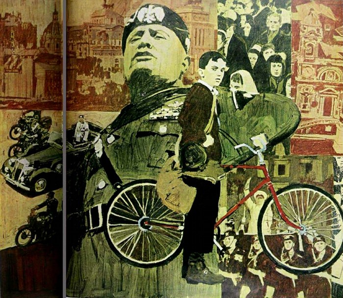
I just learned about the death of artist/illustrator Fred Otnes. I tend to focus here and in my own practice on the acknowledged masters of fine-art collage, but Mr. Otnes certainly had a greater influence on me during my formative years and during the period of my life devoted to “making it” as an independent illustrator and designer. He is rarely included among the seminal figures of 20th-century collage, but he should be. Allow me to back up a bit and reveal some of my own story.

In the 1960s I had four different art teachers in four years of high school. I resist being unkind, but each one of them was worthless. I had some talent, so there was no reason to spend time with me. I was left to fend for myself, because, apparently, it was more urgent to actively babysit the class goof-offs. By sixteen I was investigating the available correspondence coursework. No one thought to tell me about the Dayton Art Institute in the closest big city. I don’t think I even realized how desperate I’d become. What others might have viewed as crass merchandising was a Godsend for me. I responded to an advertisement from the Famous Artists School and completed the test. A representative actually paid a visit to discuss the home-study course that would provide the fundamental art instruction I’d been missing, and I begged my parents to let me give it a shot. They said, “Okay,” and I am grateful for this simple consent — access to legitimate art educators would be mine. I acknowledge now that their “Course For Talented Young People” was a marketing experiment, an attempt to leverage the successful adult course with a younger demographic. That meant nothing to me at the time. This was the school endorsed by Norman Rockwell, and I was a charter student! Although my Mom eventually had to cajole me into keeping abreast of the challenging lessons, a sea change had occurred. I was at long last formally introduced to the world of fine and applied artists. Among those that impressed me most was someone named Fred Otnes.

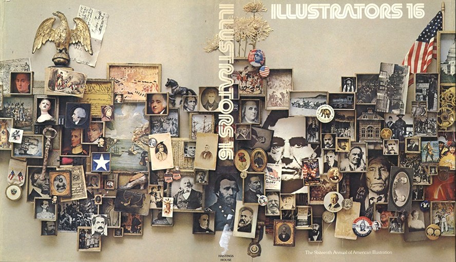
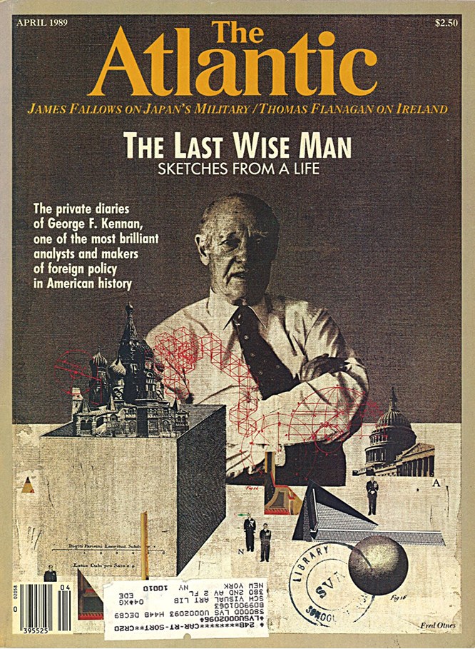
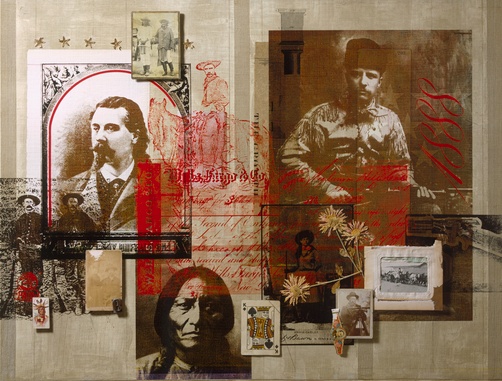
I was a peculiar kid who got more excited about magazine illustrations, corporate trademarks, television animation, and the Sunday comics than I did about “museum art.” The work of Otnes touched me in a way that would take decades for me to unravel. In my youth, not being able to figure out how an artist created something was usually paired with disinterest, but his work affected me in the opposite way. His graphic synthesis of images, engravings, diagrams, and language exposed a realm that I could aspire to enter. Even as an experienced pro, I continued to find his technique mystifying. I was relieved when legendary illustrator Mark English said, “I don’t even know how he did them, the mechanics of printing, photography and all the things he did to put them together.” Suffice it to say that in a profession biased against the creative explorer, Fred Otnes braved a path that few, if any, realized was there, successfully made it his own, and became one of the most distinctively recognizable, highly honored applied artists of his generation.

For many years, through the Illustrator’s Workshop, Otnes was a teacher and mentor, and, like others in the field, spent his later years expanding his personal style as a gallery artist. Whether applied to editorial or commercial use, the creations embody his profound respect for subject matter. If there is something elusive in his work that will continue to inspire me, it is this — I shall always hold in high regard the sense of “reverence” he brought to each layered plane of expression, to every choice of color or texture, to the symbolic meaning of each ingredient, and to the aesthetic harmony of the whole.
 

Otnes_Mussolini_1966

The Day Mussolini Dies . . .
Saturday Evening Post illustration by F Otnes, 1966

Society of Illustrators 16th Annual ~ cover by F Otnes

Illustrators 16
Society of Illustrators Annual cover by F Otnes, 1974

Atlantic cover by Fred Otnes, April, 1989

The Last Wise Man
Atlantic cover by F Otnes, 1989

National Geographic illustration by Fred Otnes

(title unknown)
National Geographic illustration by F Otnes (rights managed)

Piero ~ traditional collage by Fred Otnes

Piero
traditional collage by F Otnes, 1994

A Tragic Princess ~ collage painting by Fred Otnes

A Tragic Princess
collage painting by F Otnes, date unknown

Liagre ~ Fred Otnes ~ 2002

Liagre
collage painting by F Otnes, 2002

Not So Big

Monday, August 3rd, 2015

“Shadow boxes become poetic theater or settings wherein are metamorphosed the elements of a childhood pastime.”
— Joseph Cornell
 

The creations of Joseph Cornell are small, and remained so throughout his unusual life as an artist, even as many of his contemporaries responded to the fashion of producing ever larger works. For me, a salute to this influential American seemed like the fitting approach when I decided to enter notBIG(3), an annual juried exhibition devoted to small art. I am pleased to have had a piece accepted to this show, which hangs from 8/11 to 9/11 at Lexington’s M S Rezny Studio/Gallery.

The “poetic theater” of little shadow boxes is not an isolated medium in collage/assemblage. To consider one’s activity in this comprehensive oeuvre as anything but an homage to Cornell would be an act of mild self-delusion. His singular, enduring presence overarching the genre must be acknowledged. There was a concern that my taking this approach with the notBIG(3) entry might appear to the juror as too derivative, but I pushed ahead with the “sincere flattery” of my plan. I had failed to crack this competition in its previous calls to artists, and I had hopes that the third time would be a charm for me. In addition, I wanted to assemble a range of ingredients outside my norm, including metal, wood, organic material, glass vials, and vinyl dimestore figures.

I created and entered two works as a pair — Histopia and Hertopia — a dual allusion to Utopia Parkway and its significance to the art history of the 20th century. It was not possible to enter both as a combined entry because the dimensions would have exceeded the size limitation of 12 x 12 inches. Only the first shadow box was selected. I was delighted to learn of my getting in the show, but it came with a small serving of disappointment, knowing that the gender balance of my overall idea would be lost with the “boy scene” presented to viewers by itself. It is something I can accept. Out of 380 works submitted, the 45 artists who make up the exhibition have a single artwork included. At any rate, this is what blogsites are for. Both pieces can be viewed together, and I have the opportunity to explain the whole thing to anyone kind enough to read this far. I also anticipate that many of you will be able to visit what appears to be shaping up as a strong exhibition. The opening reception is Friday evening, August 14th, 5 to 8 pm.
 

Histopia ~ collage/assemblage in shadow box frame by John Andrew Dixon

Histopia
collage/assemblage in shadow-box frame by J A Dixon
10 x 10 x 1.75 inches, available for purchase

Hertopia ~ collage/assemblage in shadow box frame by John Andrew Dixon

Hertopia
collage/assemblage in shadow-box frame by J A Dixon
10 x 10 x 1.75 inches, available for purchase

Pearental Discretion

Wednesday, February 4th, 2015

“When people think about creativity, they think about artistic work — unbridled, unguided effort that leads to beautiful effect. But if you look deeper, you’ll find that some of the most inspiring art forms, such as haikus, sonatas, and religious paintings, are fraught with constraints. They are beautiful because creativity triumphed over the ‘rules.’ Constraints shape and focus problems and provide clear challenges to overcome. Creativity thrives best when constrained.”
— Marissa Ann Mayer

I have been intrigued by the recent work of participants in the Matchbook Collage Collaboration Project. Collage artists, whether working alone or in collaboration, are increasingly known for imposed restrictions — time, scale, format, or ingredients. Early on I gained a healthy respect for the power of parameters, most likely because I was educated as a designer and trained as an applied artist. Years later, this respect was amplified significantly when I witnessed my nephew create thousands of 101-word stories as an exercise in creative writing.

A big part of managing open-ended potential when initiating new work is to dig for an “inner assignment” that limits the options and sparks a creative impulse. Another good catalyst is to look around for an external constraint. I enjoy reacting to calls-to-artists that focus on an organizing concept. Even if I don’t actually apply, the triggered intuitive process can be informative. Here is a piece that I just finished in response to the exhibition theme of “Home.” In addition to framing the possibilities, it provided an opportunity for me to work more three-dimensionally, explore color scheme limitations, and further investigate the combining of found materials.
 

Pearental Discretion ~ John Andrew Dixon

Pearental Discretion
mixed-media artifact by J A Dixon
11.25 x 9.25 inches
available for purchase

Is there no help?

Sunday, January 11th, 2015

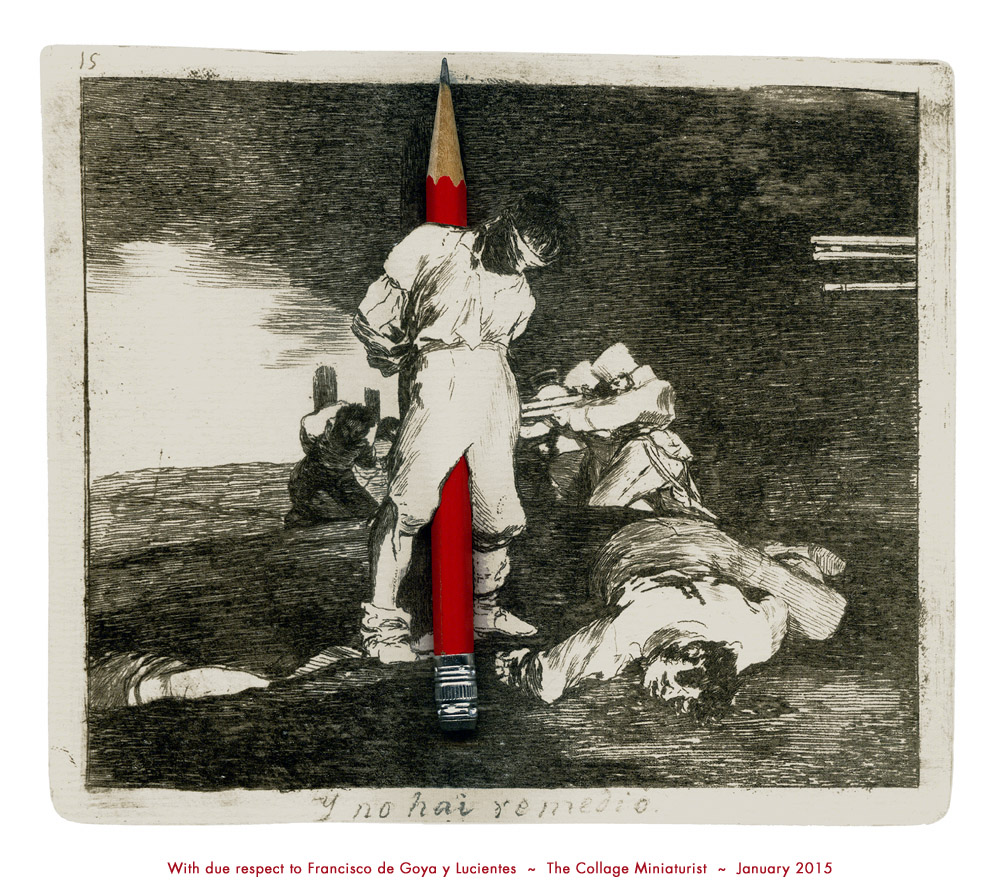
With due respect to Francisco de Goya y Lucientes ~ John Andrew Dixon


On reworking a “finished” piece . . .

Wednesday, November 27th, 2013

“. . . the completion of a work is only ever an abandonment, a halt that can always be regarded as fortuitous in an evolution that might have been continued.”
— Paul Valéry

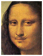
Whether one thinks of the anonymous medieval monk embellishing a pre-existing manuscript, of Leonardo da Vinci working on the surface of his older painting, or of George Lucas making alterations to the original Star Wars trilogy, there is a long and sometimes controversial history of “refining” creative works already accepted as finished. I remember reading about Asian masters who thought nothing of making additions to artworks created in earlier eras. Apparently some art historians believe that halos were added to religious masterpieces much later. Duchamp did not draw those whiskers on the actual Mona Lisa, but he might have, had he been able to get away with it. What has all this to do with collage? Perhaps our entire genre came into being with the essential hunch that worthwhile art could result from revising something in contrast to its original purpose or frame of reference.

There is a wide spectrum to consider, if the subject under discussion is “altered art.” We might be talking about anchoring the concept for a collage on a singular appropriated image or transforming a mundane object into a new work of art. (L T Holmes recently shared a multi-part, personal tour of her Don’t Get Jittery On Me.) Or we might be referring to the simple idea of returning to a work already deemed complete and “writing a final chapter” to improve it. Think long enough about this topic and you may ask yourself whether any artwork is ever really done. Going back to Leonardo and Lucas for a moment, both turn up from time to time in attributions that suggest they also may have altered a version of the Valéry quotation more pithy than the poet most likely ever expressed.

“A poem is never finished, only abandoned.” — Paul Valéry
“Art is never finished, only abandoned.” — Leonardo da Vinci
“A movie is never finished, only abandoned.” — George Lucas

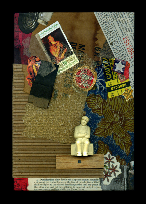
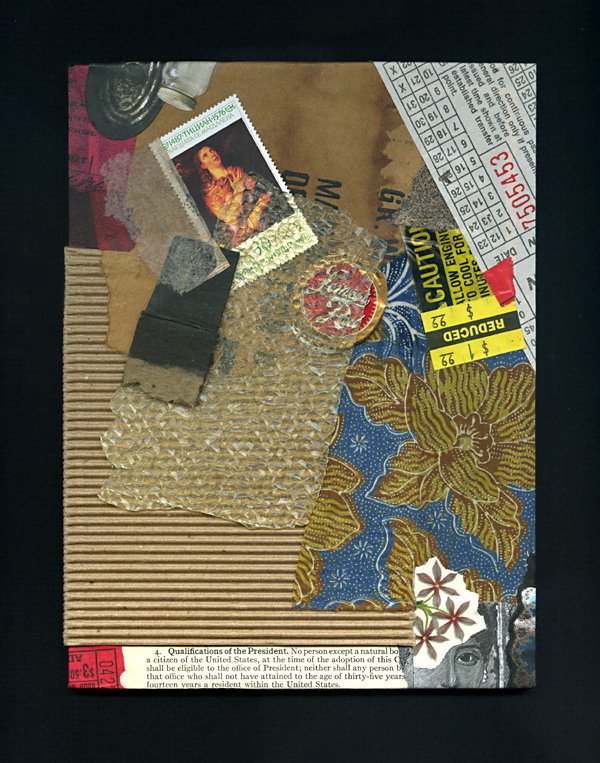
Forgive me if all of this undue rambling merely serves as an opportunity to highlight two “finished” collage artworks that I recently chose to revisit. Both examples also illustrate the complications of visually comparing two images created with different digital devices. After writing about a corresponding issue last week, I have since discovered S Caswell-Pearce’s related words from an April entry at paper with a past. My images for Rhapsody with Fever Chills demonstrate the same scanner/camera differential, although the scan of the new version is a better rendition of the artwork’s strong complementary effects. (This piece is currently on display with the “Seeing Red” exhibit in the McKinney Conference Center at Kentucky’s Constitution Square Historic Site.) The digital documentation of a revised Broken Qualifications, having shared the original version previously at this site, became a bit more challenging the second time around, given the addition of three-dimensional ingredients. At any rate, neither piece had ever felt fully resolved, although I had no specific plans to “reopen the case” until I made a broader reassessment of my inventory. Did I enhance them, ruin them, or just squander my time? You be the judge.
 

Rhapsody with Fever Chills
collage on paper by J A Dixon
7.5 x 10 inches, available for purchase

Broken Qualifications
collage/assemblage by J A Dixon
6 x 8 inches, available for purchase

Shadows of Joseph

Monday, February 11th, 2013

“From the beginning he had responded to the avant-garde developments of his time with admirable swiftness and sureness. It is hard to think of another American artist who was receptive to so many different art movements or who managed to win the admiration of everyone from the Surrealists in the 1940s to the Abstract Expressionists in the 1950s to the Pop Artists in the 1960s. Artists who agreed on little else agreed on Cornell.”
—Deborah Solomon

“The central themes of Pop Art were sub-culture, folk cultures, media imagery, new technologies, design, the consumer goods and engineering industries, the inter-relationships between these phenomena and their effect on human beings.”
—Tilman Osterwold

Osterwold’s analysis suggests that traditions, fashions, and even avant-gardist achievements could no longer be the norm after Pop Art, which swept away the boundaries of artistic development with its focus on a “consciously perceived and reflected present-day existence.” Having just finished Deborah Solomon’s biography of Joseph Cornell (Utopia Park: The Life and Work of Joseph Cornell), I am struck by how Cornell anticipated Pop Art with his focus on the appropriated elements of mass culture and his various obsessions with celebrities, while at the same time demonstrating an abiding indifference to the cult of personal fame so typically associated with the movement. Walter Hopps stated that Cornell was “Schwitters’ greatest successor.” Cornell was certainly aware of Schwitters, for he was highly cognizant of nearly everything about the onrushing stream of modern art (in contrast to the misconception that he was some sort of urban hermit), but the precise lineage of artistic influence may never be fully known. Perhaps it was Cornell’s connection with Max Ernst that is a key factor. In my opinion, Ernst was not a giant of 20th-century collage, but did have a vital influence on the genesis of Cornell’s art. It is well recognized that Joseph began and ended his unique body of work with the medium of collage. One of the things that astonishes me is how he could be so attuned to the advancing frontier of present-day art (often staying a step or two ahead of it) and, at the same time, carry such a personal dysfunction that derived from the driving intensity of his inner world. Was that the nature of his genius? At any rate, his strange but amazing ability to synthesize powerful emotional and cultural content by inventing (virtually from scratch) a distilled form of assemblage continues to set the standard for almost everything in the mix of media that has followed in its wake. Hardly a day goes by that I don’t observe an artwork that can be traced directly to his seminal vision. But rarely do I see another artist infuse their juxtapositions with a rich symbolism to compare favorably with his complex associations. Most of the art I see with an obvious Cornellian tone owes more to surrealist automatism or atmospheric illustration than to the intricate blend of embedded meaning and refined intuition that characterized his enduring originality.
 

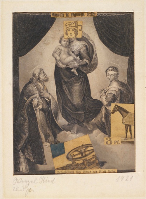
Knave Child
Kurt Schwitters, 1921
Collage on paper
Sprengel Museum, Hannover.

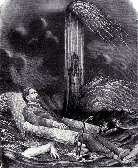
plate from La Femme 100 Têtes
Max Ernst, 1929
Collage novel
Published Éditions du Carrefour, Paris

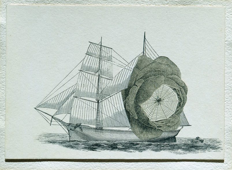
Untitled (Schooner)
Joseph Cornell, 1931
Collage on paperboard

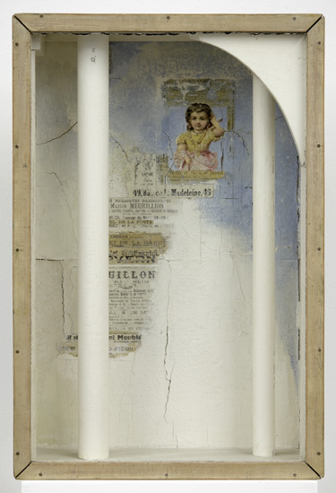
Untitled (Girl and Two Columns)
Joseph Cornell, c. 1950
Glass, wood, tempera and printed paper collage

Circe III — Surface and Volume in Nature
Joseph Cornell, c. 1961-66
Collage on masonite

Is it or isn’t it?

Wednesday, November 14th, 2012

“Man himself is mute, and it is the image that speaks. For it is obvious that the image alone can keep pace with nature.”
—Boris Pasternak

Those who speak or write as though they understand everything about this medium do not know what they are talking about. But, to be honest, I have never met anyone who behaves that way, so perhaps my opening declaration is meaningless. Sometimes it is even difficult to classify what we do as artists in order to place the effort in some category. I just encountered an interesting chunk of round-table discourse by a new online discussion group struggling to define their area of focus. Most distinctions made between what artists call collage, montage, assemblage, construction, layerism, mixed-media, digital art, illustration, or graphic design are somewhat arbitrary, and we continue to see new terms coined by those who hope to distinguish what they perceive as a unique approach. At any rate, the intent of the artist is central. Clearly, definitions in art are rarely necessary except when attempting to trace a cross-pollination or lineage of influences, and when an organized effort or exhibition requires mutually acknowledged parameters. Additionally, there are always other important considerations to discuss, such as: What is an original? What is the relationship between process and artifact? What is the purpose of reproduction? Does a nomenclature based on exclusion have intellectual validity, or is it simply an adjunct to merchandising?
 

A likely story indeed! ~ J A Dixon

A likely story indeed!
collage miniature by J A Dixon
4 x 6 inches
 
Purchase this artwork!