“While many modern-day album artworks tend to favor strict minimalism, The Beatles make a serious case for going bold and wacky without any type of restraint.”
— Nicole Singh
As promised, I’m devoting an entry to the project that kept me out of the collage studio for at least a dozen weeks. I shall beg your forgiveness at the outset for delving into the details of a digital process. Not only has this site kept a seven-year focus on traditional cut-and-glue techniques, but I haven’t indulged the applied-arts side of my multiple personality as a graphic artist. I’m going to depart from that now — perhaps just this once — because it’s been an extraordinary circumstance for me, and a few of you may find the description worthwhile. At any rate, I encourage everyone to read Patrick Roefflaer’s article for a story that is genuinely more interesting than mine!
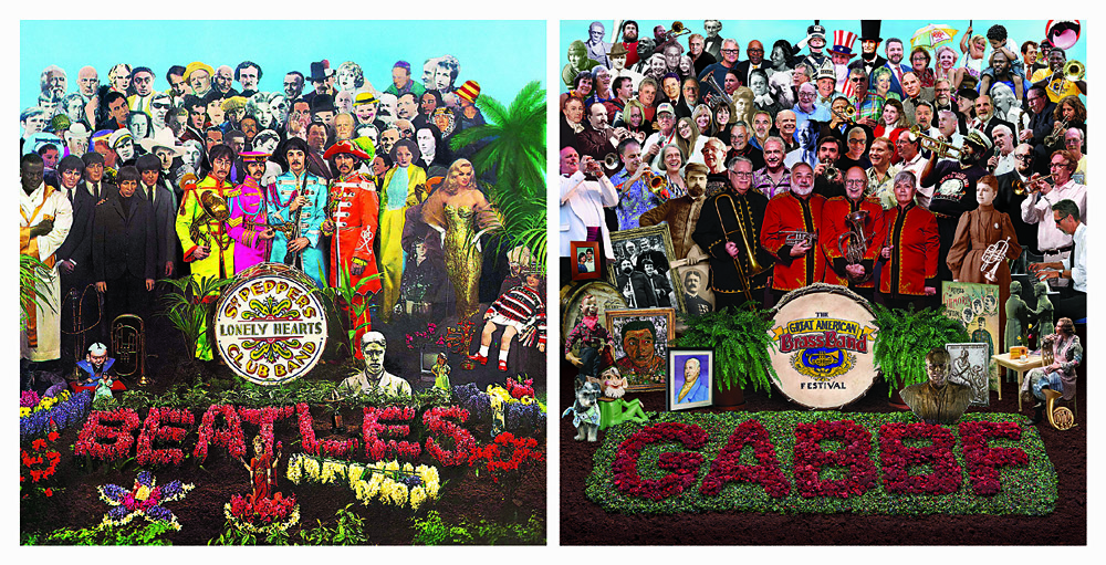
Not so long ago, a prominent local musician and former brass band director took me aside at an exhibition opening. Based on her recognition of my fondness for collage, she asked me if I would take on a visual homage to the Sgt. Pepper’s album cover design. The purpose would be to mark the 30th production of the Great American Brass Band Festival, held each June in our hometown of Danville, Kentucky.  It had always been her dream to link the announcement of her retirement at the annual weekend of concerts to the classic album, with a medley of tunes arranged for brass instruments. Sadly, a severe health crisis had forced her early retirement before that could happen, but she preserved hope that a multi-discipline Beatles tribute for the festival’s upcoming milestone might happen in 2019.
I’d already designed nine posters during the festival’s lifespan. To create a tenth was tempting, and this idea had a barbed hook. It really snagged me. My previous experience offered no sense of proportion about the magnitude of time to which I was committing myself when I said, “Sure.” The first obstacle was whether we were allowed to do it at all. we soon discovered that an enormous number of entities had made a visual salute to the famous image over the past fifty years, and that it had already become a ritual of pop culture, in spite of the complexities involved. There’s even a website that shows over a hundred previous parodies. Before long, we had mutually decided that it might as well be our local festival’s turn to pay homage.
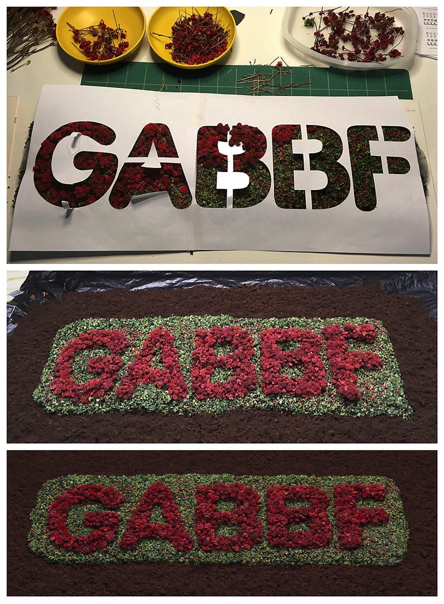
 The assignment was now in my lap, and I was overwhelmed with a desire to do it justice and exceed expectations. I found inspiration in filmmakers who I admired (like John Frankenheimer or Robert Altman), because their time-consuming approach would be required for what I’d bitten off. I wanted to bring the same passion, attention to detail, and collaborative leadership to my effort. I ended up shelving all other priorities and putting a ludicrous amount of time into the project, but not without the help of many partners. First and foremost was my wife, Dana, who jumped in head first to play a key part in nearly every aspect of the creative enterprise. After getting advice from an experienced model railroader, she began crafting a miniature flower garden to display the festival acronym for a mandatory foreground allusion. More than once, she would come back to the unfinished artifact to find that its spongy base had “spit out” some of the “flowers.”
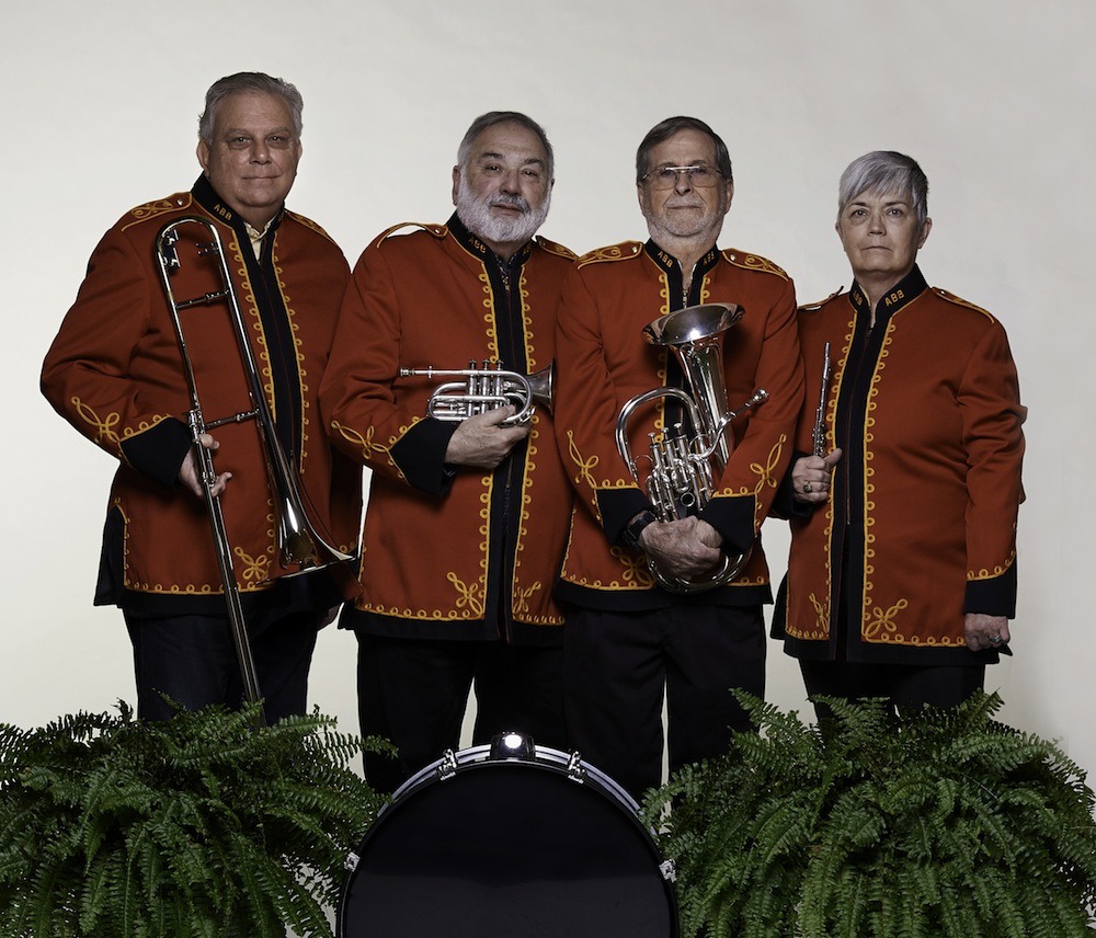
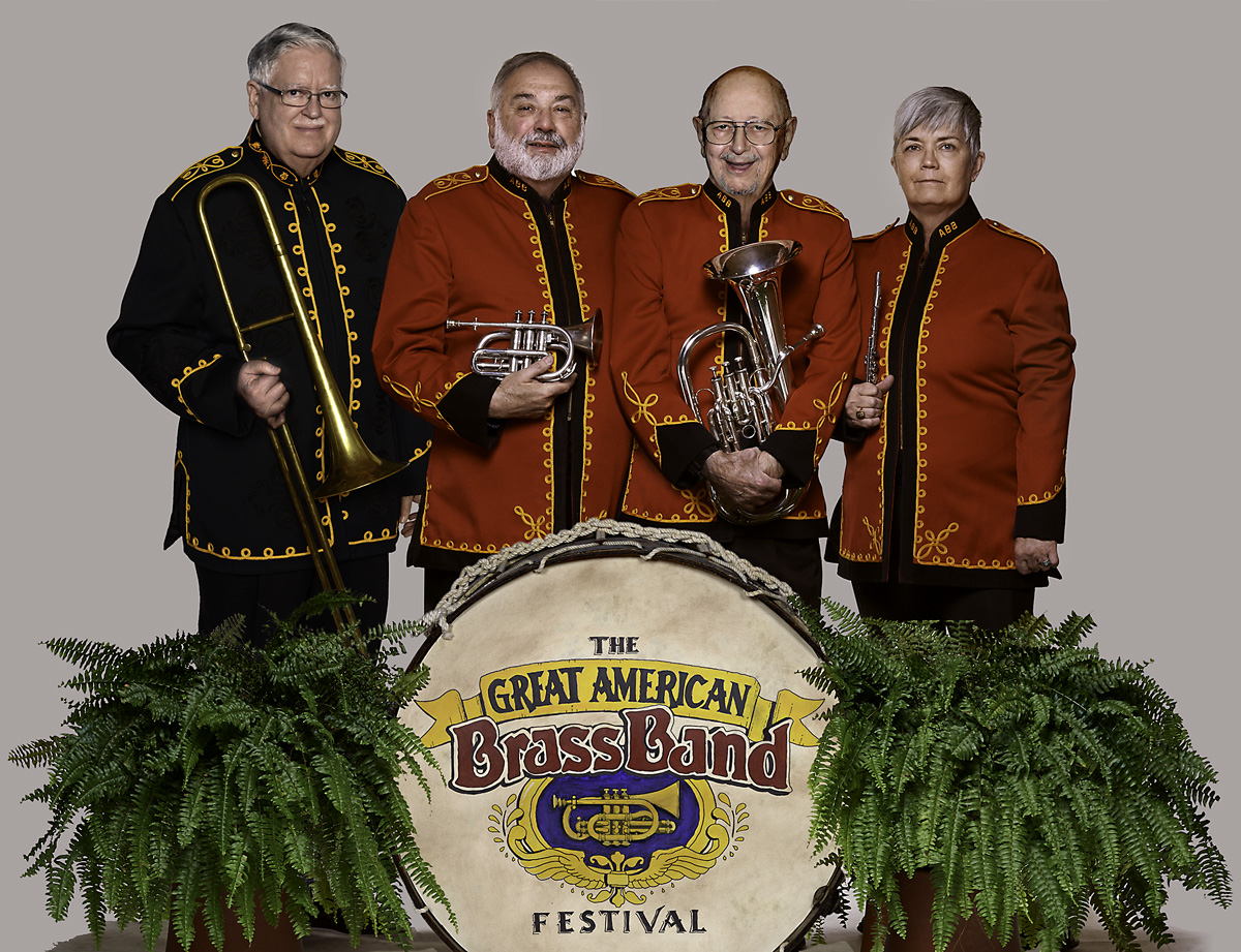
The rest of it hinged on two important elements — whether we could pull together our own “Fab Four,” and then surround them with a crowd of numerous figures.  It was determined that the Beatles would be “represented” by the previous directors of the Advocate Brass Band, a Golden-Age-style band associated with every festival. Their initial formation to color a political rally in 1989 was a direct influence on the organizing of the annual event itself. This made perfect sense because the foursome would include the festival’s pair of co-founders and their band uniform jackets, although not psychedelic, would be an effective visual reference point. We immediately knew that some digital sleight of hand would be called for, since only two of the four were locally present.
 One was near a university town many counties away, and the fourth had moved to a distant state. It took lots of coordination to solve that equation, and we pulled it off with the crucial participation of my friend, photography pro Bill Griffin, who took time away from his day job of wealth management. In keeping with the guiding theme of “a little help from our friends,” getting all the ingredients for the poster art to coalesce would demand the magnanimous assistance of others — furnishing space, props, and standing in at our photo shoot, plus image research and acquisition.
At a certain point, I began to focus on researching the background “crowd of fans,” to honor the countless performers, organizers, sponsors, staff, and volunteers who made three decades of festivals possible. It became a daunting, complicated task of culling and selection. I realized that the poster would be the size of a picnic table if everyone who deserved to be on it were included. The original setup by Jann Haworth and Peter Blake was peopled with life-size, hand-tinted cut-outs that imposed a certain physical limitation, and it was fabricated within two weeks. A virtual approach was too open-ended for comfort. There was a limit to how methodical I could become in choosing ingredients for the montage of faces. The solution was to approach it more intuitively, as I would any of my “maximalist” works.

All collage art worthy of the name is irrational at some level, and one of the reasons the original Beatles art is so iconic is the sheer illogic of it. And so, for us, that idea led to a few incongruous personalities, such as Carrie Nation and Howdy Doody. The final assembly was challenging, painstaking, rewarding, and fun, all at the same time. After refining the list of candidates and compiling the source files, each master image had to be sillouetted, retouched, color balanced, and optimized for inclusion. It seemed like the rearranging would never end before every element of the composition appeared to “belong.” I shall confess that I do not possess a powerhouse workstation. The increasing quantity of digital layers in Photoshop had to be continuously merged to prevent the composite file from paralyzing my Macintosh. Even so, it would often exceed 500 MB in size. I tried to save and back up as often as feasible without breaking stride, but there were periodic freezes that would result in “three steps forward and two steps back.”
 There should be no misunderstanding, however. The marathon endeavor was punctuated by many fortunate, often astonishing developments. One of our “Fab Four” individuals made a vital connection with an outstanding photographer in Athens, Georgia, who went the extra yard in matching my parameters for an important superimposition of the black-suited Dr Foreman. He also shot an antique bass drum to add another convincing Sgt Pepper’s touch — the same one that appeared on the festival’s first poster in 1990, and it still had the original, hand-painted emblem! Dana took the lead in preparing the poster “mechanical” for offset production, as she always has done for Dixon Design. She also knocked one out of the park during the solicitation of bids. As a contribution to the landmark production, Mike Abbott of Thoroughbred Printing agreed to produce the job at cost, and spent an hour with the press operator, Dana, and me, making sure we were satisfied with the quality.
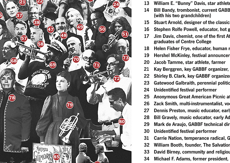
 Our closing duty was to devise a printable key for identifying all the individuals and design elements. My original idea of including a longer “blurb” for each line item quickly became far-fetched when producing the abbreviated version dragged on. By the time we declared it done, the “labor of love” vibe had been exhausted. There wasn’t much love left in the air, and I just wanted all of it to hit the street, which it has, of course, and the positive response has been even more than I anticipated.
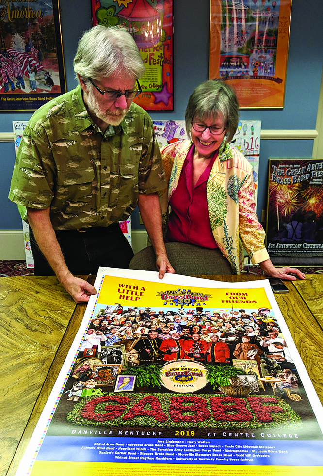
This post is already far too long, so I won’t get started on my Eva Marie Saint story, but I need to explain why we included a picture of the creators, and then I’ll finish up on an appropriate collage note. I was adamant that I would not fall prey to the Hitchcock Urge. I had no interest in, nor justification for, inserting myself, since I was making so many brutal choices to leave others on the cutting room floor. Dana was in total agreement, but the team of people who helped with the proofing process took an opposing viewpoint. Their collective drum beat was that the final rendition must include us! You can see that we eventually waved the white flag and stuck a small portrait on top of the Bourbon barrel.
A tiny figure seated at a kitchen table was provided by the Great American Dollhouse Museum as a nod to the Shirley Temple doll in the original composition, which also featured a Madame Tussauds wax figure of Sonny Liston on the opposite side. I knew there had to be a way to include Kentucky’s own Muhammed Ali in our version. Rather than take unavailable time to solicit permission to use a photograph that might get buried in the sea of faces, I turned to my friend Robert Hugh Hunt, who kindly let us insert the extraordinary collage portrait from his 20th Century Icons series!
Oh, I get by with a little help from my friends!

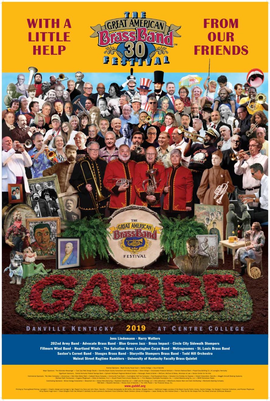
30th GABBF Poster
digital homage by Dana and John A Dixon
24 x 36 inches
Purchase one now!
Online order page includes a printable key to identification,
plus a ‘special thank you’ to all our essential collaborators!
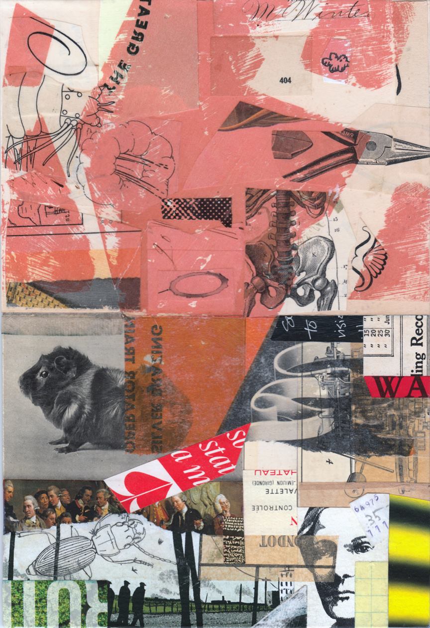
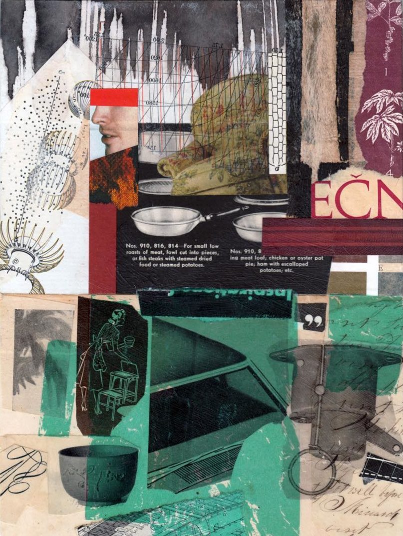
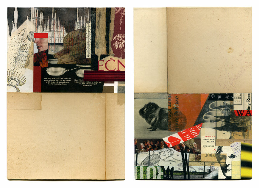 of partners. I knew from our previous collaboration that we could use the other’s stimuli to great benefit. After I received Allan’s starts, I waited until I’d sent him mine (this one with an Abyssinian cavy, and this one with roasting pans) before I finished my half of each lively “conversation.”