Archive for the ‘Applied Arts’ Category

Assignment: Mars

Monday, December 22nd, 2014

“I would do ‘John Carter’ again tomorrow. I’m very proud of ‘John Carter.’ Box office doesn’t validate me as a person, or as an actor.”
— Taylor Kitsch

One of the more exciting developments for any artist is the request for original artwork based on an interesting theme. Whether it is for personal or commercial purposes, the medium of collage is ideally suited for commissions, and the process can make use of visual ingredients provided by the client, if the artist sees fit to embed them. It probably goes without saying that the applied arts can be a tricky affair for some fine artists. It is important to sort out the contrasts between meeting customer expectations and following one’s own creative direction. There is also a range of differences among the types of projects that might benefit from a collage assignment, including packaging or label graphics, book cover or editorial illustration, product design, or the straightforward commissioning of a fine-art work. Clear communication up front is always the best approach, and there is nothing wrong with declining a job if client objective and artist satisfaction cannot be fulfilled at the same time.

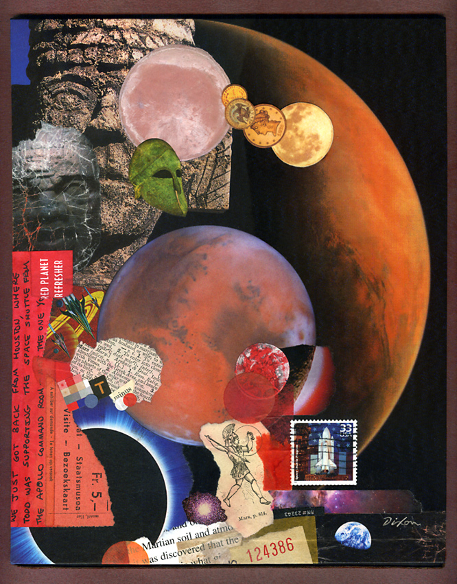
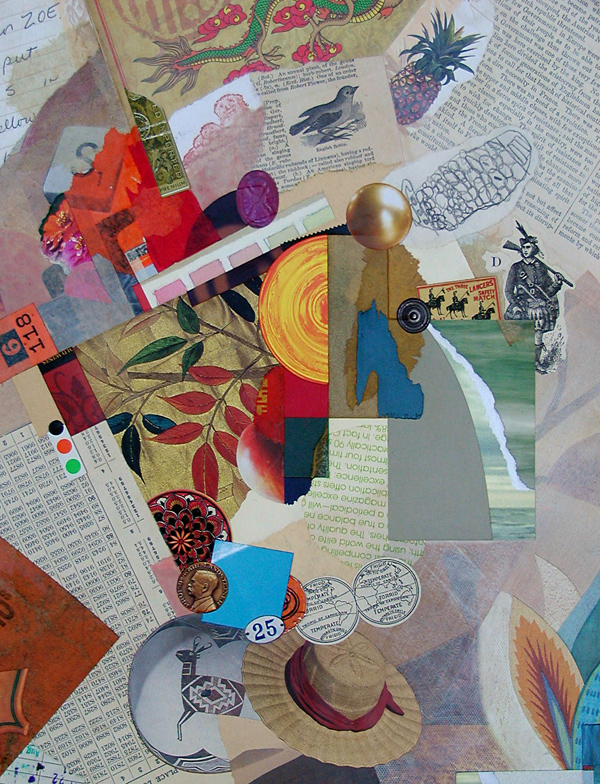
Today’s example was created for the buyer’s presentation as a gift to an engineer closely involved in Martian exploration. When the client described the intended recipient’s passion for the subject, I swallowed hard, but my initial trepidation soon faded as the process took on a life and momentum of its own (as, thankfully, it always does for me). I shall admit, however, that it may take a little time before I replenish my red-planet stash.
 

Dixon_AssignmentMars

Assignment: Mars
collage miniature on panel by J A Dixon
8 x 10 inches
private collection

The Other Doorway

Tuesday, November 25th, 2014

“Art comes out of art, and you are just another stone in the wall.”
— Richard Serra

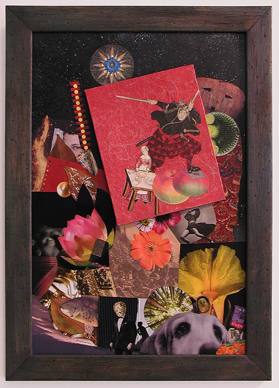
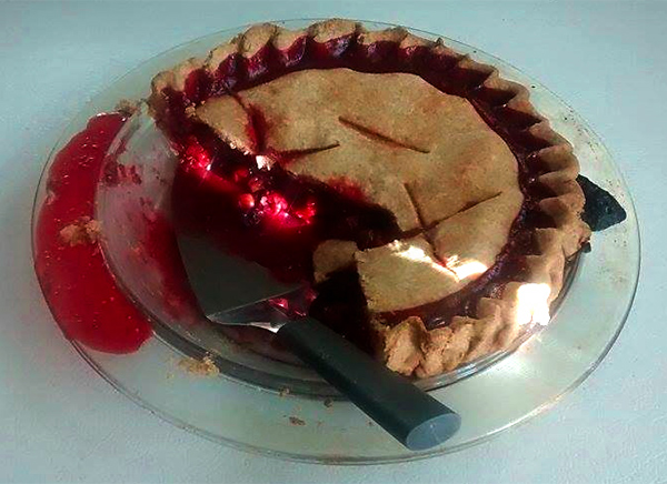
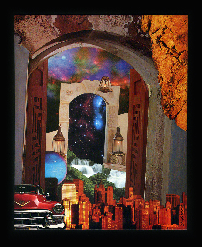
My “Partner In All Things” has outdone herself again. She prepared an outstanding dinner last night in celebration of our grandson’s 23rd birthday, including “game stew” with rabbit and venison, plus the tastiest cherry-raspberry pie ever.cherry-raspberry pie As for my part, I completed a collage miniature for him that took off on a phrase he said to me over a year ago while unraveling some difficult life choices. I am very proud of the young man, for many reasons having nothing to do with his being a great source of encouragement as I continue to create work that puzzles a majority of art buyers. Some time ago, L T Holmes introduced her online followers to the idea of producing a collage “under the influence” of a fellow artist. I admire her for elevating it to an exercise in perceptual focus. It is good to be mindful of influences, because they are not necessarily at a level of awareness. Today’s featured image is an example of how I have come to recognize the unconscious influence of peers after a work is finished. I am not sheepish about admitting it. Inviting the artistic strengths of others to rub off a bit is why we regularly partake of the excellence in our medium. The collage artworks of my friend Connie Beale, a retailer and accomplished interior designer, touch on the irrational aspects of environments and room-like enclosures with effects that are unsettling yet also whimsical. The prolific Eugenia Loli consistently captures the surreal potential of spatial contrasts and arresting juxtapositions. Perhaps a shade of both can be found in my grandson’s gift.
 

The Other Doorway ~ J A Dixon

The Other Doorway
collage miniature by J A Dixon
6.25 x 7.75 inches
collection of J M Strock, Jr

Arbitrary Mischief

Sunday, October 5th, 2014

“As we mature, all of us learn to ‘put away childish things.’ Often, though, we do such a good job of growing up that we lose contact with our spontaneity, teaching ourselves to follow rules and habits that inhibit us from acting on our hunches and intuition.”
— W. Clement Stone

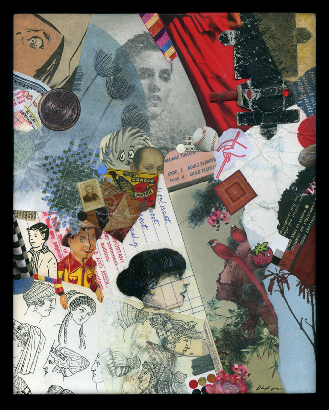
One of my earliest entries at this site made mention of the intuitive response in our process of collage creation. I have continued to ponder this idea of making visual decisions without conscious thought, especially after a lengthy discussion at the Collage Critique group in the facebook realm. There is something to be said for intuitive spontaneity with no preconceived notions, in contrast to the methodical execution of a concept. Collage as a medium is diverse enough to embody both approaches and everything in between. In my opinion, there is ample “non-thought thinking” taking place, even when no “idea” is driving the process. On the other hand, most of us can tell when a piece is struggling to be more than a mere stew of ingredients and the temptation to declare it “finished” should be resisted.

Personally, it is no longer possible for me to imagine coming to this activity without the foundation of art education, a rigorous training in graphic design, and 40 years of practice as a creative professional. I suspect that I have internalized all this to become part of an inner resource, so that when, at the conscious level, I put all of it out of mind, it still informs each spontaneous visual choice and the sense of something appearing “right” to the eye. Deciding that “an ingredient in play” has the right color, the right value, the right shape, the right texture, or the right spatial role often happens without rational awareness. That is my goal, at any rate, to keep such “non-thinking thought” in motion for as long as possible before I find myself falling back into outer rumination. It is not only a matter of aesthetics. The same phenomenon applies to thematic or symbolic associations, and the overall process of ingredient acquisition and selection that initiates and sustains the whole affair. Not that there is anything undesirable or distasteful about planning, calculation, and a deliberate methodology. Far from it. Nearly every work of art will involve some of that. It just happens to be that what I am most hoping to take place is something else — that the flow of assembly leading to a stimulating but balanced effect is the result of an artistic intention deeper than conscious decision making.
 

hand-crafted collage by John Andrew Dixon, The Collage Miniaturist

Arbitrary Mischief
collage on panel by J A Dixon
8 x 10 inches
 
Purchase this artwork!

Brass 25

Monday, June 9th, 2014

“We need a little confusion.”
— Neil Gaiman

The Great American Brass Band Festival’s milestone 25th event is now in the archives. The finale was one of the most satisfying concerts in the history of the Kentucky festival. My appreciation goes to those who made it all happen one more time! I am pleased to have played a small part.

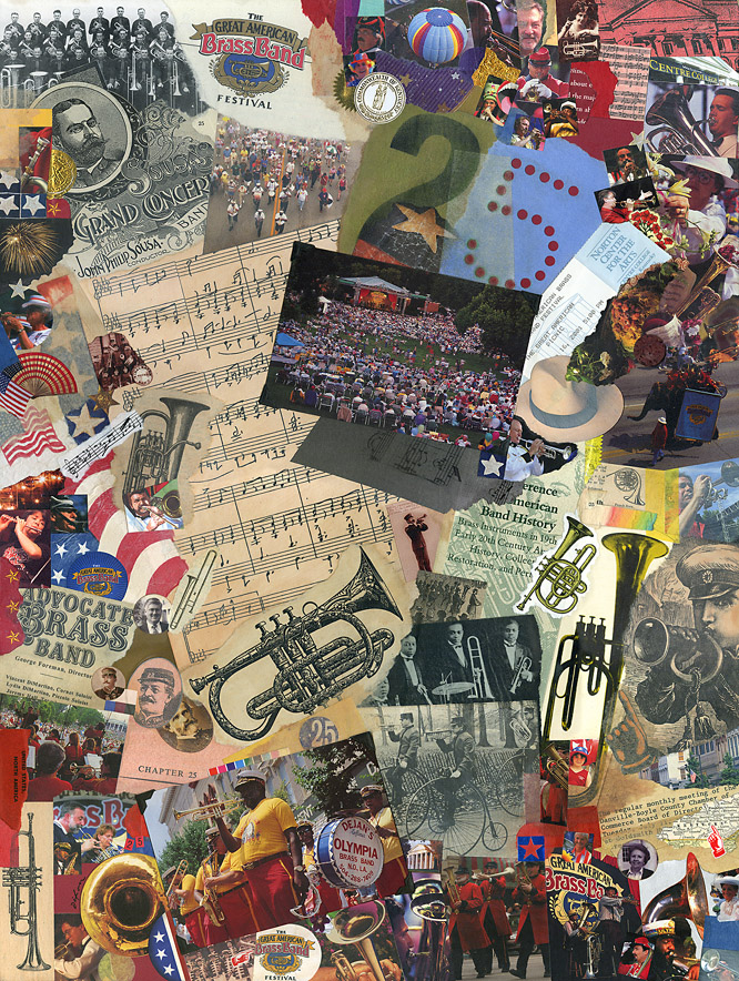
When I was first approached about lending my creative experience to the effort, I pitched the idea of a traditional collage to mark the 25th, using scraps from memorabilia of the last quarter century. A decision was made to go a different direction, but I could not put the idea aside. The result is “Brass 25,” a tribute to my community’s exceptional contribution to the American musical and cultural scene.

Is “commemorative collage” art? Perhaps not. Some might make the case that no example of the medium has approached “high art.” In my opinion, such a viewpoint fails to consider the 100-year impact that the medium has had on our visual landscape and the evolution of our aesthetic perceptions. It neglects the seminal role of Schwitters, Höch, Cornell, Kolář, and others. For me, the core relationship between mundane material and the art of collage transmits a unifying principle. When the remnants of ordinary life are physically re-purposed to resolve a unique compositional harmony, the culminating artifact can achieve a transcendent tone and offer a shared experience with each participating observer. If that is not art, stripped of elitist notions, then what is?

Brass 25
commemorative collage by J A Dixon
17.5 x 23.5 inches
available for purchase

G A B B F

Saturday, May 31st, 2014

“Design is moving an existing condition to a preferred one.”
— Milton Glaser

I attended the first Great American Brass Band Festival in 1990 with my wife and partner, Dana, the same summer that we relocated our home-based design business to Danville, Kentucky. Big portions of the previous year had been spent apart, as I developed business contacts in Central Kentucky while she held the fort at our studio in Dayton, Ohio. That inaugural Festival was an opportunity to spend time together in downtown Danville, and the ambiance of that weekend supported all that we were discovering about our new home community. We have been devoted fans of the Festival ever since, and it is now impossible for us to imagine a June in Danville without world-class brass music within walking distance. After that first Festival, my capabilities as a graphic designer and lettering artist came to the attention of the organizers. I have since worked closely with them on establishing the visual identity of the event and creating designs for nine commemorative posters.

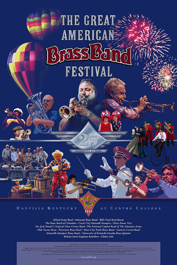
The 25th Great American Brass Band Festival will be held next weekend, and I shall be signing posters at the kick-off Gallery Hop Stop. Coming up with a suitable theme for this year’s poster was a challenge. We recognized that the milestone 25th Festival demanded a visual approach that would pay bold tribute to its heritage. No single aspect would do that, so I built a montage of images to salute the key elements of the Festival: the musicians, the parade, the picnic, the patriotism, the balloons, the fireworks, and the long history of enthusiasm for brass. With a quarter century of photography on file, it was a tough editing task. The result is a colorful, celebratory design intended to bring a smile to the face of every fan of the event.

The visual montage and the traditional collage are close cousins, and both techniques inform the other in my work as a fine and applied artist. The blurred boundary between graphic illustration and fine-art collage — conventional and digital — is an intriguing subject that I shall explore from time to time at this site. Please stop back here again (and do drop in at the Community Arts Center on Thursday evening, 5:30 to 7 pm, if you are in the Danville area).

Celebrating 25 Years
commemorative poster design by J A Dixon
available for purchase

this thing we all do . . .

Wednesday, November 20th, 2013

In response to an assertion that his environmental works are impossible to visually document—

James Turrell: “Well, someone has to make up for all the work that photographs better than it is.”
 

Mr. Turrell’s recent quip brings to the forefront a distinct feature of representing or documenting one’s artwork. Does it really look like the image being included with a call for entries, posted at an online marketplace, or shared on a social network? Of course, the photographing of artwork to enhance its appeal did not begin with digital devices or the World Wide Web. Most of us are familiar with the curator’s disclaimer that reserves their right to reject artwork which arrives substantially different than visually represented when proposed. Even non-artists know how easy it is to boost the contrast or color saturation of a digital image. Setting apart from our discussion works that are essentially digital from the outset, it is important for anyone working in the medium of traditional collage to squarely meet this challenge: How do we properly interpret the visual experience of seeing our artwork firsthand?

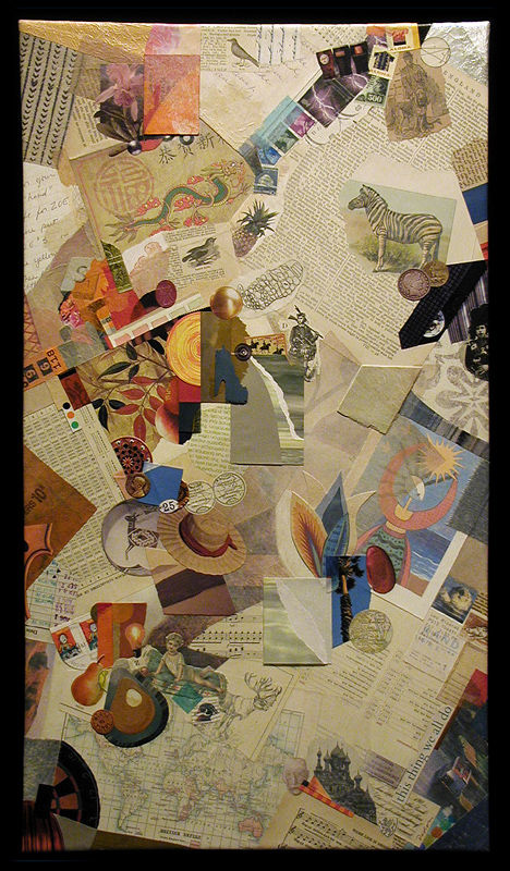
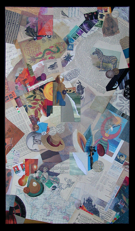
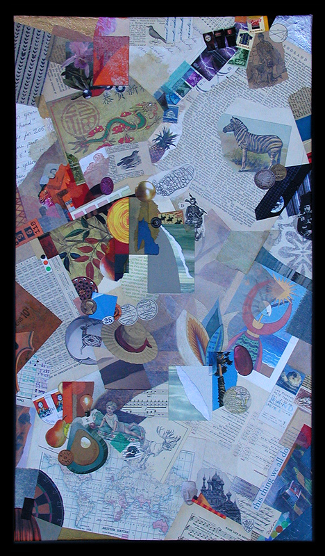
Needless to say, faithfully photographing or scanning conventional artwork is something that professionals face every day, but how can it ever be an exact science? What is the “true” appearance of anything? As the three examples below demonstrate, one of my recent collage artworks photographed differently under three different lighting conditions, before it was delivered. The more neutral version is closer to how it might “typically” appear, but perhaps the most faithful rendition would be an image made in the setting for which the piece was commissioned, under the unique lighting conditions of that particular environment, and then subsequently balanced for a reasonable match to the naked eye.

I review nearly a hundred collage artworks a day, as my eye passes over numerous online displays each week. What percentage of these creations actually look like the corresponding digital image? We all know what it’s like to see something and think, “I wonder if it really looks like that.” On the other hand, we also know what it’s like to scan a piece and think, “Wow. That looks better than I expected.”

All that any of us can do is establish a level of integrity about representing work to others. For those who routinely cheat or push an ethical boundary? Rest assured; the habit will eventually come back to haunt their studios.

And now, a few words about today’s collage example. I must first express my appreciation to Lee and David Simpson for the commission that resulted in this thing we all do, a mixed media and collage artwork on canvas. To infuse the composition with images that represent aspects of significance to their lives, this piece was personalized by using the clients’ own artifacts and memorabilia, as well as additional ingredients carefully selected from my morgue. Creating works with special meaning to those for which they were intended has always been some of the most fulfilling time I have spent as an artist.


this thing we all do (three different digitals)
collage with combined mediums on canvas by J A Dixon
15.75 x 27.75 inches (22.50 x 34.50 inches, framed)
collection of L and D Simpson

this thing we all do (detail)
collage with combined mediums on canvas by J A Dixon
(photographed and digitally balanced to match original)
 

150 years ago today . . .

Tuesday, November 19th, 2013

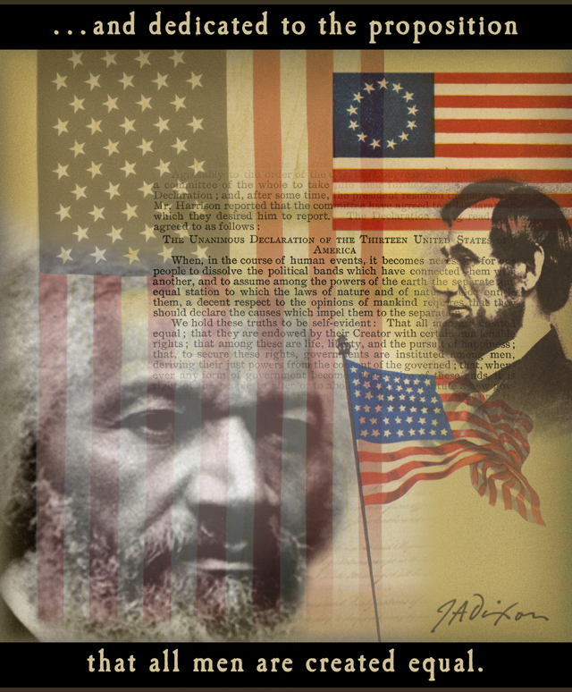
“That is what he said.
That is what Abraham Lincoln said.”
 

Dixon_Nov19

On collage derivations . . .

Sunday, November 17th, 2013

“I believe that it is better to be receptive to correction than to be satisfied with one’s own imperfection, and to think that one is oh so original!”
— Piet Mondrian

As I mentioned in a welcome statement from over a year ago (and perhaps more recently), I have nothing against digital collage, although I do maintain a bias in favor of conventional (so-called analogue) techniques, especially at this site, but don’t expect me to become “all blogmatic” about the topic, since I have been known to gratefully accept commissions for digital montage and affirm my respect for those who do collage illustration at a high level. The point I want to make today is that, so far, I have not generated much enthusiasm for manipulating or reproducing my “tear and glue” artworks as digital prints or “art merchandise.” Someone recently asked if I sold note-card versions of my miniatures, and I had to admit that “I have never quite gotten around to that.”

There are many reasons, both good and bad, to produce derivations of one’s own work for the marketplace. There are also many reasons, both good and bad, to restrain oneself. I would hope to be open-minded about the subject. Not everyone who enjoys collage can afford to collect originals. In addition, I often get ideas about how to combine separate works into a composite digital design, exploring in the process a distinctive aesthetic resonance that might not be discovered in other ways. I occasionally imagine how one of my miniatures would look as a super-enlargement, or I envision an exhibition of large canvases created from Giclée blow-ups of small works. No doubt, there is an appropriate place for digital technology in the medium, whether on the front- or back-end of the process. The digital image is, of course, the stock in trade of any artist with an active presence on the Internet. That comes with its own set of issues that I plan to cover in my next discussion. Meanwhile, I hope to preserve my emphasis on a traditional methodology and observe how other collage practitioners adopt emerging technology to enhance their fine-art investigations.
 

Microcosmic Moments
compilation of nine miniatures by J A Dixon
proposed digital concept, variable in dimensions

Modular Zowee
composite of collage details by J A Dixon
proposed digital concept, variable in dimensions

Mystery Solved (detail)
super-enlargement of collage detail by J A Dixon
proposed digital concept, variable in dimensions

Mystery Solved (set of four cards)
merchandise with collage details by J A Dixon
proposed digital reproductions, 5.75 x 4.5 inches

Broadband Access
digital montage by J A Dixon
editorial illustration for ACUTA Journal

Dawn Goes Down to Day

Saturday, November 2nd, 2013

Day One / Open Studios ARTTOUR —
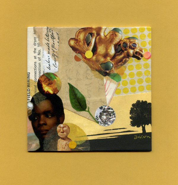
How much sleep I got last night will remain a secret, but I crossed the finish line with everything in place to welcome the public today. We had a steady trickle of folks who enjoyed viewing and talking about art. The design studio, art studio, and gallery/meeting space were looking fine (not to mention the exterior facade), and it feels like I have not caught my breath for several months. Dana outdid herself with some tasty punch and snacks for guests, and she was bragging on my collage all day. Nothing feels like reaching an ambitious goal with a kindred spirit, and I wish every friend in the world had been with me today, too.
 

Dawn Goes Down to Day
collage miniature by J A Dixon
4 x 4 inches
 
Purchase this artwork!

Remember . . .

Sunday, May 26th, 2013

Dixon_Remember


Shadows of Joseph

Monday, February 11th, 2013

“From the beginning he had responded to the avant-garde developments of his time with admirable swiftness and sureness. It is hard to think of another American artist who was receptive to so many different art movements or who managed to win the admiration of everyone from the Surrealists in the 1940s to the Abstract Expressionists in the 1950s to the Pop Artists in the 1960s. Artists who agreed on little else agreed on Cornell.”
—Deborah Solomon

“The central themes of Pop Art were sub-culture, folk cultures, media imagery, new technologies, design, the consumer goods and engineering industries, the inter-relationships between these phenomena and their effect on human beings.”
—Tilman Osterwold

Osterwold’s analysis suggests that traditions, fashions, and even avant-gardist achievements could no longer be the norm after Pop Art, which swept away the boundaries of artistic development with its focus on a “consciously perceived and reflected present-day existence.” Having just finished Deborah Solomon’s biography of Joseph Cornell (Utopia Park: The Life and Work of Joseph Cornell), I am struck by how Cornell anticipated Pop Art with his focus on the appropriated elements of mass culture and his various obsessions with celebrities, while at the same time demonstrating an abiding indifference to the cult of personal fame so typically associated with the movement. Walter Hopps stated that Cornell was “Schwitters’ greatest successor.” Cornell was certainly aware of Schwitters, for he was highly cognizant of nearly everything about the onrushing stream of modern art (in contrast to the misconception that he was some sort of urban hermit), but the precise lineage of artistic influence may never be fully known. Perhaps it was Cornell’s connection with Max Ernst that is a key factor. In my opinion, Ernst was not a giant of 20th-century collage, but did have a vital influence on the genesis of Cornell’s art. It is well recognized that Joseph began and ended his unique body of work with the medium of collage. One of the things that astonishes me is how he could be so attuned to the advancing frontier of present-day art (often staying a step or two ahead of it) and, at the same time, carry such a personal dysfunction that derived from the driving intensity of his inner world. Was that the nature of his genius? At any rate, his strange but amazing ability to synthesize powerful emotional and cultural content by inventing (virtually from scratch) a distilled form of assemblage continues to set the standard for almost everything in the mix of media that has followed in its wake. Hardly a day goes by that I don’t observe an artwork that can be traced directly to his seminal vision. But rarely do I see another artist infuse their juxtapositions with a rich symbolism to compare favorably with his complex associations. Most of the art I see with an obvious Cornellian tone owes more to surrealist automatism or atmospheric illustration than to the intricate blend of embedded meaning and refined intuition that characterized his enduring originality.
 

Knave Child
Kurt Schwitters, 1921
Collage on paper
Sprengel Museum, Hannover.

plate from La Femme 100 Têtes
Max Ernst, 1929
Collage novel
Published Éditions du Carrefour, Paris

Untitled (Schooner)
Joseph Cornell, 1931
Collage on paperboard

Untitled (Girl and Two Columns)
Joseph Cornell, c. 1950
Glass, wood, tempera and printed paper collage

Circe III — Surface and Volume in Nature
Joseph Cornell, c. 1961-66
Collage on masonite