Some collage ideas can be best described as a Rorschach.
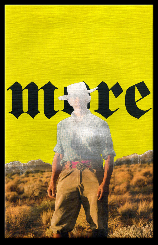
more
collage Rorschach by J A Dixon
7 x 11 inches
private collection
“We do not analyze works of art because we want to imitate them or because we distrust them.”
— Paul Klee
The other day the world learned about an unpublished Ernest Hemingway short story. If there had not been a Mark Twain first, would literature know Hemingway’s writings at all? Could there have been an Isaac Asimov, Stan Lee, or Gene Wolfe without a Verne or Burroughs? The J.K. Rowling body of work without an Austen or Tolkien? 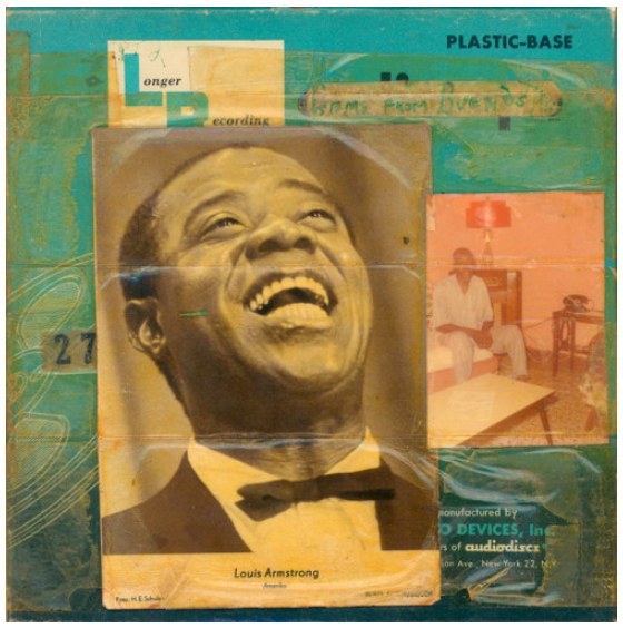 Similarly, all of today’s rock music can be linked to direct influences — to bands such as Ramones, Led Zeppelin or the Beatles, which, of course, had their own precursors. Would jazz exist in its current form without the innovations of Armstrong and all those who inspired him? Imagine a contemporary musician saying, “I really haven’t paid attention to any music that was recorded before I started to play.” And yet, not infrequently, collage artists will boast that they have little use for art history (all the breakthroughs of bygone creators who dug the swimming pools in which they now frolic).
It is argued that modern artists were the first to decide that visual art would be about art, rather than subject matter. Nonsense. Art has always been about art, because it always has been structured on prior foundations. The idea that any artist can burst on the scene as an original is absurd. Nobody who comes out of early childhood with any level of awareness has not built an inventory of perceptions — countless images from the culture around them. Each of these individual influences involved creative activity based on another bank of stimuli, and so forth, back to the first proto-human who picked up a piece of charcoal to make interesting marks on a stone (and was probably knocked on the head by another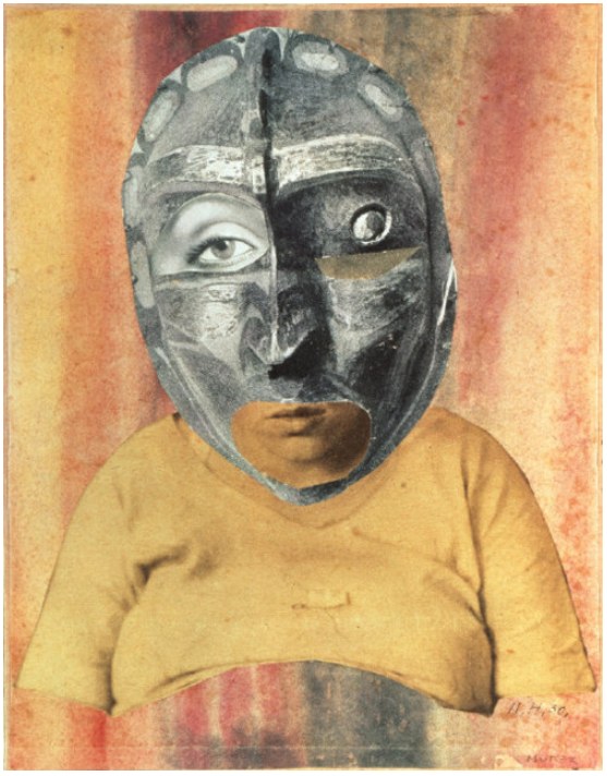
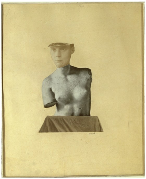 who judged the action as irrelevant to group survival).
Perhaps I have belabored my point. Perhaps it is a point that anyone who reads this would not need emphasized in the first place. Isn’t it obvious to us that no art form is more about all these churning influences from untold visual decision makers — painters, printers, illustrators, photographers, designers — than the medium of collage itself? So, let us all continue to study the collage artworks of the explorers who came before us, to trace the direct lineage of their concepts and techniques, to recognize that valuable inheritance in the work of our peers, as well as in the composition taking shape on the surface before us, and then, fully informed, to push confidently into the second century of collage.
Tranquil Ode (to Merz)
collage homage by J A Dixon
9.5 x 11.875 inches
Purchase this artwork.
“I don’t think of all the misery, but of the beauty that still remains.”
— Anne Frank
It has been a distinct pleasure to perform in the company of some accomplished dramatic artists. I felt like a novice throughout our local production of The Diary of Anne Frank. There were times when the angst of my character, Mr. Kraler, spilled over into my off-stage being. So, naturally, I fell back on my own art and made a collage miniature as a creative catharsis. After a bit of sadness when the Secret Annex set was struck, I found myself eager to spend more time in the studio.
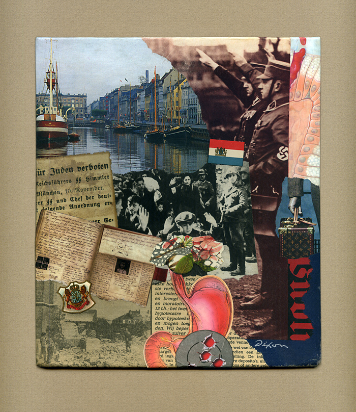
Mr. Kraler’s Distress
collage miniature by J A Dixon
8.25 x 9.375 inches
collection of the artist
“Even in the absence of inspiration and talent, I think that through sheer craft you can actually create extremely good work, all the time, reliably. Great work is something else. I think for great work you also need a lot of luck. You can only aspire to really good work. The great work either happens or it doesn’t.”
— Christoph Niemann
Sloppy collage artwork has never held much appeal for me. Individuals might define “sloppy” differently, so I’ll rephrase that. I have always found well-crafted collage artwork to be the most appealing. In practice, I have aspired to the highest level of artisanship to which I am capable. According to my peculiar notions, the very nature of collage as a “mash-up” of visual ingredients suggests that one resist all the inherent temptations to condone careless techniques. To do anything less is a disservice to the medium, and strikes me as being a bit lazy.
I have been at this long enough to contrast current activity with a study of my “early” work. I perceive it now as more crisp and aligned with my long stint as a designer and illustrator. I remain proud of craftsmanship that continues to challenge my present hand skills. Like everyone who sticks around, I have moved relentlessly toward a period of life when manual dexterity and vision are unlikely to improve. At any rate, clean, precise work is more about attitude and personal commitment than it is about facility. Lately, on the other hand, I have sought a more organic, less contrived look — the impression that a piece is naturally the way it should be, rather than appear too obviously composed and belabored. As I work, I try not to permit the goal of a somewhat softer and cohesive whole to suggest a relaxation of craft. In fact, I have gradually introduced steps in the process that demand extra time and attention: sanding the reverse side of ingredients for adhesive-saturated compression and eliminating white edges on printed scrap to enhance a seamless effect. I combine that with ample burnishing and some hair-dryer prep before curing time under weight, followed by multiple light-touch coats of matte sealant. I would rather be thinking about practical methodology or a musical playlist than what is literally evolving on the surface before me, allowing that to be as intuitive as possible.
And perhaps (just maybe), Lady Luck will smile.
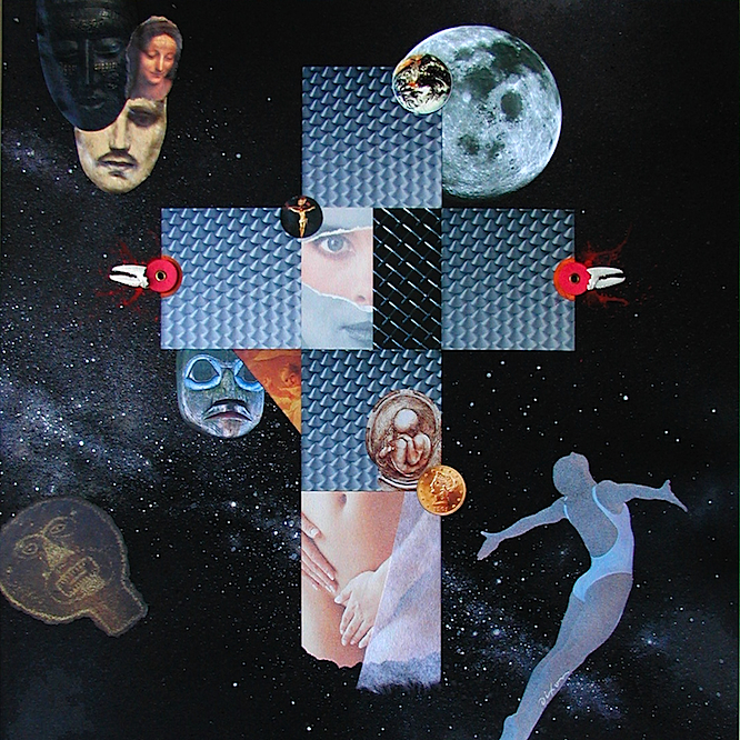
Cosmic Crucifixion
mixed-media collage by J A Dixon
2006, 16 x 16 inches
available for purchase
“When you take risks you learn that there will be times when you succeed and there will be times when you fail, and both are equally important.”
— Ellen DeGeneres
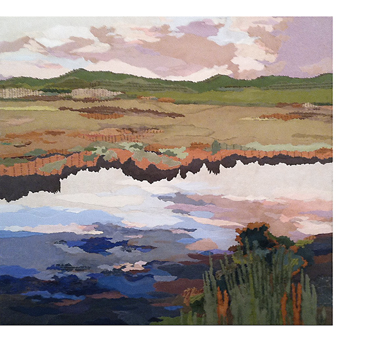
Although it was created in the studio, my new collage landscape titled ‘Wetland’ benefits from a summer of plein-air activity. My “painting with paper” out of doors  has opened a rewarding area of investigation for my work as a collage artist. I’m pleased to share this piece with the art-viewing community at my first invitational exhibition of the year, the annual New Year New Art show at our Community Arts Center, just a biscuit toss from my home base in downtown Danville, Kentucky. This event has been a fortifying tradition for regional artists, because we can complete our year of work at a risk-taking level, and still know that the result will get a prominent public display.
 An artist working outside a metropolitan center could not ask for greater support from a local institution.
Based on an excellent photograph by a longtime pal, this artwork was created as an entry for a contemporary landscape show, but the juror rejected it for unknown reasons. I kept it handy for a pair of upcoming open studio events (my participation in the Central Kentucky ARTTOUR and Gallery Hop Stop). Plenty of praise ensued, but nobody took it home, so I decided to make additional refinements, leading up to the deadline for the January exhibition. A full makeover was unnecessary, as the in-process image above indicates. However, I was not entirely pleased with the vegetation at the waterline, above the dark shadow that spans the composition. In this case, less was not more. Additional ‘foliage’ was needed. I also thought that the lower right corner was too abstract. The desired sense of realism would profit from a more detailed foreground. Late-season ironweed, a favorite of mine, seemed a suitable choice. That led intuitively to a few closing decisions in the sky reflection and distant terrain. 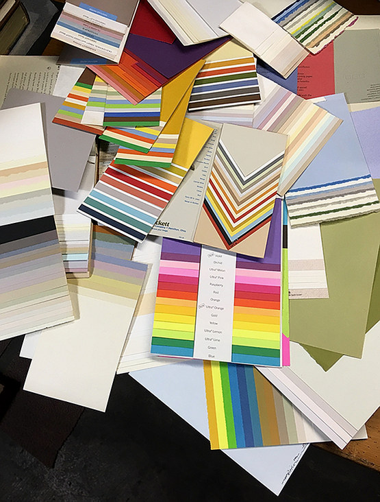 Nearly all of the ingredients were infused with wheat paste and press firmly onto the evolving surface with polymer gel. After thorough drying, selected areas were lightly sanded and the total surface evenly daubed with a flat sealant.
It is very satisfying to work with a palette of elegant papers, and I am fortunate to have them. Some of you may remember (especially those with a background connected in some way to the graphic arts) the pre-internet days of a more diversified paper industry. Numerous mills and distributors slugged it out in a highly competitive market. Inkjet printing was still on the horizon and multi-color offset printing was expensive. Printing on colored stock was a cost-effective way to get more color into published material. Paper producers went out of their way to demonstrate creative ways to use colored paper and many of us who specified paper for printing projects were lavished with promotional samples. Decades later, I still have a stash from that era, and I rely on it now for my plein-air miniatures and studio landscapes. A piece such as ‘Wetland’ puts this hoard to good use; it would not look the same with scrapbook or construction paper. The richness of premium papers manufactured for fine printing were accented with fragments of dulled foil, tissue, scraps of found packaging, and fragments of typography. After all, it’s meant to be a collage artwork!
The opening reception for NYNA is this Friday evening, 5 to 8 pm. Perhaps I shall see you there to discuss ‘Wetland’ in person.
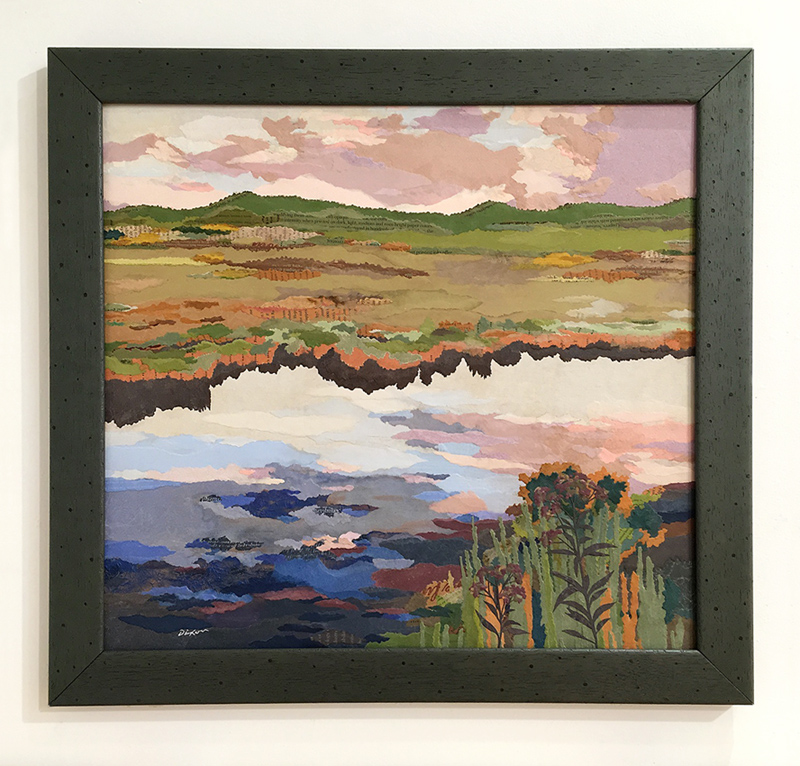
Wetland
collage landscape by J A Dixon
21.25 x 19.25 inches
on structured panel, framed
available for purchase
Brendan’s Birthday Comic Strip Artifact
collage artifact by J A Dixon
12 x 7.375 inches
collection of B C Adkins
“The real voyage of discovery consists, not in seeking new landscapes, but in having new eyes.”
—Marcel Proust
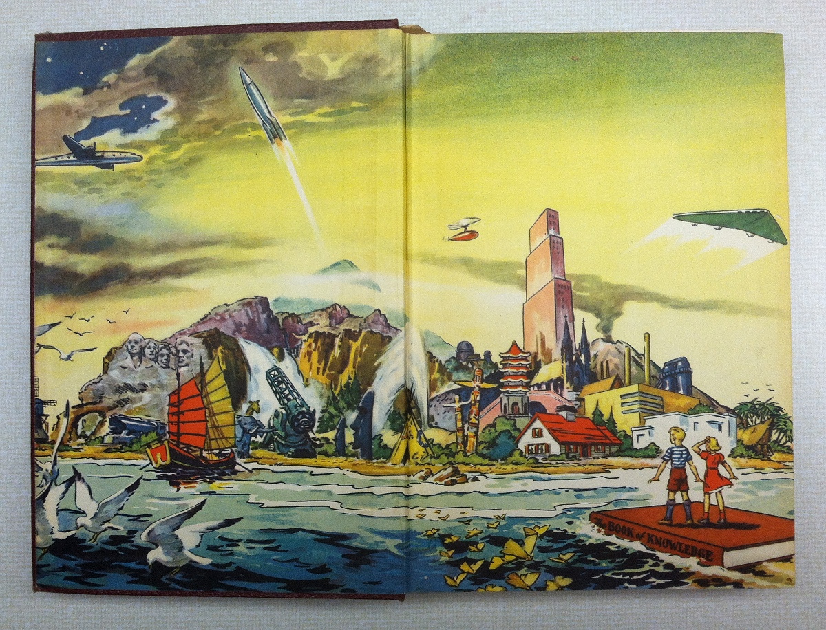
Here are the illustrated endpapers and dust jacket from the 1951 edition of The Book of Knowledge set — my introduction to the concept of visual montage. These absurd juxtapositions compelled my first 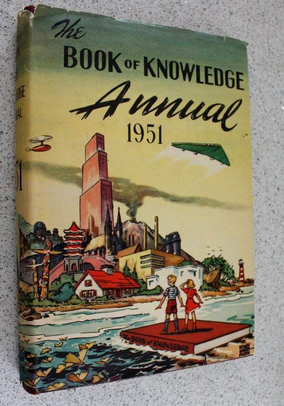 perceptual leap beyond the literal, and, to tell the truth, I don’t think that my innate creativity has been quite the same since. How far back can one trace these kinds of images? Did they precede collage and influence its development, or did they actually derive from the collage innovations of the early 1900s? At any rate, I was captivated by this particular painting and others like it. There is no doubt in my mind that a sweet obsession with the chaotic harmony of montage imagery began with childhood influences that came from unsung illustrators — such as the artist who came up with this extraordinary vision — long before I understood the visual mastery of a Fred Otnes, Bob Peak, or Paul Melia.
“If we adopt a surrealist viewpoint, art logically must be and naturally will tend to be surrealist, and thus be justifiable only in its ability to reveal the new, the ‘never seen,’ the parallel activity of thought and chance in consciousness.”
— Alan Gullette, 1979
You may recall, dear visitor, my June jaunt at this site into the staying power that “the surreal face” maintains in contemporary collage. I shall highlight a few more examples below. 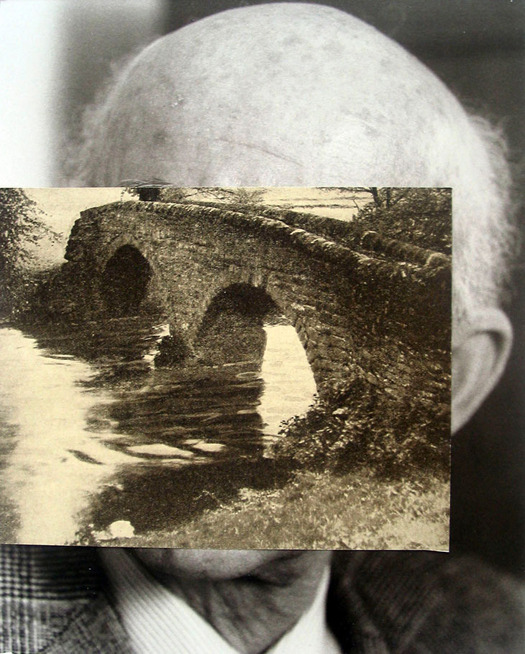 When a distinct sub-genre of the medium intrigues me, as this one clearly does, I often attempt to “diagram its visual pedigree” through the history of modern art. This is not an easy task for a non-academic (nor one, perhaps, for a scholar). A “collage geneologist” can run the risk of getting sidetracked into Man Ray or René Magritte, only to question whether use of the word “surreal” is relevant at all. Does it make more sense to trace a connection from Picasso to Tatlin to Hausmann’s 1920 homage to the Russian Constructivist and thereby leap-frog André Breton’s “psychic automatism” entirely? As much as I love the history of collage, all that delineation is beyond the scope of your humble Collage Miniaturist.
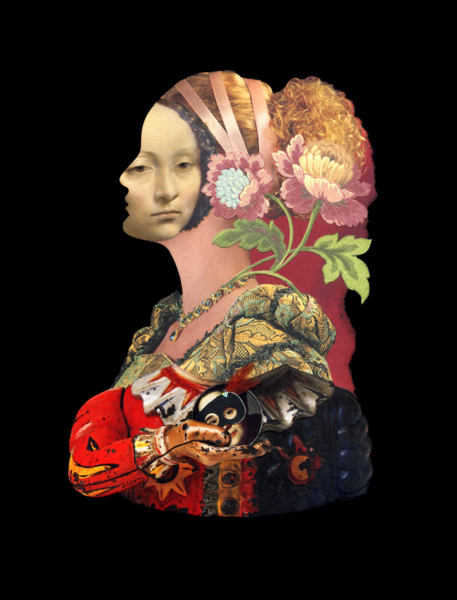
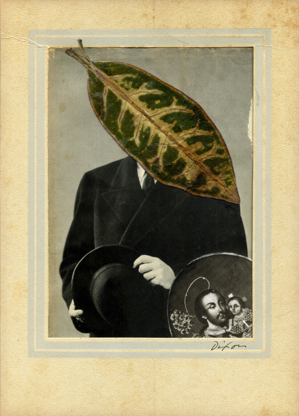 Suffice it to say that the gongs of Dada still reverberate. Ultimately, we are more concerned with a phenomenon that is alive and well among contemporary collage artists (and that long ago shed any musty trappings of Weimar Republic protest, Trotskyite dilettantism, or hostility toward religion). Even a cursory review of recent collage output exposes an enduring thread weaving its way through students, emerging professionals, veteran practitioners, and masters of the medium. Rather than muddy ourselves grubbing 20th-century roots, let us instead ask two important questions — What is the elusive essence of “the surreal face,” and why does its enduring appeal lack any sign of a downtrend?
Isabel Reitemeyer
Her consummate approach convinces me that less indeed can be more.
Robert Hugh Hunt
Fresh, intuitive, culturally aware. Robbo’s art springs from individuality.
Manu Duf
There is never a timid thing about his proficient approach to collage.
Eduardo Recife
The Brazilian illustrator sets a high standard for digital collage.
Erin Case
The Michigan-based artist is rapidly making her mark as a collage pro.
Claudia Pomowski
The versatile graphic artist is a “collage experimentalist.”
Jordana Mirski Fridman
This emerging designer/artist is “exploding” onto the medium.
Julia Lillard
The self-taught Oklahoma artist has nailed “the surreal face.”
“In 1998, Ma founded Silkroad, a nonprofit outfit that connects diverse cultures and musicians not only through Ma’s Silk Road Ensemble (for which more than 80 pieces have been commissioned), but also by supporting education and cross-cultural business and artistic partnerships.”
– NPR.org
Today is the 60th birthday of Yo-Yo Ma, among the world’s most impressive creative individuals.  When he brought his Silk Road Ensemble to my hometown in 2013, I was inspired to begin a series of collage poems dedicated to East-West understanding. I can think of no living artist with a greater curiosity for diverse influences, or a wider versatility, fusing cultural traditions with innovative experimentation.
Silk Road Details
digital compilation by J A Dixon
a birthday salute to Yo-Yo Ma
“Otnes abandoned the narrative style… The move set him apart from other commercial artists of his time, and his willingness to embrace the abstract and chaotic nature of collage put him in high demand during one of the most turbulent decades of American history.”
— The Saturday Evening Post, 2015“Fred Otnes brings to his collage paintings a classical refinement and control that makes poetry out of chance pictorial effects. He dips into early Cubist collage techniques, touches Florentine and Renaissance bases, and reverses Dadaist chaos into gorgeous homages to order.”
— Maureen Mullarkey, 2002
I just learned about the death of artist/illustrator Fred Otnes. I tend to focus here and in my own practice on the acknowledged masters of fine-art collage, but Mr. Otnes certainly had a greater influence on me during my formative years and during the period of my life devoted to “making it” as an independent illustrator and designer. He is rarely included among the seminal figures of 20th-century collage, but he should be. Allow me to back up a bit and reveal some of my own story.
In the 1960s I had four different art teachers in four years of high school. I resist being unkind, but each one of them was worthless. I had some talent, so there was no reason to spend time with me. I was left to fend for myself, because, apparently, it was more urgent to actively babysit the class goof-offs. By sixteen I was investigating the available correspondence coursework. No one thought to tell me about the Dayton Art Institute in the closest big city. I don’t think I even realized how desperate I’d become. What others might have viewed as crass merchandising was a Godsend for me. I responded to an advertisement from the Famous Artists School and completed the test. A representative actually paid a visit to discuss the home-study course that would provide the fundamental art instruction I’d been missing, and I begged my parents to let me give it a shot. They said, “Okay,” and I am grateful for this simple consent — access to legitimate art educators would be mine. I acknowledge now that their “Course For Talented Young People” was a marketing experiment, an attempt to leverage the successful adult course with a younger demographic. That meant nothing to me at the time. This was the school endorsed by Norman Rockwell, and I was a charter student! Although my Mom eventually had to cajole me into keeping abreast of the challenging lessons, a sea change had occurred. I was at long last formally introduced to the world of fine and applied artists. Among those that impressed me most was someone named Fred Otnes.
I was a peculiar kid who got more excited about magazine illustrations, corporate trademarks, television animation, and the Sunday comics than I did about “museum art.”  The work of Otnes touched me in a way that would take decades for me to unravel. In my youth, not being able to figure out how an artist created something was usually paired with disinterest, but his work affected me in the opposite way. His graphic synthesis of images, engravings, diagrams, and language exposed a realm that I could aspire to enter. Even as an experienced pro, I continued to find his technique mystifying. I was relieved when legendary illustrator Mark English said, “I don’t even know how he did them, the mechanics of printing, photography and all the things he did to put them together.” Suffice it to say that in a profession biased against the creative explorer, Fred Otnes braved a path that few, if any, realized was there, successfully made it his own, and became one of the most distinctively recognizable, highly honored applied artists of his generation.
For many years, through the Illustrator’s Workshop, Otnes was a teacher and mentor, and, like others in the field, spent his later years expanding his personal style as a gallery artist. Whether applied to editorial or commercial use, the creations embody his profound respect for subject matter. If there is something elusive in his work that will continue to inspire me, it is this — I shall always hold in high regard the sense of “reverence” he brought to each layered plane of expression, to every choice of color or texture, to the symbolic meaning of each ingredient, and to the aesthetic harmony of the whole.
The Day Mussolini Dies . . .
Saturday Evening Post illustration by F Otnes, 1966
Illustrators 16
Society of Illustrators Annual cover by F Otnes, 1974
The Last Wise Man
Atlantic cover by F Otnes, 1989
(title unknown)
National Geographic illustration by F Otnes (rights managed)
Piero
traditional collage by F Otnes, 1994
A Tragic Princess
collage painting by F Otnes, date unknown
Liagre
collage painting by F Otnes, 2002
“When people think about creativity, they think about artistic work — unbridled, unguided effort that leads to beautiful effect. But if you look deeper, you’ll find that some of the most inspiring art forms, such as haikus, sonatas, and religious paintings, are fraught with constraints. They are beautiful because creativity triumphed over the ‘rules.’ Constraints shape and focus problems and provide clear challenges to overcome. Creativity thrives best when constrained.”
— Marissa Ann Mayer
I have been intrigued by the recent work of participants in the Matchbook Collage Collaboration Project. Collage artists, whether working alone or in collaboration, are increasingly known for imposed restrictions — time, scale, format, or ingredients. Early on I gained a healthy respect for the power of parameters, most likely because I was educated as a designer and trained as an applied artist. Years later, this respect was amplified significantly when I witnessed my nephew create thousands of 101-word stories as an exercise in creative writing.
A big part of managing open-ended potential when initiating new work is to dig for an “inner assignment” that limits the options and sparks a creative impulse. Another good catalyst is to look around for an external constraint. I enjoy reacting to calls-to-artists that focus on an organizing concept. Even if I don’t actually apply, the triggered intuitive process can be informative. Here is a piece that I just finished in response to the exhibition theme of “Home.” In addition to framing the possibilities, it provided an opportunity for me to work more three-dimensionally, explore color scheme limitations, and further investigate the combining of found materials.
Pearental Discretion
mixed-media artifact by J A Dixon
11.25 x 9.25 inches
available for purchase