Archive for the ‘Graphic Design’ Category

G A B B F

Saturday, May 31st, 2014

“Design is moving an existing condition to a preferred one.”
— Milton Glaser

I attended the first Great American Brass Band Festival in 1990 with my wife and partner, Dana, the same summer that we relocated our home-based design business to Danville, Kentucky. Big portions of the previous year had been spent apart, as I developed business contacts in Central Kentucky while she held the fort at our studio in Dayton, Ohio. That inaugural Festival was an opportunity to spend time together in downtown Danville, and the ambiance of that weekend supported all that we were discovering about our new home community. We have been devoted fans of the Festival ever since, and it is now impossible for us to imagine a June in Danville without world-class brass music within walking distance. After that first Festival, my capabilities as a graphic designer and lettering artist came to the attention of the organizers. I have since worked closely with them on establishing the visual identity of the event and creating designs for nine commemorative posters.

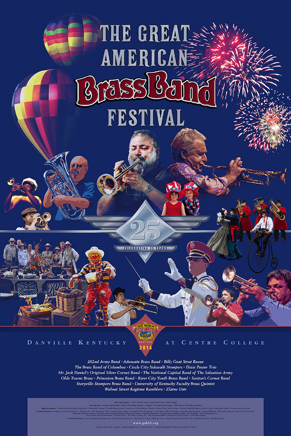
The 25th Great American Brass Band Festival will be held next weekend, and I shall be signing posters at the kick-off Gallery Hop Stop. Coming up with a suitable theme for this year’s poster was a challenge. We recognized that the milestone 25th Festival demanded a visual approach that would pay bold tribute to its heritage. No single aspect would do that, so I built a montage of images to salute the key elements of the Festival: the musicians, the parade, the picnic, the patriotism, the balloons, the fireworks, and the long history of enthusiasm for brass. With a quarter century of photography on file, it was a tough editing task. The result is a colorful, celebratory design intended to bring a smile to the face of every fan of the event.

The visual montage and the traditional collage are close cousins, and both techniques inform the other in my work as a fine and applied artist. The blurred boundary between graphic illustration and fine-art collage — conventional and digital — is an intriguing subject that I shall explore from time to time at this site. Please stop back here again (and do drop in at the Community Arts Center on Thursday evening, 5:30 to 7 pm, if you are in the Danville area).

Celebrating 25 Years
commemorative poster design by J A Dixon
available for purchase
On collage derivations . . .

Sunday, November 17th, 2013

“I believe that it is better to be receptive to correction than to be satisfied with one’s own imperfection, and to think that one is oh so original!”
— Piet Mondrian

As I mentioned in a welcome statement from over a year ago (and perhaps more recently), I have nothing against digital collage, although I do maintain a bias in favor of conventional (so-called analogue) techniques, especially at this site, but don’t expect me to become “all blogmatic” about the topic, since I have been known to gratefully accept commissions for digital montage and affirm my respect for those who do collage illustration at a high level. The point I want to make today is that, so far, I have not generated much enthusiasm for manipulating or reproducing my “tear and glue” artworks as digital prints or “art merchandise.” Someone recently asked if I sold note-card versions of my miniatures, and I had to admit that “I have never quite gotten around to that.”

There are many reasons, both good and bad, to produce derivations of one’s own work for the marketplace. There are also many reasons, both good and bad, to restrain oneself. I would hope to be open-minded about the subject. Not everyone who enjoys collage can afford to collect originals. In addition, I often get ideas about how to combine separate works into a composite digital design, exploring in the process a distinctive aesthetic resonance that might not be discovered in other ways. I occasionally imagine how one of my miniatures would look as a super-enlargement, or I envision an exhibition of large canvases created from Giclée blow-ups of small works. No doubt, there is an appropriate place for digital technology in the medium, whether on the front- or back-end of the process. The digital image is, of course, the stock in trade of any artist with an active presence on the Internet. That comes with its own set of issues that I plan to cover in my next discussion. Meanwhile, I hope to preserve my emphasis on a traditional methodology and observe how other collage practitioners adopt emerging technology to enhance their fine-art investigations.
 

Microcosmic Moments
compilation of nine miniatures by J A Dixon
proposed digital concept, variable in dimensions

Modular Zowee
composite of collage details by J A Dixon
proposed digital concept, variable in dimensions

Mystery Solved (detail)
super-enlargement of collage detail by J A Dixon
proposed digital concept, variable in dimensions

Mystery Solved (set of four cards)
merchandise with collage details by J A Dixon
proposed digital reproductions, 5.75 x 4.5 inches

Broadband Access
digital montage by J A Dixon
editorial illustration for ACUTA Journal

Dawn Goes Down to Day

Saturday, November 2nd, 2013

Day One / Open Studios ARTTOUR —
How much sleep I got last night will remain a secret, but I crossed the finish line with everything in place to welcome the public today. We had a steady trickle of folks who enjoyed viewing and talking about art. The design studio, art studio, and gallery/meeting space were looking fine (not to mention the exterior facade), and it feels like I have not caught my breath for several months. Dana outdid herself with some tasty punch and snacks for guests, and she was bragging on my collage all day. Nothing feels like reaching an ambitious goal with a kindred spirit, and I wish every friend in the world had been with me today, too.
 

Dawn Goes Down to Day
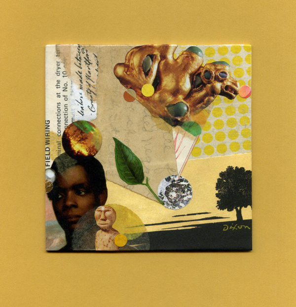
collage miniature by J A Dixon
4 x 4 inches
 
Purchase this artwork!

Is it or isn’t it?

Wednesday, November 14th, 2012

“Man himself is mute, and it is the image that speaks. For it is obvious that the image alone can keep pace with nature.”
—Boris Pasternak

Those who speak or write as though they understand everything about this medium do not know what they are talking about. But, to be honest, I have never met anyone who behaves that way, so perhaps my opening declaration is meaningless. Sometimes it is even difficult to classify what we do as artists in order to place the effort in some category. I just encountered an interesting chunk of round-table discourse by a new online discussion group struggling to define their area of focus. Most distinctions made between what artists call collage, montage, assemblage, construction, layerism, mixed-media, digital art, illustration, or graphic design are somewhat arbitrary, and we continue to see new terms coined by those who hope to distinguish what they perceive as a unique approach. At any rate, the intent of the artist is central. Clearly, definitions in art are rarely necessary except when attempting to trace a cross-pollination or lineage of influences, and when an organized effort or exhibition requires mutually acknowledged parameters. Additionally, there are always other important considerations to discuss, such as: What is an original? What is the relationship between process and artifact? What is the purpose of reproduction? Does a nomenclature based on exclusion have intellectual validity, or is it simply an adjunct to merchandising?
 

A likely story indeed! ~ J A Dixon

A likely story indeed!
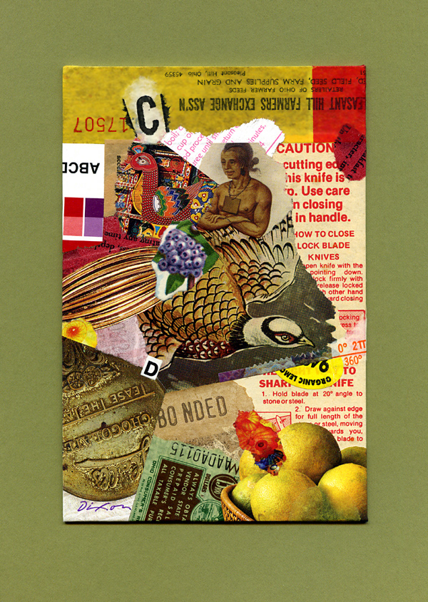
collage miniature by J A Dixon
4 x 6 inches
 
Purchase this artwork!

But is it art?

Sunday, August 26th, 2012

“With the institutionalization of belief, art becomes an instrument of social enhancement instead of what it is— a basic instinct of the human species.”
—Milton Glaser

For more than a century or two, the distinction between the illustrator and the artist has been an ongoing debate. Is there a significant difference, or is it primarily an artificial disparity? Most would agree that there is a contrast of intent— the applied artist subordinates certain aspects of personal expression for a commercial or social objective, and the fine artist is accountable only to the creative self. But what about the illustrator who is handed no constraints by the client, or the fine artist with a market-driven agenda? Like most things, shades of gray preside and one is left to place each instance on a spectrum, or to disregard all attempts to categorize the creative impulse in the first place. I’ll admit that I’ve always been more impressed with the very best of illustration, vintage or current, than with run-of-the-mill fine art, but who am I to judge what is “very best” or “run-of-the-mill?” Regardless of what critics, academics, or connoisseurs may think, the phenomenon of “to each his own” will always play a major role in the world of art. On top of that, public taste, analytical opinion, and the viewpoint of art historians can change radically over time. Thomas Bewick, Alphonse Mucha, Henri Toulouse-Latrec, Jessie Willcox Smith, Adolphe Jean-Marie Mouron, Jessie Marion King, N.C. Wyeth, Charles Rennie Mackintosh, Elenore Abbott, Charles Marion Russell, and Norman Rockwell are examples to consider (to name only a few from the past). Who knows how those in the future will classify Betye Saar, Al Hirschfeld, Bob Peak, Brad Holland, Gary Larson, Jack Unruh, Jean-Michel Folon, James McMullan, or Milton Glaser?

So, you may now ask, since you’ve been kind enough to read this far, what’s the point of all this name dropping and what does it have to do with collage? I suppose that I’m inviting you also to think about what causes an artwork to have an “illustrative look,” separate from the circumstances of its creation. Perhaps the variance between the fine and applied arts has as much to do with appearance as with motivation. I’m interested in your viewpoint, dear reader, and I hope you share it here with your comment. Are there effects a fine artist must always strive to elicit with a collage, if it is to be perceived as art, or methods that should be guarded against, to avoid the verdict of illustration? If a collage is used for editorial purposes, for promotion, or packaging, does that automatically make it an illustration or a graphic design? If a collage is composed for optimum appeal to the perceptions of a particular type of buyer (or a prospective collector who responds to nostalgia, a period look, or the bizarre), does that disqualify it as fine art?
 

Festive Tones by J A Dixon

Festive Tones
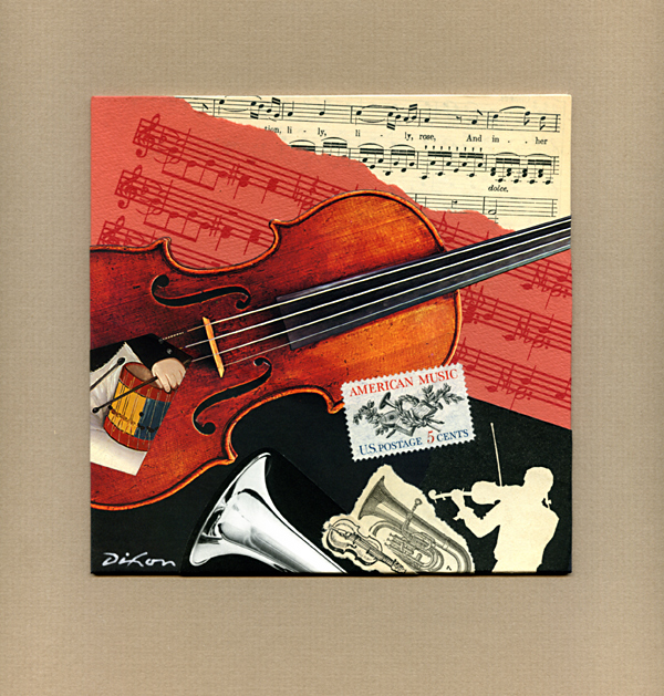
collage miniature by J A Dixon
6 x 6 inches

•  S O L D