Archive for the ‘Graphic Design’ Category
Sunday, June 28th, 2020
You can only work for people whom you like.
If you have a choice, never have a job.

Some people are toxic.
Avoid them.
The good is the enemy
of the great.
Less is not necessarily more.
Style is not to be trusted.
How you live changes
your brain.
Doubt is better than
certainty.
On aging: It doesn’t matter.
Tell the truth.
Milton Glaser
1929 – 2020
Posted in Criticism, Graphic Design, Illustration, M Glaser, Priorities | No Comments »
Saturday, February 8th, 2020
“Don’t think of it as failure. Think of it as time-released success.”
— Robert Orben
“If you’re doing it for prizes, you’re in big trouble.”
— Linda Ronstadt
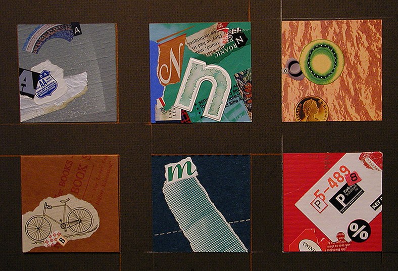
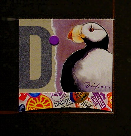
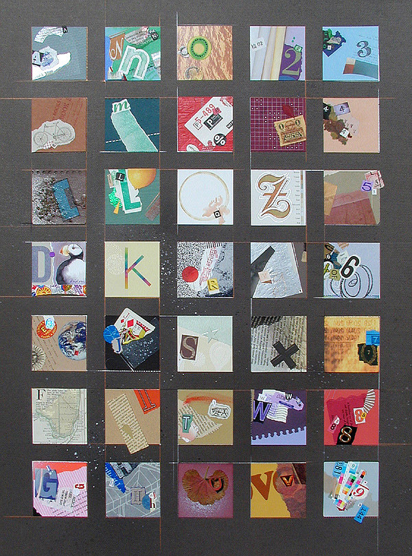
Alphanumero is a large composite of 35 miniatures that I created for my first solo collage exhibition in 2007. It was acquired earlier this week by Bluegrass Care Navigators through the coordinating assistance of LexArts, the dynamic arts organization of greater Lexington, Kentucky. My sincere thanks to community arts director Nathan Zamarron for his professionalism and hard work.
Spontaneous expression within structural order had been my goal, as I created each individual “A-to-Z” and “1-to-9” composition from found material and combined mediums. I had no overall value-scale or color scheme in mind, so I didn’t see the effect of the sequential, up-and-down “path” until final assembly. With a bit of hindsight, the influence of my graphic design foundation is quite obvious, and I was only beginning to devote myself to an improvisational approach.
For a long time after that, I would focus on isolated miniatures as finished works. Alphanumero was a large and time-consuming affair, with a relatively expensive price.  It’s no surprise that it took awhile to find a buyer. I’m pleased and gratified that it has.
I’ve had many thoughts about the piece over the last dozen years, and I now question the validity of some. I haven’t created anything similar at that size since. Although there might have been a sound motive for that, my likely rationale was that the original version hadn’t sold. That is not a good basis for discontinuing an artistic investigation. Thinking that a piece has a strong chance of being purchased is an equally wrong-headed reason to make a work of fine art. Yes, the creative calling exists in a marketplace, and that consideration is always present, but shouldn’t we try mightily to strip “merchandising” from our incentive to enter the studio each day?
Easier said than done . . .

Alphanumero
composite of collage miniatures by J A Dixon
30 x 40 inches, framed
• S O L D
Posted in Details, Graphic Design, J A Dixon, Larger Works, Multiple Miniatures, Theme/Variation | No Comments »
Saturday, June 15th, 2019
“One year ago, on 24th April, Retroavangarda Gallery held its opening exhibition in the modern office building complex Jerozolimskie Business Park in Warsaw. Since that day, many great artists and guests have visited the gallery. A big thank you to all artists and visitors!”
— Anna Kłos
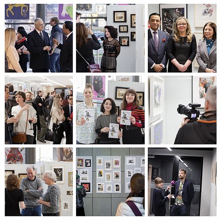
I became aware of Dr Anna Kłos almost from the time she was instrumental in opening Warsaw’s Retroavangarda Gallery in 2018, which immediately hosted its first high-profile collage exhibition. As the gallery’s director, she used her evident social networking skills to quickly develop a strong presence on the worldwide stage of contemporary collage. I wasn’t nearly as impressed with this capability as with her curatorial acumen as a design historian and modern art scholar.
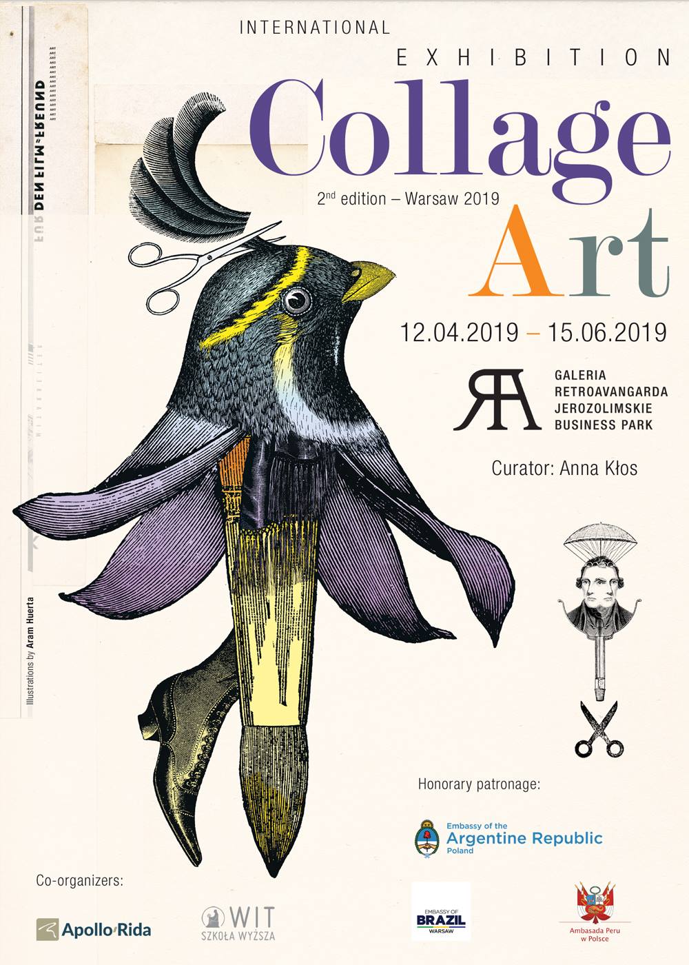
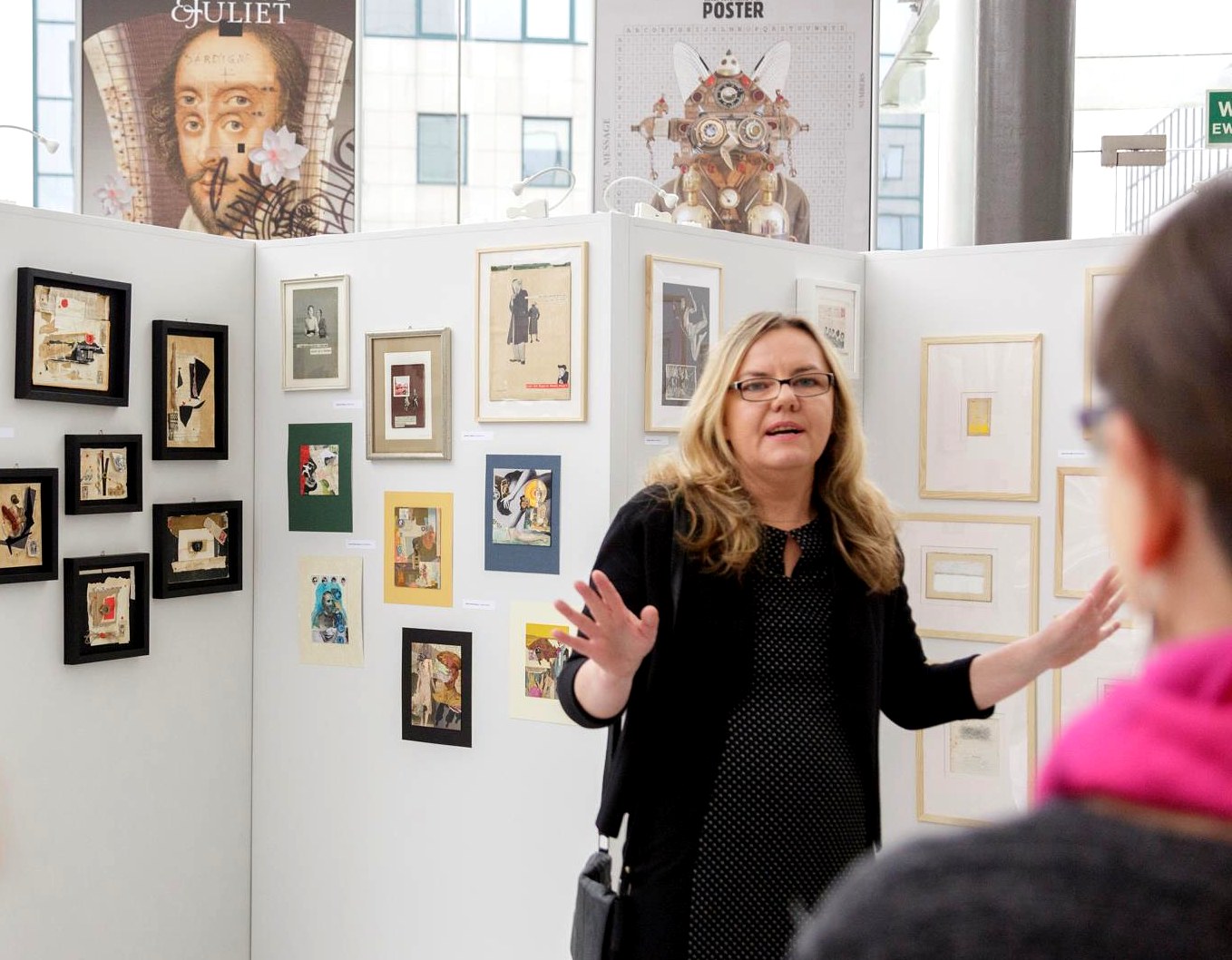
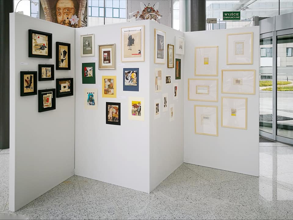
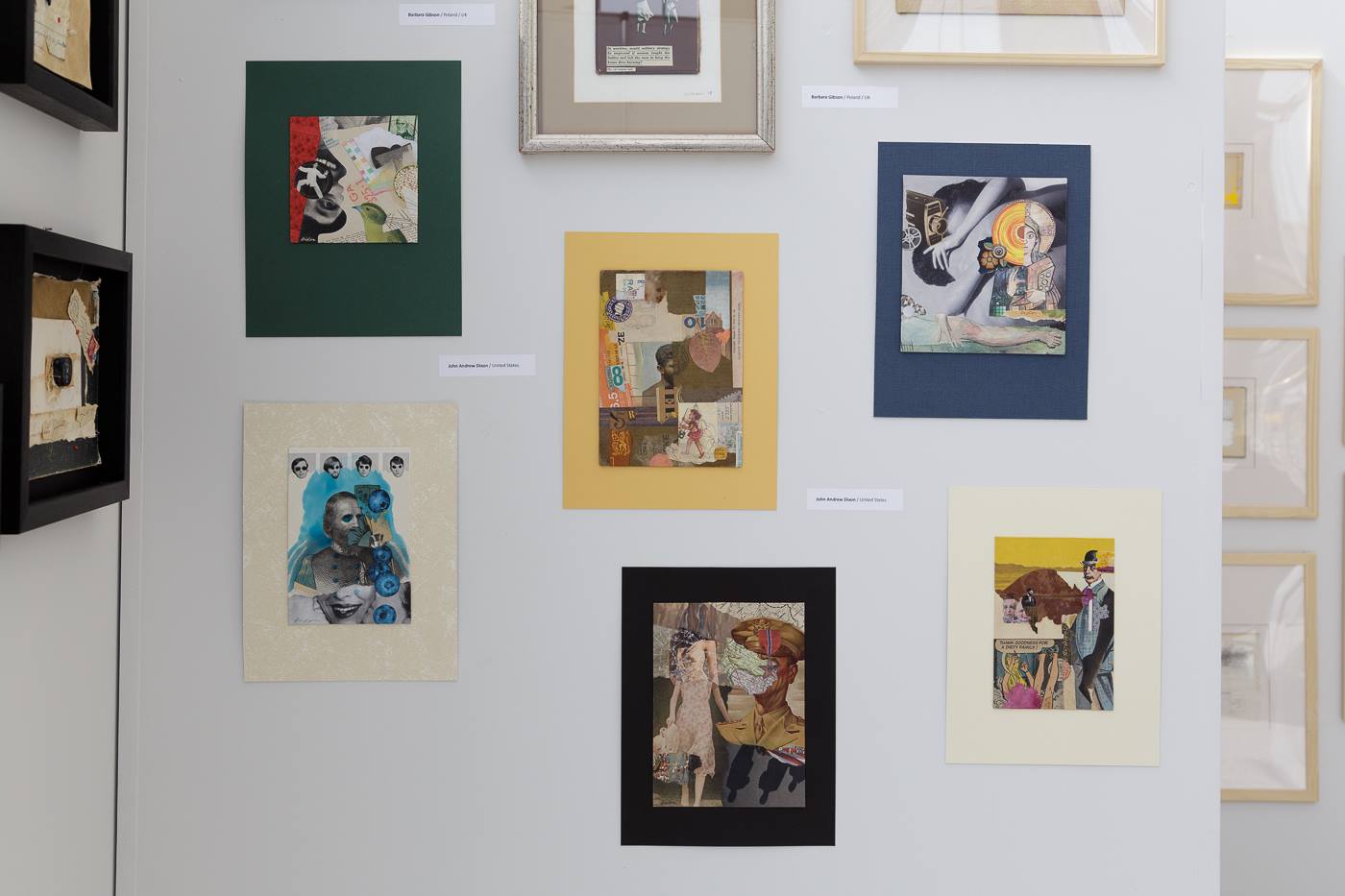
It was on this basis that I was profoundly gratified with her invitation to be a part of Retroavangarda’s second International Collage Art Exhibition  to mark the institution’s first anniversary. It more than made my day when I was notified that all six of the works that I sent to Poland were selected for display and acceptance into the gallery’s permanent collection. With more than 200 works by 76 artists from around the world, Kłos organized the show under the honorary patronage of the Embassy of Argentina, the Embassy of Brazil, and the Embassy of Peru. The exhibition opened on April 4th, followed by a well-attended reception that included dignitaries from the three embassies. The show closes today, and jetting to Warsaw wasn’t possible for me, although I would have been thrilled to personally experience what was obviously a landmark compilation of exceptional collage artwork. The dynamic Anna, whose PhD dissertation was on Dadaist collage, is also a fine artist, lecturer, graphic design instructor at the Warsaw School of Information Technology, and curator of their WIT gallery.
It is a distinct privilege to be among the few North Americans selected to participate in one of the largest showcases of fine art collage ever held in Central Europe. Other artists from the USA with displayed work include Allan Bealy and Nikki Soppelsa, previously featured here, in addition to Angela Holland and Claire Dinsmore, both new to me. Please visit Anna’s facebook page and the Retroavangarda site to view images from the exhibition. Everyone interested in the art of collage will want to follow her ambitious activities in Poland.


The six collage miniatures exhibited at Retroavangarda Gallery were:
Blind the Mocking Eye • Faded Recollections • Truth Be Told • A Dirty Family • A General Affair • Myrmidons
Posted in A Bealy, A Kłos, Events, Exhibitions, Graphic Design, J A Dixon, N Soppelsa | No Comments »
Friday, November 16th, 2018

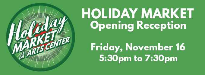
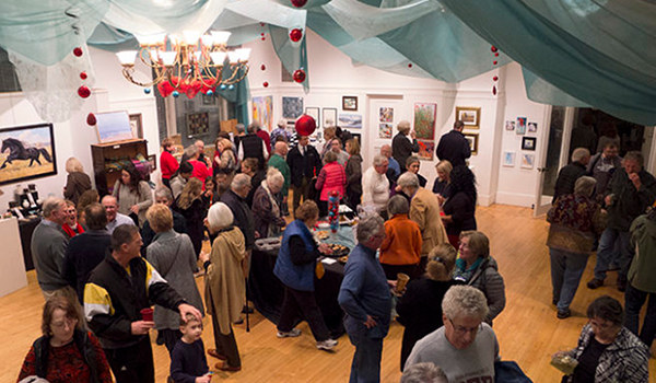
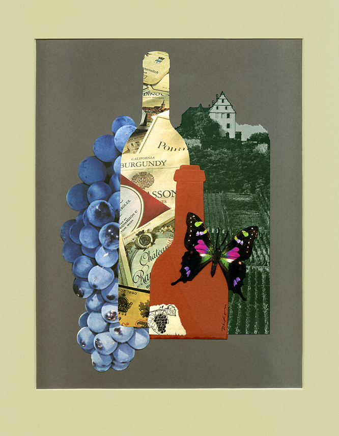
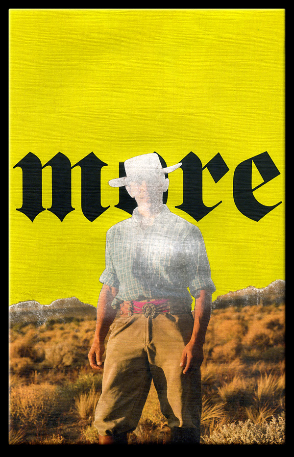
November inevitably brings a year-end uptrend in studio production, if not in my volatile stock portfolio. In addition to releasing a set of new note cards featuring five of my  Christmas-tree miniatures, I made two spontaneous artworks for display during Danville’s Holiday Market at the Community Arts Center, which hosts its opening reception tonight. Composed with somewhat more restraint than my typical “maximalist” creations, I am very interested in the response they elicit. Last year’s event was a record-setting kickoff for the season. Shall I be seeing you this evening?


two new “stocking stuffers” —
Gift of Grape (available) (buy now)
and
Fortune’s Conspiracy (sold)
Buy Gift of Grape now.
Posted in 1) Available!, Events, Exhibitions, Graphic Design, Illustration, Market Shard Series | No Comments »
Tuesday, August 21st, 2018
“We do not analyze works of art because we want to imitate them or because we distrust them.”
— Paul Klee
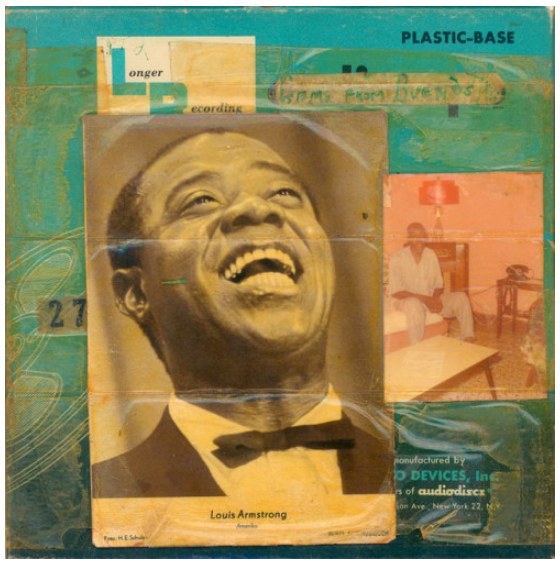
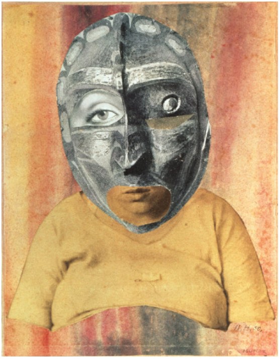
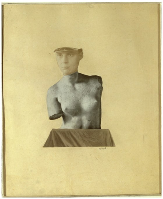
The other day the world learned about an unpublished Ernest Hemingway short story. If there had not been a Mark Twain first, would literature know Hemingway’s writings at all? Could there have been an Isaac Asimov, Stan Lee, or Gene Wolfe without a Verne or Burroughs? The J.K. Rowling body of work without an Austen or Tolkien?  Similarly, all of today’s rock music can be linked to direct influences — to bands such as Ramones, Led Zeppelin or the Beatles, which, of course, had their own precursors. Would jazz exist in its current form without the innovations of Armstrong and all those who inspired him? Imagine a contemporary musician saying, “I really haven’t paid attention to any music that was recorded before I started to play.” And yet, not infrequently, collage artists will boast that they have little use for art history (all the breakthroughs of bygone creators who dug the swimming pools in which they now frolic).
It is argued that modern artists were the first to decide that visual art would be about art, rather than subject matter. Nonsense. Art has always been about art, because it always has been structured on prior foundations. The idea that any artist can burst on the scene as an original is absurd. Nobody who comes out of early childhood with any level of awareness has not built an inventory of perceptions — countless images from the culture around them. Each of these individual influences involved creative activity based on another bank of stimuli, and so forth, back to the first proto-human who picked up a piece of charcoal to make interesting marks on a stone (and was probably knocked on the head by another
 who judged the action as irrelevant to group survival).
Perhaps I have belabored my point. Perhaps it is a point that anyone who reads this would not need emphasized in the first place. Isn’t it obvious to us that no art form is more about all these churning influences from untold visual decision makers — painters, printers, illustrators, photographers, designers — than the medium of collage itself? So, let us all continue to study the collage artworks of the explorers who came before us, to trace the direct lineage of their concepts and techniques, to recognize that valuable inheritance in the work of our peers, as well as in the composition taking shape on the surface before us, and then, fully informed, to push confidently into the second century of collage.

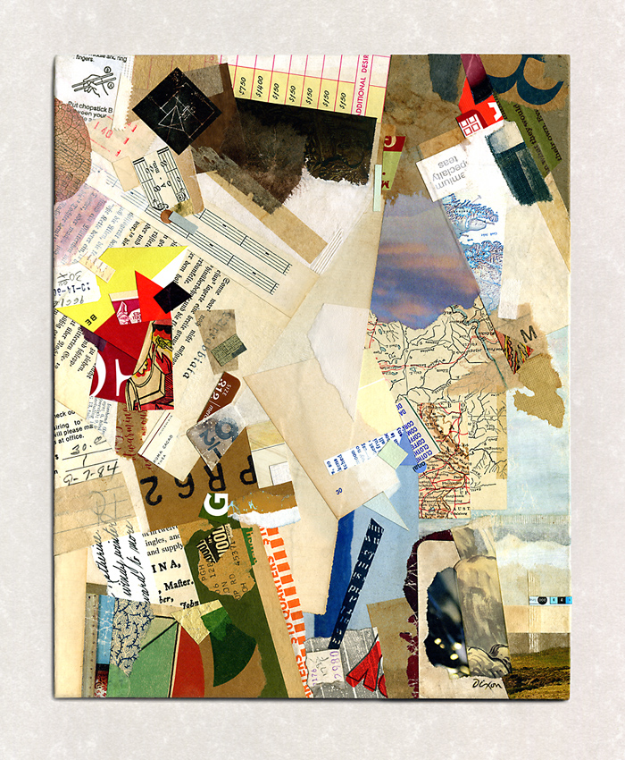
Tranquil Ode (to Merz)
collage homage by J A Dixon
9.5 x 11.875 inches
Purchase this artwork.
Posted in Abstraction, Applied Arts, Collage, Criticism, Cubism, Dada, Fluxus, Graphic Design, H Höch, Homage, Illustration, Influences, J A Dixon, J T Baargeld, K Schwitters, Literature, M Twain, Merz, Music, P Klee, Priorities, Surrealism | No Comments »
Saturday, March 24th, 2018
“Even in the absence of inspiration and talent, I think that through sheer craft you can actually create extremely good work, all the time, reliably. Great work is something else. I think for great work you also need a lot of luck. You can only aspire to really good work. The great work either happens or it doesn’t.”
— Christoph Niemann
Sloppy collage artwork has never held much appeal for me. Individuals might define “sloppy” differently, so I’ll rephrase that. I have always found well-crafted collage artwork to be the most appealing. In practice, I have aspired to the highest level of artisanship to which I am capable. According to my peculiar notions, the very nature of collage as a “mash-up” of visual ingredients suggests that one resist all the inherent temptations to condone careless techniques. To do anything less is a disservice to the medium, and strikes me as being a bit lazy.
I have been at this long enough to contrast current activity with a study of my “early” work. I perceive it now as more crisp and aligned with my long stint as a designer and illustrator. I remain proud of craftsmanship that continues to challenge my present hand skills. Like everyone who sticks around, I have moved relentlessly toward a period of life when manual dexterity and vision are unlikely to improve. At any rate, clean, precise work is more about attitude and personal commitment than it is about facility. Lately, on the other hand, I have sought a more organic, less contrived look — the impression that a piece is naturally the way it should be, rather than appear too obviously composed and belabored. As I work, I try not to permit the goal of a somewhat softer and cohesive whole to suggest a relaxation of craft. In fact, I have gradually introduced steps in the process that demand extra time and attention: sanding the reverse side of ingredients for adhesive-saturated compression and eliminating white edges on printed scrap to enhance a seamless effect. I combine that with ample burnishing and some hair-dryer prep before curing time under weight, followed by multiple light-touch coats of matte sealant. I would rather be thinking about practical methodology or a musical playlist than what is literally evolving on the surface before me, allowing that to be as intuitive as possible.
And perhaps (just maybe), Lady Luck will smile.

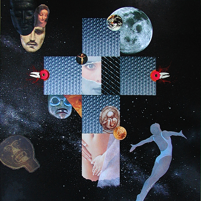
Cosmic Crucifixion
mixed-media collage by J A Dixon
2006, 16 x 16 inches
available for purchase
Posted in Artifacts, C Niemann, Collage, Criticism, Graphic Design, Illustration, Ingredients, J A Dixon, Larger Works, Methodology, Priorities, Technique | No Comments »
Monday, January 15th, 2018
“When you take risks you learn that there will be times when you succeed and there will be times when you fail, and both are equally important.”
— Ellen DeGeneres
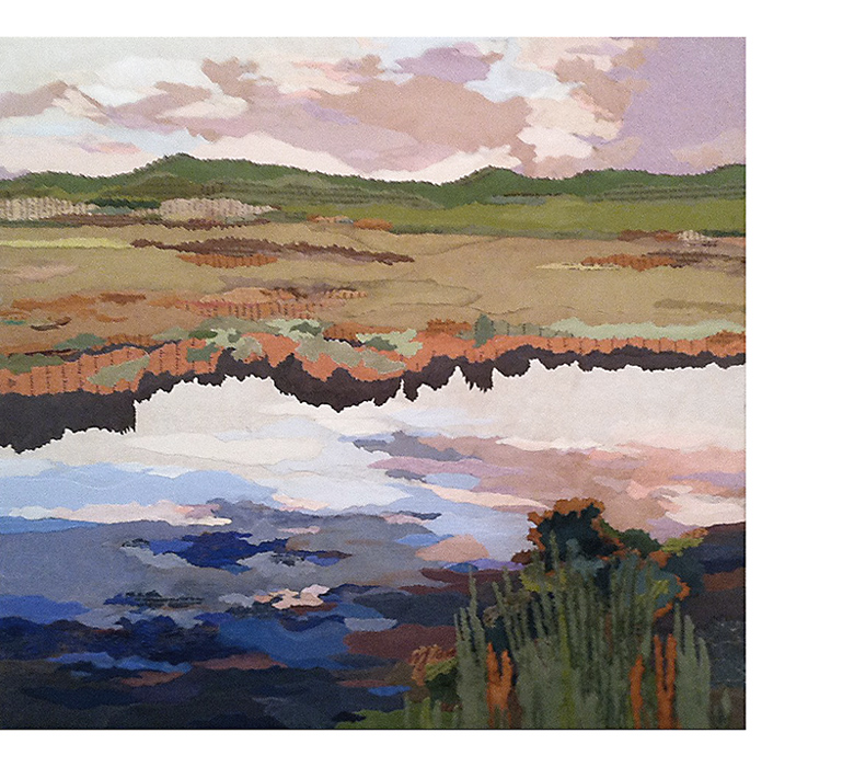
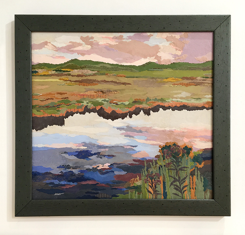
Although it was created in the studio, my new collage landscape titled ‘Wetland’ benefits from a summer of plein-air activity. My “painting with paper” out of doors  has opened a rewarding area of investigation for my work as a collage artist. I’m pleased to share this piece with the art-viewing community at my first invitational exhibition of the year, the annual New Year New Art show at our Community Arts Center, just a biscuit toss from my home base in downtown Danville, Kentucky. This event has been a fortifying tradition for regional artists, because we can complete our year of work at a risk-taking level, and still know that the result will get a prominent public display.
 An artist working outside a metropolitan center could not ask for greater support from a local institution.
Based on an excellent photograph by a longtime pal, this artwork was created as an entry for a contemporary landscape show, but the juror rejected it for unknown reasons. I kept it handy for a pair of upcoming open studio events (my participation in the Central Kentucky ARTTOUR and Gallery Hop Stop). Plenty of praise ensued, but nobody took it home, so I decided to make additional refinements, leading up to the deadline for the January exhibition. A full makeover was unnecessary, as the in-process image above indicates. However, I was not entirely pleased with the vegetation at the waterline, above the dark shadow that spans the composition. In this case, less was not more. Additional ‘foliage’ was needed. I also thought that the lower right corner was too abstract. The desired sense of realism would profit from a more detailed foreground. Late-season ironweed, a favorite of mine, seemed a suitable choice. That led intuitively to a few closing decisions in the sky reflection and distant terrain.  Nearly all of the ingredients were infused with wheat paste and press firmly onto the evolving surface with polymer gel. After thorough drying, selected areas were lightly sanded and the total surface evenly daubed with a flat sealant.
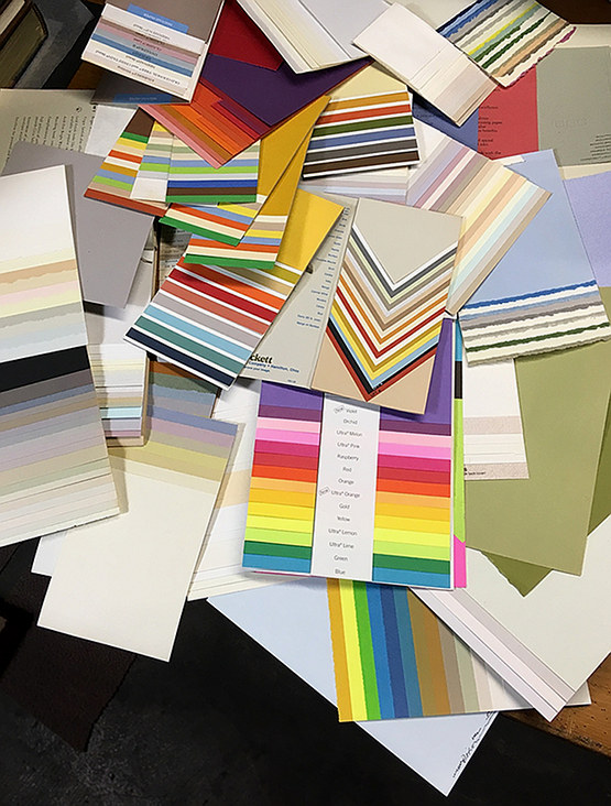
It is very satisfying to work with a palette of elegant papers, and I am fortunate to have them. Some of you may remember (especially those with a background connected in some way to the graphic arts) the pre-internet days of a more diversified paper industry. Numerous mills and distributors slugged it out in a highly competitive market. Inkjet printing was still on the horizon and multi-color offset printing was expensive. Printing on colored stock was a cost-effective way to get more color into published material. Paper producers went out of their way to demonstrate creative ways to use colored paper and many of us who specified paper for printing projects were lavished with promotional samples. Decades later, I still have a stash from that era, and I rely on it now for my plein-air miniatures and studio landscapes. A piece such as ‘Wetland’ puts this hoard to good use; it would not look the same with scrapbook or construction paper. The richness of premium papers manufactured for fine printing were accented with fragments of dulled foil, tissue, scraps of found packaging, and fragments of typography. After all, it’s meant to be a collage artwork!
The opening reception for NYNA is this Friday evening, 5 to 8 pm. Perhaps I shall see you there to discuss ‘Wetland’ in person.

Wetland
collage landscape by J A Dixon
21.25 x 19.25 inches
on structured panel, framed
available for purchase
Posted in Applied Arts, Collage, En Plein Air, Events, Exhibitions, Graphic Design, Ingredients, J A Dixon, Landscape, Larger Works, Methodology, Morgue, New Year New Art, Technique | No Comments »
Monday, December 22nd, 2014
“I would do ‘John Carter’ again tomorrow. I’m very proud of ‘John Carter.’ Box office doesn’t validate me as a person, or as an actor.”
— Taylor Kitsch
One of the more exciting developments for any artist is the request for original artwork based on an interesting theme. Whether it is for personal or commercial purposes, the medium of collage is ideally suited for commissions, and the process can make use of visual ingredients provided by the client, if the artist sees fit to embed them. It probably goes without saying that the applied arts can be a tricky affair for some fine artists. It is important to sort out the contrasts between meeting customer expectations and following one’s own creative direction. There is also a range of differences among the types of projects that might benefit from a collage assignment, including packaging or label graphics, book cover or editorial illustration, product design, or the straightforward commissioning of a fine-art work. Clear communication up front is always the best approach, and there is nothing wrong with declining a job if client objective and artist satisfaction cannot be fulfilled at the same time.
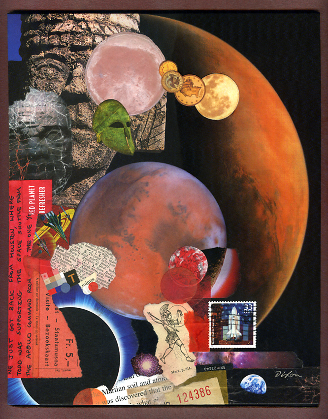
Today’s example was created for the buyer’s presentation as a gift to an engineer closely involved in Martian exploration. When the client described the intended recipient’s passion for the subject, I swallowed hard, but my initial trepidation soon faded as the process took on a life and momentum of its own (as, thankfully, it always does for me). I shall admit, however, that it may take a little time before I replenish my red-planet stash.

Assignment: Mars
collage miniature on panel by J A Dixon
8 x 10 inches
private collection
Posted in Applied Arts, Collage, Commissions, Gift Art, Graphic Design, Illustration, Morgue, Publications | No Comments »
Sunday, October 5th, 2014
“As we mature, all of us learn to ‘put away childish things.’ Often, though, we do such a good job of growing up that we lose contact with our spontaneity, teaching ourselves to follow rules and habits that inhibit us from acting on our hunches and intuition.”
— W. Clement Stone
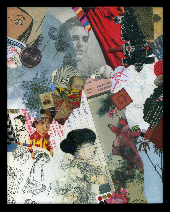
One of my earliest entries at this site made mention of the intuitive response in our process of collage creation. I have continued to ponder this idea of making visual decisions without conscious thought, especially after a lengthy discussion at the Collage Critique group in the facebook realm. There is something to be said for intuitive spontaneity with no preconceived notions, in contrast to the methodical execution of a concept. Collage as a medium is diverse enough to embody both approaches and everything in between. In my opinion, there is ample “non-thought thinking” taking place, even when no “idea” is driving the process. On the other hand, most of us can tell when a piece is struggling to be more than a mere stew of ingredients and the temptation to declare it “finished” should be resisted.
Personally, it is no longer possible for me to imagine coming to this activity without the foundation of art education, a rigorous training in graphic design, and 40 years of practice as a creative professional. I suspect that I have internalized all this to become part of an inner resource, so that when, at the conscious level, I put all of it out of mind, it still informs each spontaneous visual choice and the sense of something appearing “right” to the eye. Deciding that “an ingredient in play” has the right color, the right value, the right shape, the right texture, or the right spatial role often happens without rational awareness. That is my goal, at any rate, to keep such “non-thinking thought” in motion for as long as possible before I find myself falling back into outer rumination. It is not only a matter of aesthetics. The same phenomenon applies to thematic or symbolic associations, and the overall process of ingredient acquisition and selection that initiates and sustains the whole affair. Not that there is anything undesirable or distasteful about planning, calculation, and a deliberate methodology. Far from it. Nearly every work of art will involve some of that. It just happens to be that what I am most hoping to take place is something else — that the flow of assembly leading to a stimulating but balanced effect is the result of an artistic intention deeper than conscious decision making.

Arbitrary Mischief
collage on panel by J A Dixon
8 x 10 inches
Purchase this artwork!
Posted in 1) Available!, Collage, Graphic Design, Influences, Ingredients, J A Dixon, Methodology | No Comments »

