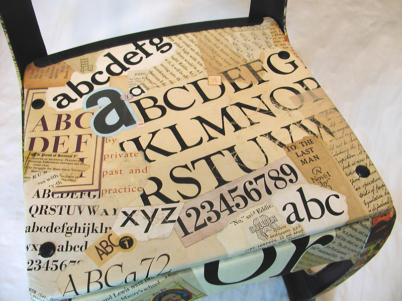
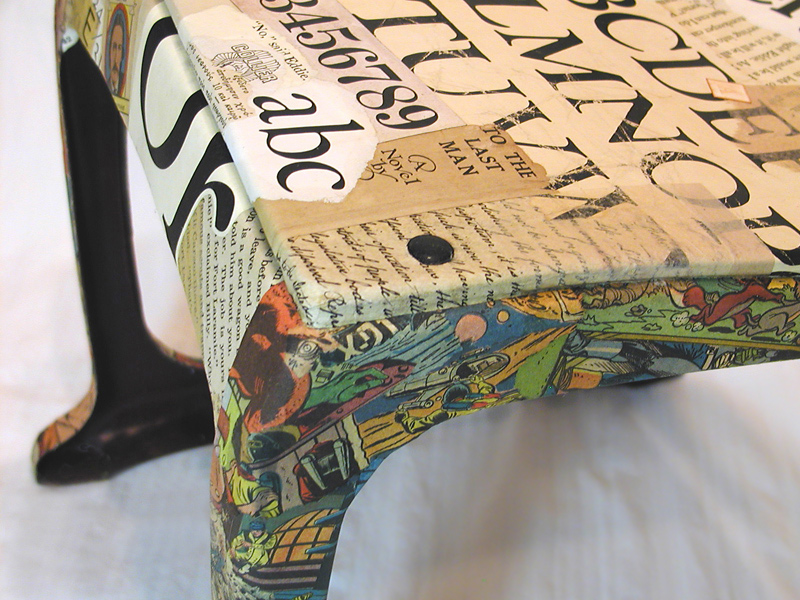
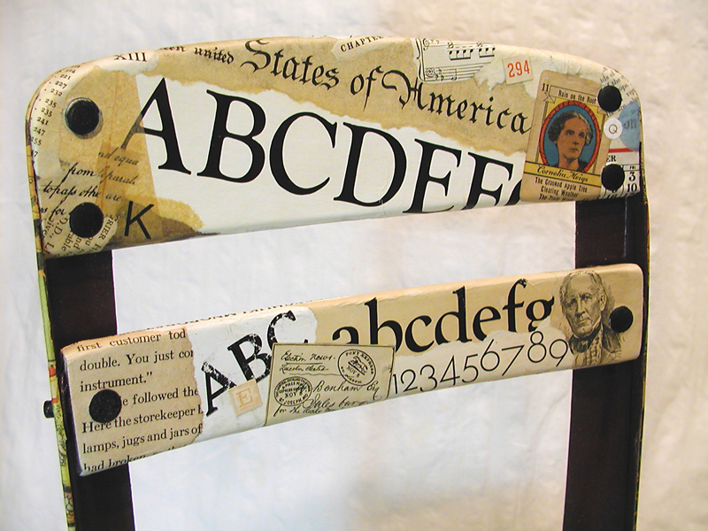
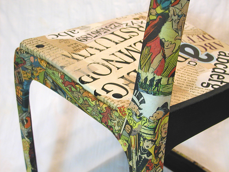
Here are a few detailed images of my repurposed chair, Good Morning, Mrs. Bradshaw. I knew from the outset that I would not be satisfied to achieve a “merely aesthetic” result, even though I am usually pleased if my collage artwork successfully does no more than that. I sought to visually communicate a symbolic tension that evoked my feelings as youngster, caught between the clarity of adult expectations and the fuzzy pleasure of indulging a literary genre that was generally frowned upon in the 1950s. I include the name of my first-grade teacher in the title. She was probably the first person outside my family who recognized and encouraged my creative interests.

The project took on a life of its own when I became convinced that it was
finally time to exploit some of my vintage typesetting specimens.
My concept rests on the visual contrast between “scholastic” and “vernacular”
imagery — what a ’50s schoolboy was supposed to read and what he was not.
My desire to preserve the circular “rivets” that held the wooden seat and back
slats to a metal structure presented challenges of collage artisanship.
A fun, rewarding part of the process was to capture the youthful energy of
reading comics and to avoid obvious narrative references at the same time.
Thank you for your interest and attention. Please let me know what you think of my work, this blogsite, or the medium of collage in general. Comment here or through TCM at Facebook. Stop back again!


